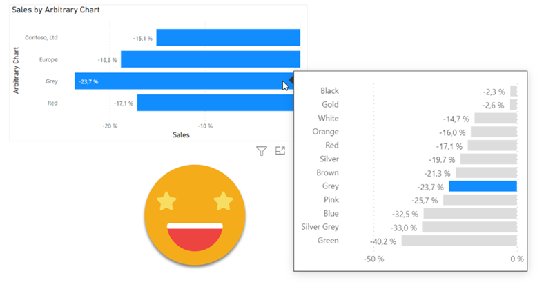
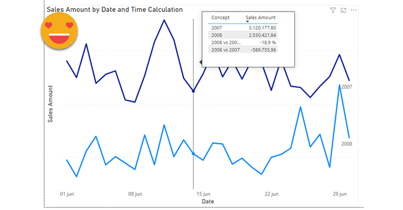
I realize that I use the word «arbitrary» a lot on my blog posts, but then I think, «so what?». Anyway, this blog post is mostly a remake on another blog post, the one called «A truly dynamic tooltip«. When I wrote that blog post, I had struggled a lot to get the effect I wanted, but even though I learned a lot in the process I ended up convinced that it was better to stay out of calculation groups when building such a chart. Well, this is no more. Calculation groups, are ususal, are just fine. You just need to know how to use them.
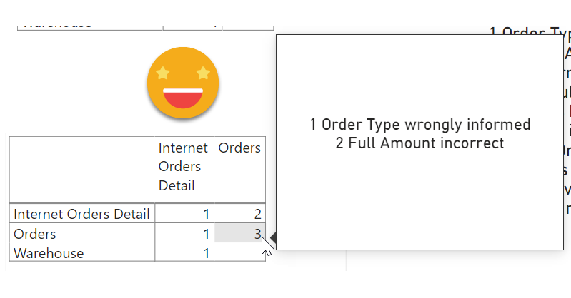
I know, I’m back again at validations, but this time is a bit different. Recently I’ve found myselft in a project where the data that was coming in was not fulfilling the sepcified requirements. We tend to thing that data that comes out of a system will always be pristine, but well, at least in one instance it was not. There were some validations set in place in Access + VBA. But then, even if the access was set out to execute every day you have to go in, check the output, and each file had it’s own validation access. Well, not great. Since the patience was running thin (errors kept apprearing in different places) it was decided that a full validatino check was to be set out. Or at least something much deeper than we had now. I figured out that we might be able to build something in Power BI. Data Validation with Power BI. Odd? yes, but hey, you gotta do what you gotta do.
Calculation Groups biggest contribution is to help us reduce the number of measures that we have to create and manage. However, sometimes, me might want measures again… Of course we can forgo the calc group altogether, but we might want to keep the centralized logic while having actual measures, and not measures + a filter as we usually do with calculation groups. The most relevant use case that comes to mind is when we do not want our calculation items to travel to the tooltip or drill through pages, as I discussed in this post not long ago. I guess that for most use cases, creating the measures manually is not the end of the world, but hey, scripting is fun and is cool, so let’s automate that a bit.
After a long break due to a truckload of presentations (for my standards) here I’m back again with the blog.
I have a pile of ideas, but always the latest idea takes priority as it is hot, it’s burning in my head.
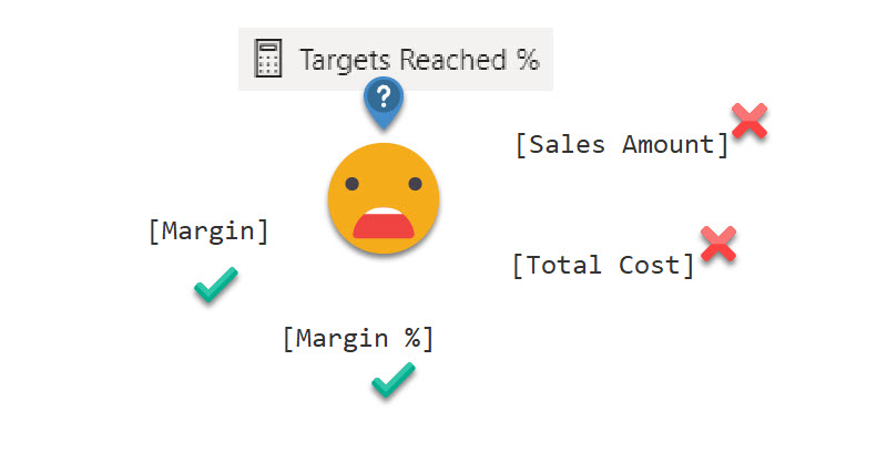
A guy from the Barcelona Power BI User Group asked me if calc groups could help him in a measure he was running. It’s like a measure of measures. There are several measures that represent different organizational KPIs, and they have a disconnected table in which there’s a target for each measure. He wants to know the percentage of targets that were met.
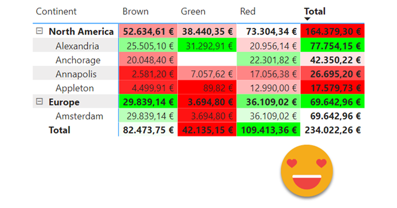
It’s a loooong title (well, it was «Conditional Formatting with divergent color gradient for values and totals»), but it’s exactly what I wanted to achieve when I discovered the limitations of the conditional formatting options in the GUI of Power BI Desktop. The key words are «dynamic» in one hand and «values and totals in the other» I know, some of you may think I’ll be doing some copy-cat article of the crazy video from Bas in which he shows how to use the undocumented (that I know of) function hsla(). A function that you need to leave as text?!? Crazy, just crazy. But no, I take a complete different approach and I think it’s worth the effort! Of course you can take ideas from both me and Bas and come up with your own unique approach for dynamic conditional formatting.
Today’s topic is more like an academic exercise than a production use case, but there are a lot of learnings along the way and I think it’s worth the effort.
The other day I saw a tweet by Igor Cotruta that talked about «text fingerprinting». The idea is embedding the user id in invisible characters so that if the exported data get’s eventually leaked it can be traced back to whoever exported it. Looks like stuff from a spy movie, so I was quickly on-board in the attempt to reproduce that with Power BI with a Calc Group.
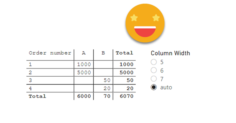
Ok, I have maybe gone a bit overboard with the title, but I think it has some advantages over other hacks out there to establish the column widths of matrix, so here I am to explain how I came up with it and how to use it.
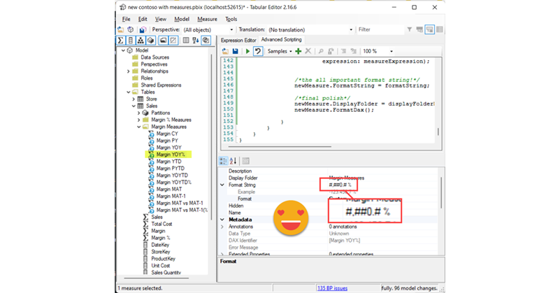
The first hack I saw was from Ben Ferris (aka The Power BI Guy) which added a dummy measure with a number of 0 to make the width (having automatic width enabled) and then it would disable automatic widths and remove the measure. Nice. But of course, if new columns appear you’ll need to set the thing again. Something similar happens with the approach of Bas, who skips the dummy measure thing and instead just plays with the format string to show the evenly wide number. His approach is cooler because you skip the measure thing, but you have the same weak points.
However, Bas’s video got me thinking on the topic and the role of format strings…
Hi there. In my previous post on how to set up a «data problems» button I did mention that there was a further improvement to the approach, so here I am to explain what is this about.
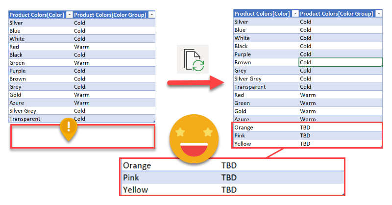
As you may recall, in my previous installment on the topic, the user is warned that there is some issue with the data through a button that brings him or her to a page where can see exactly what are the issues, such as unmapped items or any other data issues (dates which are not dates, numbers which are not numbers, duplicates…). Today will stick with the mapping problems. In such case you had to copy the offending items, add them to the excel table, and complete the (manually maintained) extended attribute columns.
Wouldn’t it be wonderful if those items could automatically travel to the excel file?
Well, this is exactly what we’ll try to get to in this post. We are going to do data mapping with table connected to the dataset
In this post I’ll explain how to break the tyranny of the «all filters» that are passed to the tooltip in particular the filters set by a calculation group which are even nastier to get rid of than regular filters.
It wasn’t intended this way, but this post is sort of a sequel (and not SQL) of my post on dynamic labels for time calculation series, which itself builds on the post introducing the time intelligence calculation group script. If you have not read them you can also watch the video you’ll find on the end of each post — although from the sound quality maybe it’s less painful to read the blog!
Anyway, if you are here probably you know something about calculation groups, and that’s good, because there’s plenty of them coming.
This is one problem that you don’t realize it’s a problem until you face it.
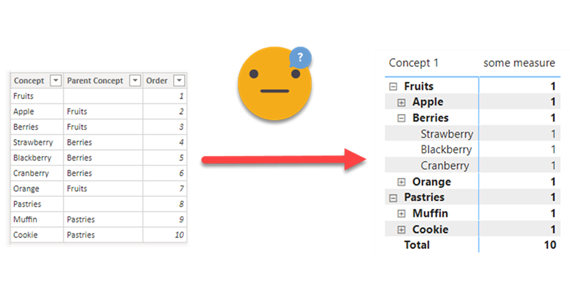
Happened to me designing a P&L report. For this report, an arbitrary list of items (arbitrary to me of course) has to be displayed in certain order, each with it’s own arbitrary calculation, and even with some hierarchy indentation. Easier said than done, really.
