Building an arbitrary YOY% growth chart with zoom-out tooltips

I realize that I use the word «arbitrary» a lot on my blog posts, but then I think, «so what?». Anyway, this blog post is mostly a remake on another blog post, the one called «A truly dynamic tooltip«. When I wrote that blog post, I had struggled a lot to get the effect I wanted, but even though I learned a lot in the process I ended up convinced that it was better to stay out of calculation groups when building such a chart. Well, this is no more. Calculation groups, are ususal, are just fine. You just need to know how to use them.
But "enough of all this talking" this is what we are trying to build here.
So what is this chart anyway? This is more or less what I did in one of my clients. It was the marketing department and they were very much interested in the Market % growth from the previous year, but for different granularities, as a manufacturer, for each of their main brands, also in general but for each region. And they wanted it all in the same chart. Not only that, they wanted that if looking at manufacturer bar (like for general o regions) the tooltip will show the bar along the same for other manufacturers, while when looking at brand bars the tooltip would show other brands.
There is a lot to unpack here, so let's go little by little.
The base chart
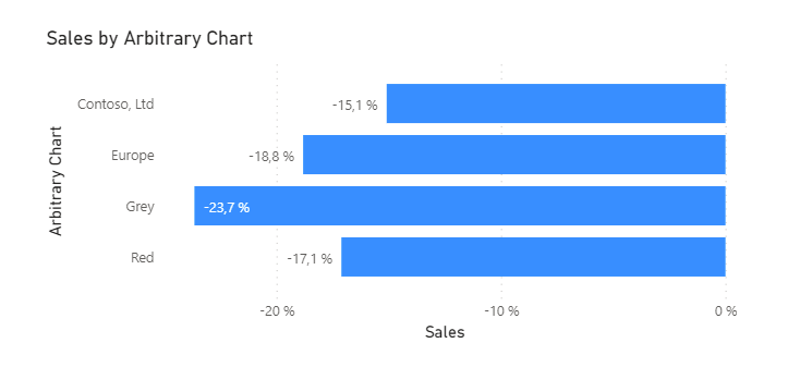
The base chart is not too complex to build with a calculation group. Here I played with the idea that I’m the manager for Red and Grey products for Contoso Europe. So my chart shows the YOY% of contoso worldwide, contoso Europe, contoso europe red, and contoso europe grey. This can be build pretty straight forward with this simple calc group:
CALCULATIONGROUP 'Arbitrary Chart'[Arbitrary Chart]
    Precedence = 35

    CALCULATIONITEM "Contoso, Ltd" =
        CALCULATE (
            SELECTEDMEASURE (),
            'Product'[Manufacturer] = "Contoso, Ltd"
        )

    CALCULATIONITEM "Europe" =
        CALCULATE (
            SELECTEDMEASURE (),
            'Store'[Continent] = "Europe",
            'Product'[Manufacturer] = "Contoso, Ltd"
        )

    CALCULATIONITEM "Grey" =
        CALCULATE (
            SELECTEDMEASURE (),
            'Product'[Color] = "Grey",
            'Product'[Manufacturer] = "Contoso, Ltd",
            'Store'[Continent] = "Europe"
        )

    CALCULATIONITEM "Red" =
        CALCULATE (
            SELECTEDMEASURE (),
            'Product'[Color] = "Red",
            'Product'[Manufacturer] = "Contoso, Ltd",
            'Store'[Continent] = "Europe"
        )
Here notice I use the exact same name for the calculation item and the specific filter. This will come in handy later on.
Of course since we want to show YOY% growth, we’ll need our often used Time Intelligence Calc group, wich you can grab here. We apply the YOY% calculation item at the visual level (along with a filter by 2009) and we are good to go.
But this is the easy part. We want to build now 3 other charts, that show the same percentages, but along the natural companions (manufacturers, contients or colors) –and they are supposed to stay put even when we select the bars of our base chart–. Let’s try it first the naive way.
The tooltip charts
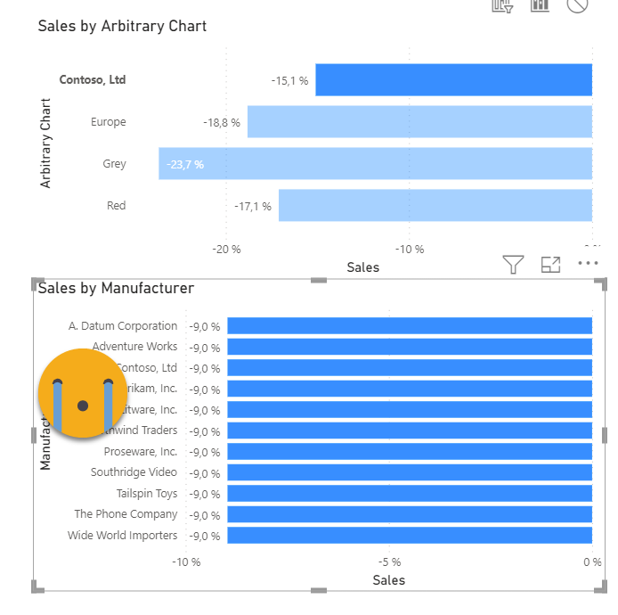
If I build a chart with the manufacturers on the axis, this is what happens. In theory the YOY% should also be applied when we click on the base chart. But by default this is what happens:
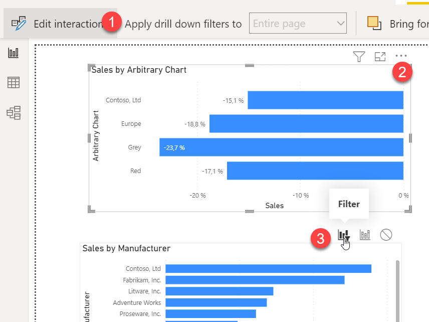
First thing we need to change is crosshighlight to crossfilter. Go to Format –> Edit Interactions. Select the base chart and select the filter sign on the second chart.
However, when we select the bar again, this is the result…
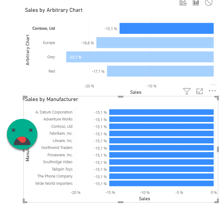
it might explode the head of many light hearted dax beginners, but this actually «expected behavior». When we add a CALCULATE( … ‘Product'[Manufacturer] = «Contoso, Ltd» ) this filter overrides the external filter. However, if you think you’re so smart to say, «yeah, if you don’t want that to happen, you need to use KEEPFILTERS» well, *this* is what happens.
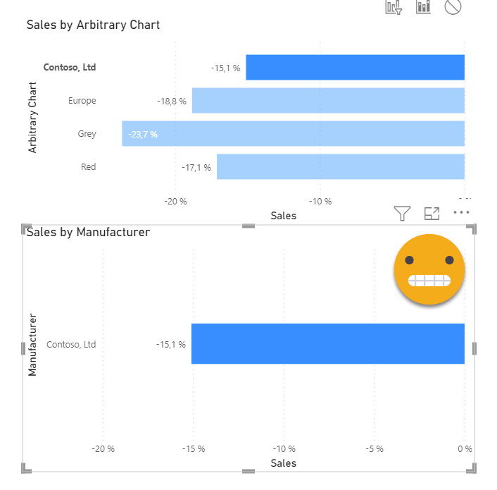
Are you happy now? Probably not. So if we use keepfilters, we only get one bar, if we don’t we get all bars, but all with the same value…. what can we do? My first instinct was «can I get rid of the calculation group altoghether? it’s a filter after all, right?» Setting a lower precedence calc group I tried my luck. It looks pretty good, right?
----------------------------------------------
-- Calculation Group: 'Remove arbitrary chart'
----------------------------------------------
CALCULATIONGROUP 'Remove arbitrary chart'[remove arbitrary chart]
    Precedence = 30

    CALCULATIONITEM "Remove arbitrary chart" =
        CALCULATE (
            SELECTEDMEASURE (),
            REMOVEFILTERS ( 'Arbitrary Chart' )
        )
Wrong. It turns out this does nothing at all. Nothing. This prompted one of my most cryptic tweets of 2022. As pointed out in the tweet, there is more hope when trying to get rid of the filters that the calc group put in place (the actual fulters, not the calc group itself). Well, we can try to get rid of that filter on manufaturer. If we add another calculation group with lower precedence, we can try to do exactly that.
----------------------------------------------
-- Calculation Group: 'Remove arbitrary chart'
----------------------------------------------
CALCULATIONGROUP 'Remove arbitrary chart'[remove arbitrary chart]
    Precedence = 30

    CALCULATIONITEM "Remove arbitrary chart" =
        CALCULATE (
            SELECTEDMEASURE (),
            REMOVEFILTERS ( 'Product'[Manufacturer] )
        )
However, now we get a terrible outcome but for a completely different reason.
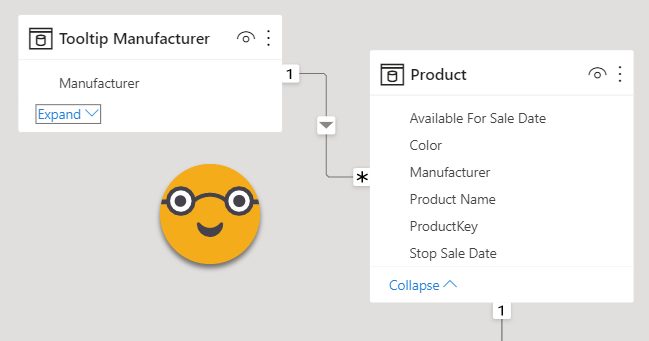
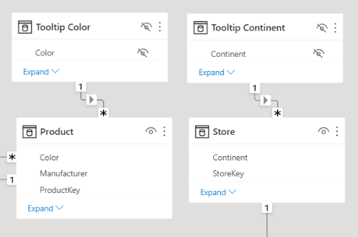
WHAT IS GOING ON HERE?? well, think about it. you just said you want to evaluate the sales measure, without the filter on manufacutrer, didn’t you? thus you get the overall value for each and every manufacutrers. We’ll it’s like we want to keep away the manufacturer filter that comes from the outside, but we want to keep the one from the visual, and guess what, there’s not really a way to do that with just DAX — We need some help from DAX’s best friend: Modelling. What we’ll do is just a small extra table with just the names of the manufacturers:
Tooltip Manufacturer =
VALUES ( 'Product'[Manufacturer] )
Once you have the table we need to establish the relationship with the product table
Now we can try to swith the axis column…
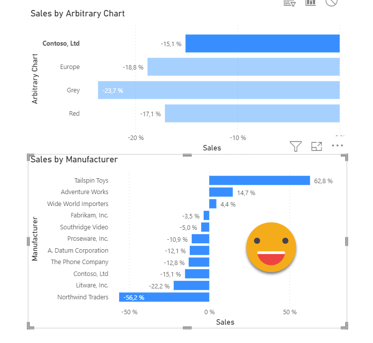
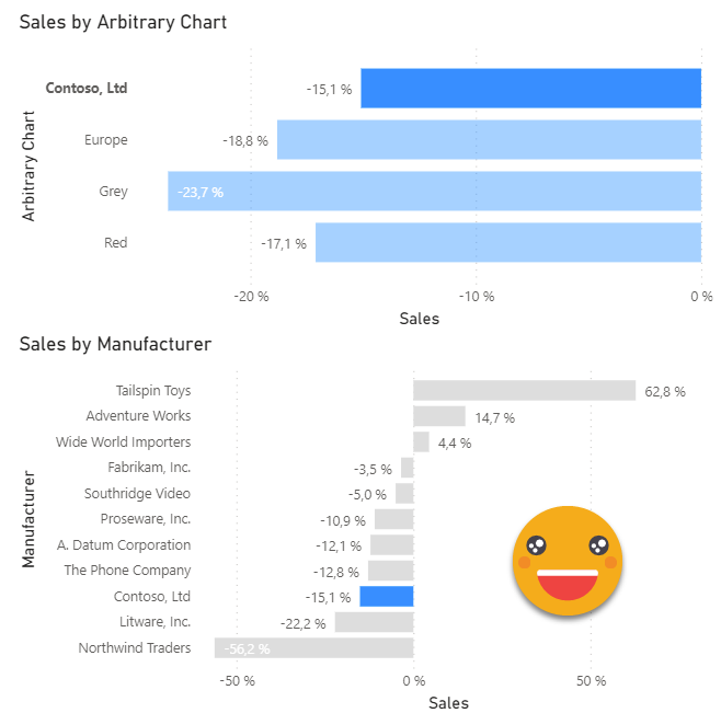
Beautiul! finally we have the desired effect. Well, almost. I would like that the Contoso bar shows blue and the rest show gray, because that’s the manufacturer selected in the main chart bar. Well, that’s the measure I came up with:
Bar Color Manufacturer =
VAR selectedCalcItem =
    SELECTEDVALUE ( 'Arbitrary Chart'[Arbitrary Chart] )
VAR selectedManufacturer =
    SELECTEDVALUE ( 'Tooltip Manufacturer'[Manufacturer] )
VAR BarColor =
    IF (
        selectedCalcItem = selectedManufacturer,
        "#118DFF",
        "#DDDDDD"
    )
RETURN
    CONVERT ( BarColor, STRING )
Here the selectedCalcItem variable will be «Contoso, Inc» when the first bar is selected. For the contoso bar in the chart by manufacturer, it will also be «Contoso, Inc». So in that case use #118DFF (blue), else #DDDDDD (gray). If you want this to be responsive to your theme colors check out this old post of mine. Anyway, make sure that the return value comes from a convert to string function, so that Power BI allows you to select it as a conditional format measure no matter what. And when we do…
Now we need to prepare similar charts for Continents and Colors, so we’ll prepare the two extra tables for the tooltip axis
Tooltip Continent =
VALUES ( Store[Continent] )
Tooltip Color =
VALUES ( 'Product'[Color] )
And we create the relationships (and set the tables as hidden, as we should too with the Tooltip Manufacturer table as well).
However if you feel that you can now go carefree and all, well, I have news for you. Even using our new axis and our special calc group…
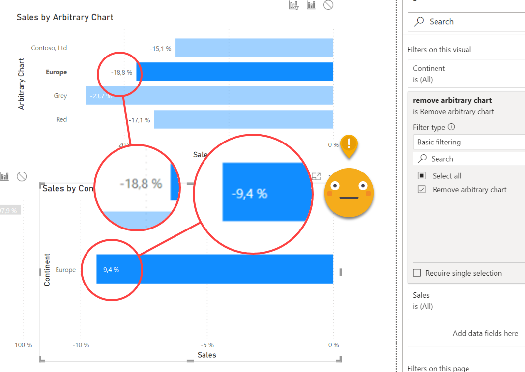
Well, but remember we cannot actually get rid of the calculation group itself, we need to think about the filters that were added, and actually we just got rid of the Manufacturer one, so actually the value we are getting here is the value of Europe for all manufacturers. So in order to «remove» the effects of the arbitrary chart calculation group, we can do different things. If we just add a remove filters on all the filters that we know are added at some point in the base chart, we’ll make a mess. For the Continent chart, we don’t want to remove filters on Manufacturer, we want to keep that one because we want the values only for contoso. So we need to think harder. Basically we can create different calculation items for each chart, or just put it all in the same calculation item, but using different logic with a SWITCH statement paired with ISINSCOPE. In this case it might help to have it all in one place (actually in some scenarios this might be even more optimized as Kane Snyder showed, probably here is not the case but still, it’s convenient).
Anyway, we can update our calculation group that get’s rid of undesired effects of the base chart calculation group to something like:
----------------------------------------------
-- Calculation Group: 'Remove arbitrary chart'
----------------------------------------------
CALCULATIONGROUP 'Remove arbitrary chart'[remove arbitrary chart]
    Precedence = 30

    CALCULATIONITEM "Remove arbitrary chart" =
        SWITCH (
            TRUE (),
            ISINSCOPE ( 'Tooltip Manufacturer'[Manufacturer] ),
                CALCULATE (
                    SELECTEDMEASURE (),
                    REMOVEFILTERS ( 'Product'[Manufacturer] )
                ),
            ISINSCOPE ( 'Tooltip Continent'[Continent] ),
                CALCULATE (
                    SELECTEDMEASURE (),
                    REMOVEFILTERS ( 'Store'[Continent] )
                ),
            ISINSCOPE ( 'Tooltip Color'[Color] ),
                CALCULATE (
                    SELECTEDMEASURE (),
                    REMOVEFILTERS ( 'Product'[Color] )
                ),
            SELECTEDMEASURE ()
        )
Then we can set the chart on continent and the chart on color, by adding the axis from the new calculated tables we created for them, and appying the calculation item at the visual level. Remember also to edit interactions and change from cross-highlight to cross-filter from the base chart. To get the complete effect, we can create the conditional format measures, which are *very* similar to the one we created for the manufactuer tooltip chart.
Bar Color Continent =
VAR selectedCalcItem =
    SELECTEDVALUE ( 'Arbitrary Chart'[Arbitrary Chart] )
VAR selectedContinent =
    SELECTEDVALUE ( 'Tooltip Continent'[Continent] )
VAR BarColor =
    IF ( selectedCalcItem = selectedContinent, "#118DFF", "#DDDDDD" )
RETURN
    CONVERT ( BarColor, STRING )
Bar Color Color =
VAR selectedCalcItem =
    SELECTEDVALUE ( 'Arbitrary Chart'[Arbitrary Chart] )
VAR selectedColor =
    SELECTEDVALUE ( 'Tooltip Color'[Color] )
VAR BarColor =
    IF ( selectedCalcItem = selectedColor, "#118DFF", "#DDDDDD" )
RETURN
    CONVERT ( BarColor, STRING )
With all these in place, actually we already have a working base charts for what we want to do.
Once we set the visibility part working and the dynamic tooltip in place, only the chart with the highlighted bar will be visible, so all the undesired dancing that goes on on the other ones is not relevant. However, if you want to feel you are in control we can add a little more logic to the "Remove Arbitrary Chart" calculation group, and add some more visual level filters, so that the chart already looks like when it's filtered, just without the highlighting on the relevant bar.
Here is the calculation group, with the added instructions in bold
----------------------------------------------
-- Calculation Group: 'Remove arbitrary chart'
----------------------------------------------
CALCULATIONGROUP 'Remove arbitrary chart'[remove arbitrary chart]
    Precedence = 30

    CALCULATIONITEM "Remove arbitrary chart" =
        SWITCH (
            TRUE (),
            ISINSCOPE ( 'Tooltip Manufacturer'[Manufacturer] ),
                CALCULATE (
                    SELECTEDMEASURE (),
                    REMOVEFILTERS ( 'Product'[Manufacturer] ),
                    REMOVEFILTERS ( 'Store'[Continent] ),
                    REMOVEFILTERS ( 'Product'[Color] )
                ),
            ISINSCOPE ( 'Tooltip Continent'[Continent] ),
                CALCULATE (
                    SELECTEDMEASURE (),
                    REMOVEFILTERS ( 'Store'[Continent] ),
                    REMOVEFILTERS ( 'Product'[Color] )
                ),
            ISINSCOPE ( 'Tooltip Color'[Color] ),
                CALCULATE (
                    SELECTEDMEASURE (),
                    REMOVEFILTERS ( 'Product'[Color] )
                ),
            SELECTEDMEASURE ()
        )
Then I moved the year filter to the page level, and added the YOY% calc item to all three charts. Then on the Continent chart I added the Contoso filter, and for the color chart I added the Contoso and Europe Filter. And this is what you get
Showing and hiding charts with DAX
Now it’s when we get to the hacky part of things. The core of the idea is the same as in «a truly dynamic tooltip» but the implementation is much more convenient. The idea is that we’ll make the charts conditionally appear and disappear, and this time we’ll put the logic in a calculation group. However, there’s a part of the logic that I don’t want to hard-code into the calculation items, and that is, which chart should be showin whith each bar. This kind of logic is best expressed in a table, and actually we can even do it in the calculatiaon group table. Yes, you can add calculated columns to a calculation group. This can be used to group calc items in a slicer, or like in this case add metadata to the calculation items.
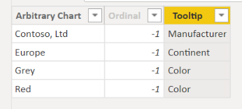
Adding calculated columns is not a supported action so from inside Power BI Desktop, we’ll go to the «arbitrary chart» calculation group and we add a new calculated column:
Tooltip =
SWITCH (
    TRUE (),
    'Arbitrary Chart'[Arbitrary Chart]
        IN VALUES ( 'Product'[Color] ), "Color",
    'Arbitrary Chart'[Arbitrary Chart]
        IN VALUES ( 'Product'[Manufacturer] ), "Manufacturer",
    'Arbitrary Chart'[Arbitrary Chart]
        IN VALUES ( 'Store'[Continent] ), "Continent",
    "Error"
)
Basically we test the calculation item name against the list of colors, manufacturers, and continents, and in the first list we find them we assign the category name to the column.
Now we’ll build a «Tooltip Visibility» calculation group that will have a calculation item for each type of tooltip. If the tooltip type selected on the base chart matches the one from the calculation item, the measure should show, otherwise it should return blank. To make things easier we’ll call the calculation items exactly like in the Tooltip column.
----------------------------------------
-- Calculation Group: 'Tooltip Visibility'
----------------------------------------
CALCULATIONGROUP 'Tooltip Visibility'[Tooltip Visibility]
    Precedence = 40

    CALCULATIONITEM "Color" =
        VAR selectedTooltipType =
            SELECTEDVALUE ( 'Arbitrary Chart'[Tooltip] )
        VAR currentCalcItem =
            SELECTEDVALUE ( 'Tooltip Visibility'[Tooltip Visibility] )
        VAR result =
            IF (
                selectedTooltipType = currentCalcItem,
                SELECTEDMEASURE ()
            )
        RETURN
            result

    CALCULATIONITEM "Continent" =
        VAR selectedTooltipType =
            SELECTEDVALUE ( 'Arbitrary Chart'[Tooltip] )
        VAR currentCalcItem =
            SELECTEDVALUE ( 'Tooltip Visibility'[Tooltip Visibility] )
        VAR result =
            IF (
                selectedTooltipType = currentCalcItem,
                SELECTEDMEASURE ()
            )
        RETURN
            result

    CALCULATIONITEM "Manufacturer" =
        VAR selectedTooltipType =
            SELECTEDVALUE ( 'Arbitrary Chart'[Tooltip] )
        VAR currentCalcItem =
            SELECTEDVALUE ( 'Tooltip Visibility'[Tooltip Visibility] )
        VAR result =
            IF (
                selectedTooltipType = currentCalcItem,
                SELECTEDMEASURE ()
            )
        RETURN
            result
Once it's set up is quite straight forward, isn't it? The code for all three calculation items is exactly the same and the only difference comes from the calculation item name, which is very cool. If we apply each calculation item to the corresponding chart, this is what we get: "The pop-up chart"
Putting the tooltip page together
Of course for a cleaner effect we should hide axis titles and maybe the same with the chart titles, or at least make it dynamic so being a measure will disappear as well. Indeed that's what we'll have to do for the tooltip effect too, and also make sure that the chart background is off, so it's transparent. Once you have done that, you might want to unselect the visibility calc item of the three charts and move them one by one to a tooltip page, any size you wish. Make sure that all three charts occupy the whole tooltip page since the tooltip size sadly is not dynamic. You might need some help from the selection pane to turn on again the corresponding visibility calc item for each of them (you might want to name them accordingly too to facilitate the process and possible maintenance). Well, I just checked and the default names are fine in my case.
And that's it! It wasn't easy, but no one said it would.
I know that "Arbitrary YOY% Chart with Zoom-out Tooltips" is a name that is difficult that will stick, but it's the best that I came up with.
You want the file? here it is