
I know, it’s a terrible title, but it’s the best I could come up with. This blog post is to explain a workaround for a behavior I detected while playing with a field parameter (all measures) and a stacked column chart. The problem is as follows: If you have more than one measure in the chart, you can define a color for each measure and all works fine. However, if you filter your field parameter table in a way that only one measure is used in the chart, then that color is ignored and you get a default color. What’s even worse is that the same color will be used whenever a single measure is included, so you can’t even configure it again to get the right color. Fighting the same issue? Keep reading!
Hello there, yes, a third part of the snapshot report and I’m not even sure it’s the last one. The thing is that since the last post there has been some major improvements on the set up that I thought are worth sharing. In my previous post I ended up with a small defeat. There were some combinations of filters that when I drilled through to see all the historic records of those order IDs I would not get any rows. Also my set up included duplicating the fact table which is a big no-no in most use cases and a shameful solution from a modeler perspective. Even though this was the best I had, I decided to present the topic on two events, one was the Data Community Day Austria 2023 and the other was @PowerBIEspanol Virtual Conf 2023 (Fin Tour Power BI Days), just a few days apart. The fact that I had to present the solution to a lot of people kept me thinking and looking for solutions, so with the help of the always reliable Ricardo Rincón I finally found out a working solution just duplicating dimension tables and creating dimension tables for everything (even comments and stuff like that). That was much better but not quite scalable. In real life things are ugly and tables have many columns. So while fighting with the same use case at work, I found a sneakier and much better solution that got rid of all those superfluous dimension tables reducing the need of them to just 2. While preparing the presentations I also worked a bit on the report layer and I’ll also share some techniques I came up with that can be helpful at some point. But enough of all this talking, let’s do what? Let’s get to it.
Well, I was happy with the result, but I was even more happy with the reaction on twitter. The dynamic header effect felt like magical to many people, and well, I have many more followers now, thank you all.
In case you haven’t seen it, here’s the video
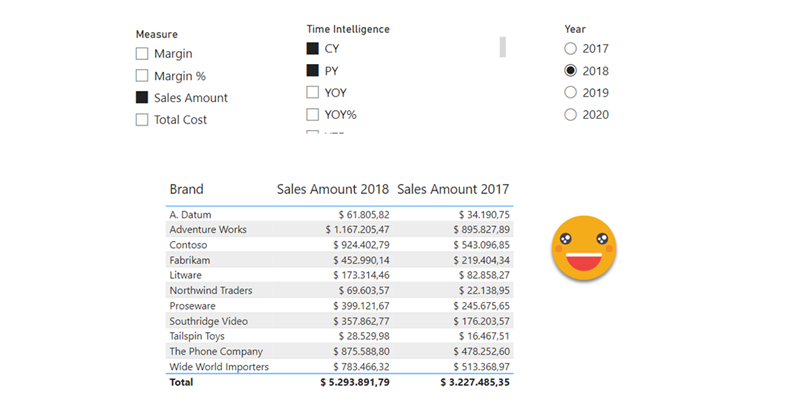
So how did I do it? Short answer: Field parameters. A little longer answer: Measures and a calculation group create more measures that are put in field parameter with some customization.
Even longer answer? Let’s do it.
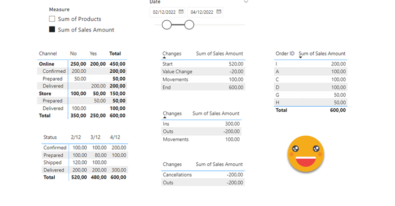
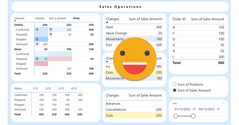
Hello again. You didn’t think there would be a second part, right? well, me neither. But as things turn out, I had to work on another report dealing with snapshots, and this time they wanted something fancier. It took me a while to figure it out, but I like the result so I thought it would be nice to share. In the first part, we just showed what went up and what went down, being able to go back and check any snapshot. However, in many use cases that does not tell the whole story. To explain why something went up or down, you need to show what went in, what went out (sometimes important to tell which way it went) and maybe even if the value changed between snapshots. If we just compare 2 consecutive snapshots is not that hard, but things get trickier we take longer time spans and we want to account for everything that happened in between.
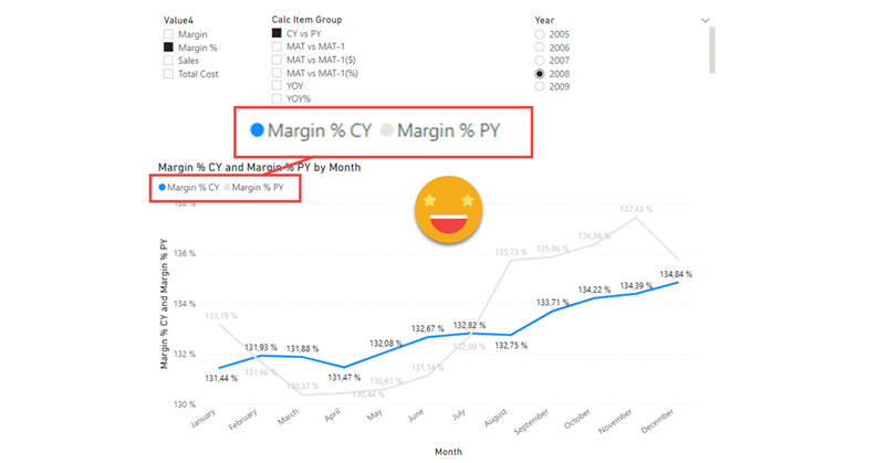
Well it’s no secret that I like calc groups. But it’s also true that calc groups have an achiles heel. Calc Item names are constant, so for charts, legends stay the same no matter what. Depending on your use case you might get away with it, but sometimes you might get an end user that will not buy it — and he or she might be an important person, so it’s always good to have a Plan B. Field Parameters have brought fresh air, and indeed are great for such use cases because it’s not like you modify the DAX of the measure in the chart, you actually change the measure, so the name shown in the legend also changes, which is great. However, what happens if you want to create a chart where the user can pick from 4 KPI’s and say 8 time intel calculations?? First you’ll have to create the measures, then the field parameter, then figure out how to model that for the user to be able to select measure and calculation intependently… I mean it’s not impossible, but looks long and boring. Let’s see what we can do about it!