I realize that I use the word «arbitrary» a lot on my blog posts, but then I think, «so what?». Anyway, this blog post is mostly a remake on another blog post, the one called «A truly dynamic tooltip«. When I wrote that blog post, I had struggled a lot to get the effect I wanted, but even though I learned a lot in the process I ended up convinced that it was better to stay out of calculation groups when building such a chart. Well, this is no more. Calculation groups, are ususal, are just fine. You just need to know how to use them.
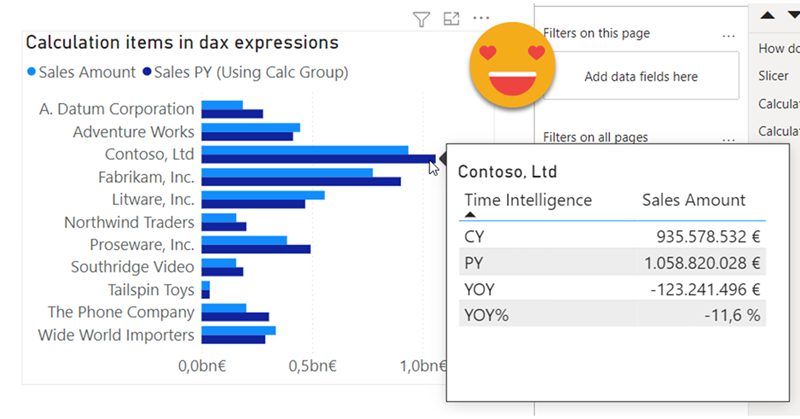
Hello there, quite a while ago I wrote a blog post explaining how to override calculation items in tooltip. Basically, if I’m using calc item A and B in a chart, how can I use A B C and D in the tooltip. My solution was to add 2 extra calculation groups with lower precedence, one to remove filters from the calculation group on the main visual, an the other one (copy of the original calculation group) to recreate the desired calculations. This solution does work, but is quite tedious to maintain if you have changes in the original calc group, and (I’m not sure if it’s related) when combined with the time intel dynamic label calc group, it took A LOT to display the tooltip. I tested again a few days ago and even with my new laptop (i7 32GB of ram) it took like 10s, most of them going to «other» things, not the dax query, so little can be done.
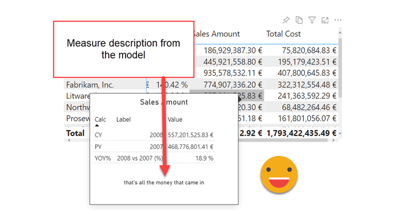
First of all I have to credit Dan Meissner for bringing up the use case in the SML forum. The idea is to add the measure description in the tooltip, somehow. He thought that calc groups might be part of the solution, as they are «aware» of the measures in the filter context and tagged me as he knows my little obsession with calc groups. And indeed Calc groups can be the answer, but not in the way that I first imagined.
In this post I’ll explain how to break the tyranny of the «all filters» that are passed to the tooltip in particular the filters set by a calculation group which are even nastier to get rid of than regular filters.
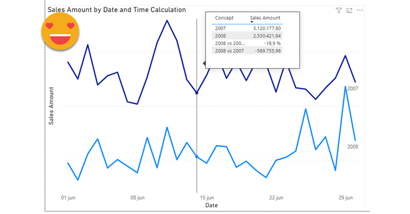
It wasn’t intended this way, but this post is sort of a sequel (and not SQL) of my post on dynamic labels for time calculation series, which itself builds on the post introducing the time intelligence calculation group script. If you have not read them you can also watch the video you’ll find on the end of each post — although from the sound quality maybe it’s less painful to read the blog!
Anyway, if you are here probably you know something about calculation groups, and that’s good, because there’s plenty of them coming.
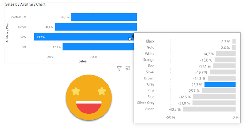
This post is based in a true use case. The customer followed the market share trends, to see how it compared to the rest, as a manufacturer, and at a brand level.
So far so good. But coming from excel they were used to build charts any way they saw fit, so they liked to see on the same chart their own year-on-year growth in general as a manufacturer, then in different distribution channels, then specifically the growth of their two main brands, and then the growth on different regions. That alone was my first challenge. But then they said that that they would like to know how others were doing on the tooltip. But of course, when looking at a manufacturer-level value, they would like to see their value together with that for other manufacturers, and when looking at a brand level then wanted to see it with all the other brands. I added to the mix that it would be nice to see highlighted their own value in the tooltip of course.