Calculation Groups and Conditional Formatting: Yes it’s possible.

I’ve been meaning to write this post for quite a few weeks if not months, and looks like today I may start finally to do it. The detonator has been that I had to do it at work, and Yuki asked about it on twitter. Too much of a coincidence to let it go.
Conditional formatting when calc groups are involved is a bit more challenging, but as usual with calc groups, once you grasp how they work you can do almost anything you want with it.
There’s many use cases and probably several ways to go about them, so don’t take my word for it and give it a try yourself. The main take away is:
It is possible to have conditional formatting when calculation groups are in play.
We’ll try to do something close to what I had to do today:
- Switch Measure Calc group
- Time Intel Calc Group
- If YOY % of whatever measure is being selected is bigger than 0 then green, otherwise red.
If we still want to have some more fun with it we’ll attempt the highest value, lowest value, formatting thing.
Let’s grab our beloved contoso model (the classic 10M flavour) with a few measures and run first the script from Johnny Winter to create a dynamic measure calc group, and then the time intel calc group script to create, er, a time intel calc group. In this order! So we’ll get a higher precedence for time intel without any manual steps. Make sure to select the dynamic measure before running the time intel calc group script, so it will be in the list of measures affected by the time intel calc group.
To check we got it right, YOY % should still have % format
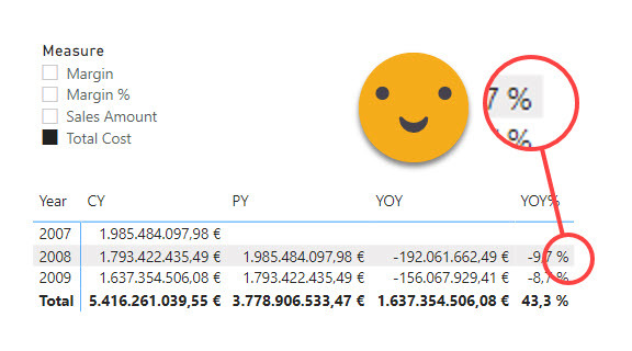
Ok so what happens if I try to apply a conditional formatting to say YOY% ?
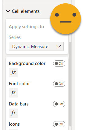
Well, first thing, since we are using just one measure (our dynamic measure), we don’t get to say (directly) on which «column» we want to apply conditional format (which by the way now you’ll find in «Cell Elements» section)
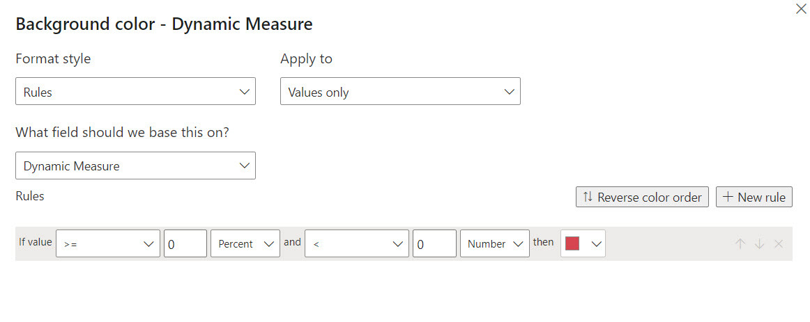
Ok, it makes sense actually. So let’s try to format those below zero first and then we’ll think how to make it work only for YOY %
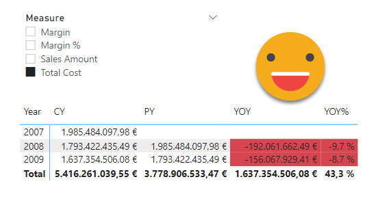
 This actually works fine (if that’s what you want)
However, if you want something more fancy, it’s time to think. For instance, how can we make conditional format to apply only on the YOY% ? We can’t add this sort of logic in the conditional format dialog panel. But can we add this logic with a measure? Actually not really. It is true we need the value driving format to follow the value of the dynamic measure, but if we create a new measure affected by the dynamic measure calc group, whatever its contents, it will be completely replaced by the measure selected in the measure slicer.
Well, maybe you could do a classic «switch»measure thing (not affected by the dynamic measure calc group), but that almost defeats the whole purpose of using calc groups.
So if measure is not the answer, then calc group certainly is. Now, we need to be able to act on whatever determines the conditional format without modifying the values shown by the dynamic measure. So we need a «twin» measure of the dynamic measure. In other words, a new measure that will be affected by the dynamic measure calc group, and the time intel calc group. And then we’ll be able to add some more logic with, yes, yet another calc group on top of the previous two.
But let’s go step by step. First we need to create this twin measure, and make the dynamic measure calc group act on it.
Let’s just go with something like
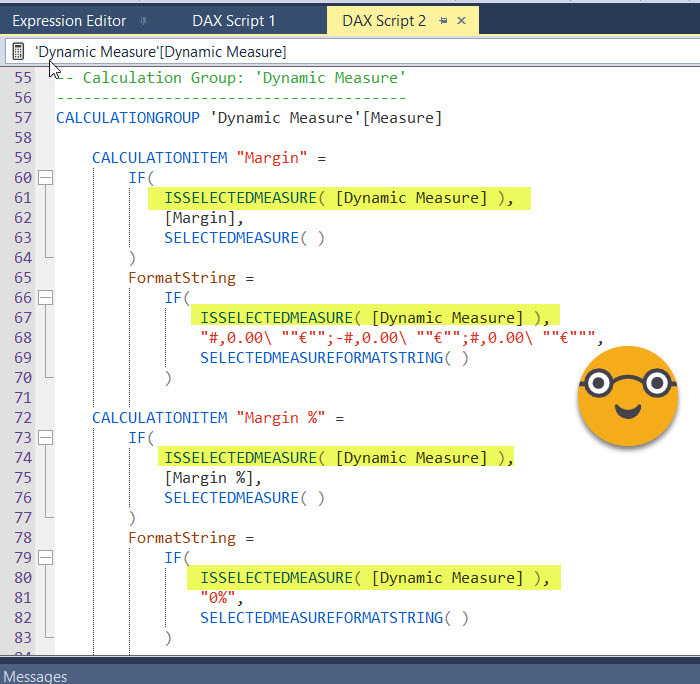
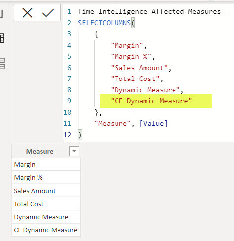
CF Dynamic Measure = BLANK()
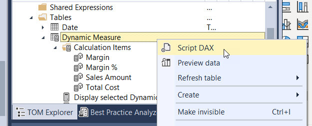
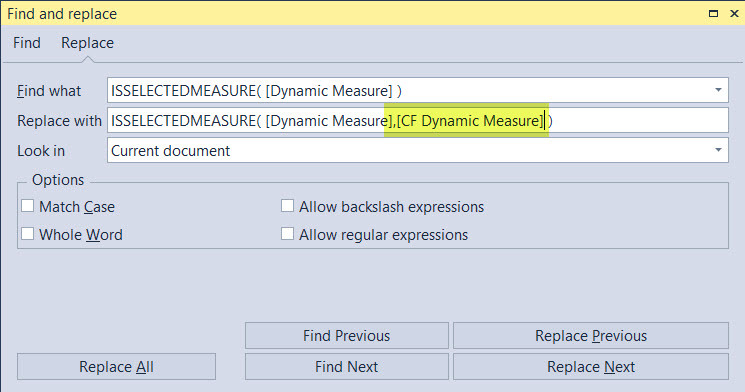
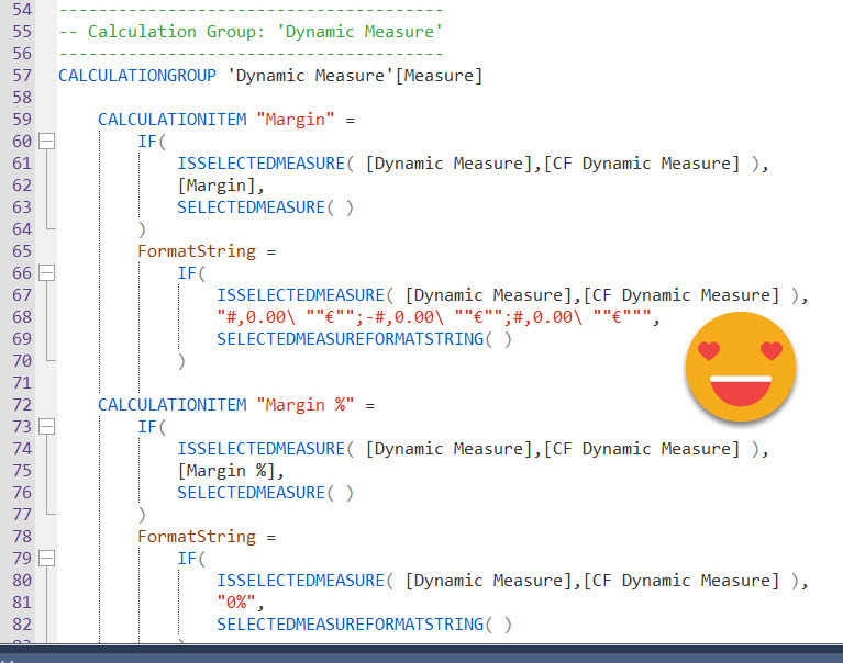
Now, if you are familiar with the calculation group created by the time intelligence calc group script, you’ll know it creates a calculated table with the list of measures it affects, so adding one is no big deal, just change the table definition and it works on the new measure, for all calc items –value *and* format expression. The dynamic measure calc group is not build like this because by default it only replaces 1 measure, the «dynamic measure» placeholder one. In this example we have only 4 measures, so we could just go and change it manually (that’s 8 places between value and format string expressions) but we can also show how to use a really cool feature from Tabular Editor 3, which is DAX scripting (no, it’s not C# scripting, that’s something else entirely). Since version 3.1.5 we can script out calculation groups so we see all calculation items at the same time. Then we can do any modifications, execute and all changes can be saved back to the model in one click. Sweet, huh? To be honest I don’t use them that much, but today is the day.
Update 2022-05-15: This step is unnecessary if you use the new script that comes with three dummy measures out of the box
We just need to click on the apply & sync button on the toolbar or press shift F5 to save the changes included in the script back to the model. This now looks like common sense, but before Tabular Editor 3 (3.1.5 I think) this was just not possible for calc groups. The DAX scripting language is something that was created by the Tabular Editor 3 team, which is bananas.
Now the dynamic measure calc group will work also on the «CF Dynamic Measure», but we still need the time intel calc group to work on it. This is much easier, we just need to modify the «Time Intelligence Affected Measures» hidden table
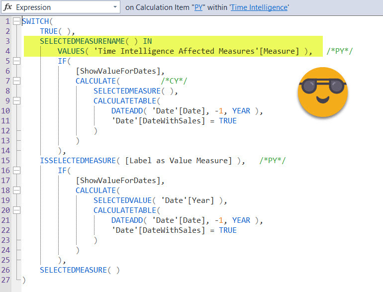
how does this relate to the Time Intel Calc Group you say? If you check any of its calculation items, you’ll see it will check the name of the measure in the filter context against this column, and decide from there what to do.
Now if we replace the measure used by the conditional formatting, we should get the same result. If we don’t, we did something wrong
So, where shall we add the extra logic? We could modify the Time Intel Calc Group so that only YOY% returns the when the measure is CF Dynamic Measure, but that would be dirty. What if you have another matrix where you need another conditional formatting? you’ll add yet another measure ?? I think it makes more sense to create another calc group (of higher precedence) to add some more logic. Then you’ll be able to define different logics as different calc items.
Why higher precedence calc group you say? Well, to just bank out any calc item other than YOY% it’s enough to have a precedence between Dynamic Measure calc group and time intel. But if we want to use the value resulting from the time intel calc group we need to be further out the expression. Anyway, let’s give it a try.
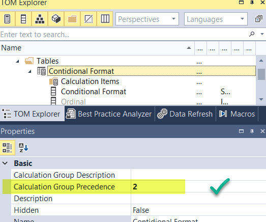
Let’s create a calc group (no script this time) as «Conditional Format» for instance. New Calc groups are always created with higher precedence, but check the number just in case. It should be 2. (0 for Dynamic Measure, 1 for Time Intelligence).
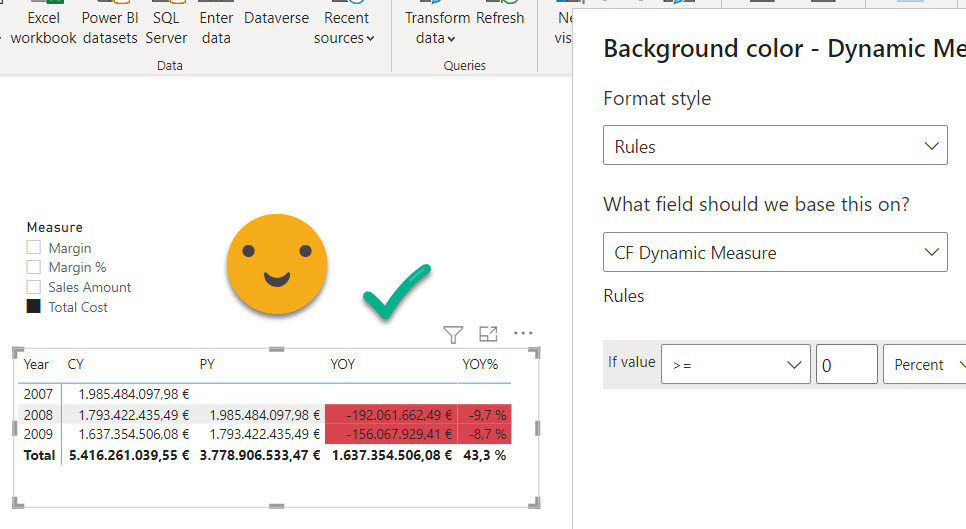
Now let’s create a calc item called for instance «YOY% Only» which should only keep the value in case YOY% was the active calc item from the time intelligence calc group, and return blank otherwise. It’s very important that the calc item works only on the CF Dynamic Measure this time. If you do it over all «time intelligence affected measures» you will blank also the original Dynamic Measure, so your table will only have one column. (I did go that down that path! ). The calc item looks something like this
Only YOY% =
SWITCH (
    TRUE (),
    SELECTEDMEASURENAME () IN { "CF Dynamic Measure" },
        VAR currenTimeIntelCalcItem =
            SELECTEDVALUE ( 'Time Intelligence'[Time Intelligence] )
        RETURN
            IF ( currenTimeIntelCalcItem IN { "YOY%" }, SELECTEDMEASURE (), BLANK () ),
    SELECTEDMEASURE ()
)
I could have skipped the BLANK(), but wanted to make it explicit to be easier to read.
But, does it work? You bet it does!
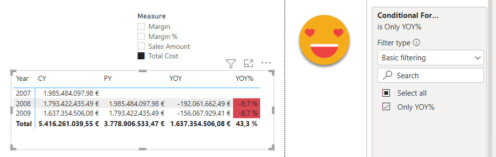
Beautiful!
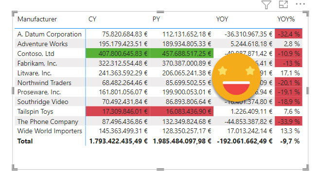
Now let’s try something more sophisticated. Let’s swap Year by brand (we’ll filter year from a slicer), and highlight highest and lowest value for Current Year and previous year, while keeping the current formatting for YOY%.
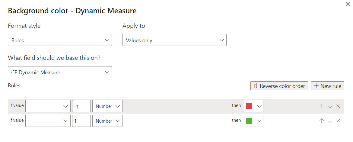
In order to to something like this we’ll have to move the logic we had in the conditional formatting pane into the dax code. But since it’s more convenient to select colors from the color picker than to go back and forth with HEX codes, we’ll stick with the Rules option, we’ll just encode each outcome to a number, and we’ll use the pane to assign colors to each number.
So following a pretty standard rule, we’ll format good things green and bad things red. To do that we’ll make the dax code produce a 1 for good things and -1 for bad things. Then on the conditional format pane we’ll assign the green to the 1 and red to the -1.
We make a new calc item called CY PY YOY% which looks like this
CY PY YOY% =
SWITCH (
    TRUE (),
    SELECTEDMEASURENAME () IN { "CF Dynamic Measure" },
        VAR currenTimeIntelCalcItem =
            SELECTEDVALUE ( 'Time Intelligence'[Time Intelligence] )
        RETURN
            SWITCH (
                TRUE (),
                currenTimeIntelCalcItem IN { "YOY%" }, IF ( SELECTEDMEASURE () < 0, -1 ),
                currenTimeIntelCalcItem IN { "CY", "PY" },
                    VAR currentValue =
                        SELECTEDMEASURE ()
                    VAR maxValue =
                        CALCULATE (
                            MAXX ( VALUES ( 'Product'[Manufacturer] ), SELECTEDMEASURE () ),
                            REMOVEFILTERS ( 'Product'[Manufacturer] )
                        )
                    VAR minValue =
                        CALCULATE (
                            MINX ( VALUES ( 'Product'[Manufacturer] ), SELECTEDMEASURE () ),
                            REMOVEFILTERS ( 'Product'[Manufacturer] )
                        )
                    RETURN
                        SWITCH (
                            TRUE (),
                            currentValue = maxValue, 1,
                            currentValue = minValue, -1,
                            BLANK ()
                        ),
                BLANK ()
            ),
    SELECTEDMEASURE ()
)
Once you see it, it’s quite straight forward to follow. In the format pane it’s even easier:
But does it work? Yep, you bet it does!
I think that’s enough to prove my point that conditional formatting does work just fine with calc groups, but you need to go the calc group way™
Actually my post on Dynamic Color Gradient for Values and Totals also shows that calc groups are here to help when it’s about conditional formatting (and that solution would be much easier if I had known about the HSLA( ) color encoding!)
So yes, conditional formatting and calculation groups do mix together. If you don’t belive me, download the pbix