Hello there!
Today’s post comes from an actual requirement that I had heard before but never handled directly. There is some nifty DAX and modeling so lets get to it!
Hello there!
Today’s post comes from an actual requirement that I had heard before but never handled directly. There is some nifty DAX and modeling so lets get to it!
UPDATE: I was kindly asked by Kerry Kolosko to make a Work-Out-Wednesday challenge for this chart, and when I did, I realized that it’s much more simple than I laid out on this article. I keep as proof that finding the best approach is an iterative process! Building the model from scratch also helps. Check out the challenge (and explanation video) here!
Hello there! Time is crazy and I haven’t been updating the blog as much as I’d like to. But here I am and I hope you enjoy it.
This 2024 I took the decision to step up my involvement at Power BI User Group Barcelona and started organizing online events from international speakers. For those that present in English I even do some live interpretation that is recorded and remastered with the video stream so that we get the renowned presenters in both English and in a not-perfect Spanish translation (check out the events here and the recordings here). But why am I speaking about that? Well, first of all to brag about it because these sessions have been awesome, but also because the most recent one is the starting point for this blog post.
Hello!
The other day on the PUG Barcelona whatsapp group there was a question regarding the possibility of reversing the selection on a slicer, with a single click. Apparently this is something you can do on Qlik and the fellow member was trying to migrate that to Power BI as the users are used to be able to do it. I thought that you can get somewhat close to that with a calculation group, so why not write a nice short article on it. Let’s do it!
Hello,
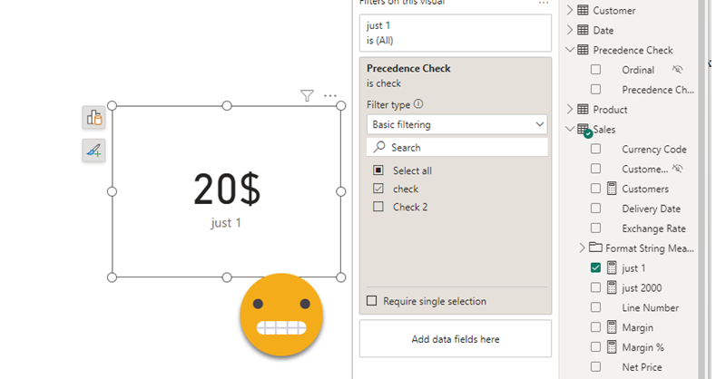
today I’m not writing any type of tutorial. I just want to share a weird behavior I have found in calculation groups, hoping that those that really know about the inner workings can help us comprehend why they behave like that. Calculation groups can be seen as groups of pairs of DAX expressions that replace measures and their format strings when they are in a filter context where they participate. There’s quite a few articles that explain calculation group precedence, but when a calculation item is applied, how are the values of SELECTEDMEASURE and SELECTEDMEASUREFORMATSTRING evaluated? are they the values and format string *before* anything is applied? What happens if we include SELECTEDMEASURE inside the format string expression or SELECTEDMEASUREFORMATSTRING inside the value expression? If your head is about to explode, you are not alone.
In the different posts of this blog I’ve reached different conclusions in different articles, so today I want to present two examples to deepen in this topic — during this process I hope to understand it more!
Hi! actually I was writing another blog post, but today I was shown something that can be done with calc groups that I wasn’t aware of. And not only that, even though the blog post I was shown had some very clever thinking behind, I found there’s still some room for improvement to bring the technique to the next level. We are talking about sorting a matrix by a calculation item placed at the columns section. Let it be said that in many use cases you might be better of just generating the measures with a script (as I showed in this blog post) and using the measures instead. That will give you more control with the UI since each column is indeed a different measure. Yet, there’s something cool in doing things in different way, so I’ll go ahead nevertheless.
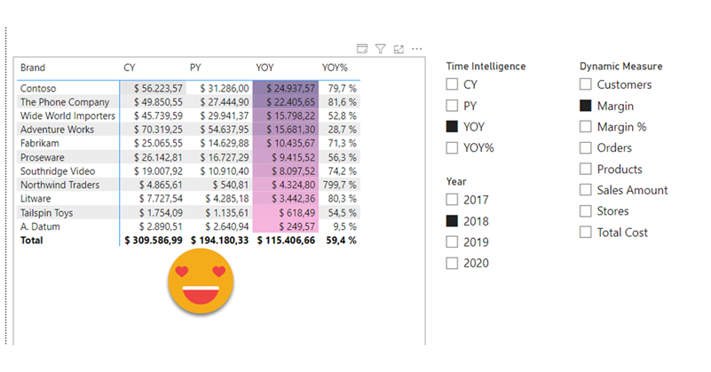
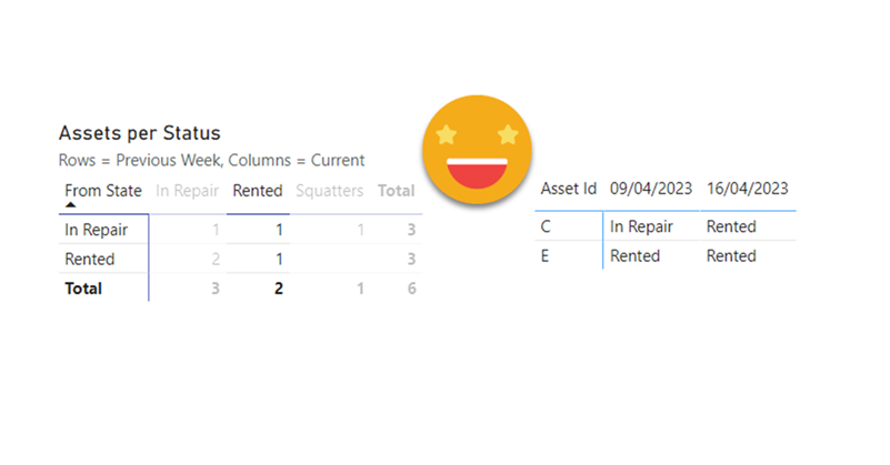
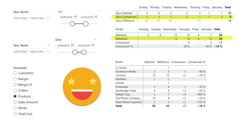
Hello hello, I’m not writing that much lately due to spring break and a DAX training I’m teaching, but I think I have just enough time to explain a fun use case I found the other day at work. In Real Estate each asset can be in a bunch of different states, especially if there is litigation, squatters, repairs etc. So in this case they want to compare the latest snapshot with the snapshot of one week ago, and see how many assets they have in each state, but also in which state were they a week ago. Let’s get to it!
Hello there, yes, a third part of the snapshot report and I’m not even sure it’s the last one. The thing is that since the last post there has been some major improvements on the set up that I thought are worth sharing. In my previous post I ended up with a small defeat. There were some combinations of filters that when I drilled through to see all the historic records of those order IDs I would not get any rows. Also my set up included duplicating the fact table which is a big no-no in most use cases and a shameful solution from a modeler perspective. Even though this was the best I had, I decided to present the topic on two events, one was the Data Community Day Austria 2023 and the other was @PowerBIEspanol Virtual Conf 2023 (Fin Tour Power BI Days), just a few days apart. The fact that I had to present the solution to a lot of people kept me thinking and looking for solutions, so with the help of the always reliable Ricardo Rincón I finally found out a working solution just duplicating dimension tables and creating dimension tables for everything (even comments and stuff like that). That was much better but not quite scalable. In real life things are ugly and tables have many columns. So while fighting with the same use case at work, I found a sneakier and much better solution that got rid of all those superfluous dimension tables reducing the need of them to just 2. While preparing the presentations I also worked a bit on the report layer and I’ll also share some techniques I came up with that can be helpful at some point. But enough of all this talking, let’s do what? Let’s get to it.
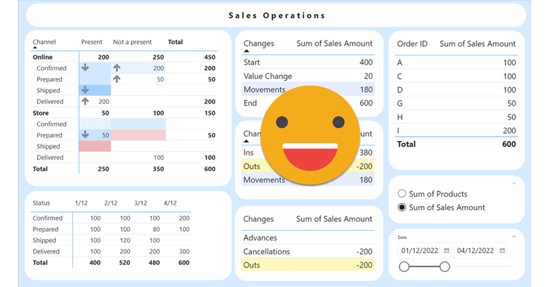
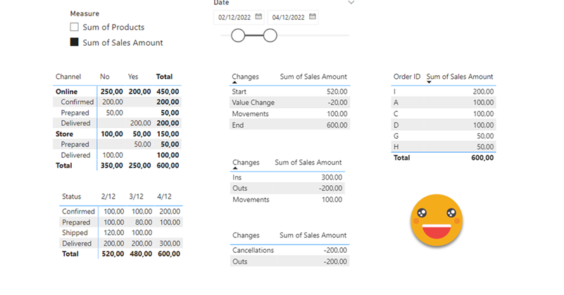
Hello again. You didn’t think there would be a second part, right? well, me neither. But as things turn out, I had to work on another report dealing with snapshots, and this time they wanted something fancier. It took me a while to figure it out, but I like the result so I thought it would be nice to share. In the first part, we just showed what went up and what went down, being able to go back and check any snapshot. However, in many use cases that does not tell the whole story. To explain why something went up or down, you need to show what went in, what went out (sometimes important to tell which way it went) and maybe even if the value changed between snapshots. If we just compare 2 consecutive snapshots is not that hard, but things get trickier we take longer time spans and we want to account for everything that happened in between.
Lately I’ve been building a report, which had not happened for a while, and I enjoyed the process. The final result too is simple yet effective, so I thought I would share the approach here because, yes, there is a calc group in place that does some of the magic.
This approach is valid when you want to follow the status of something, warehouse inventory, accounts pending to be conciliated, parking occupation. In all these situations, you are likely to be more interested in the latest snapshot than the previous ones, but at the same time you might be interested in the trends that lead to the present picture, and maybe even go back to a previous shapshot to have a look, without too many clicks. As you can see we’ll need to be smart about the date filter. For some elements we want the last snapshot only for others all of them, and yet we want we want the charts to interact.
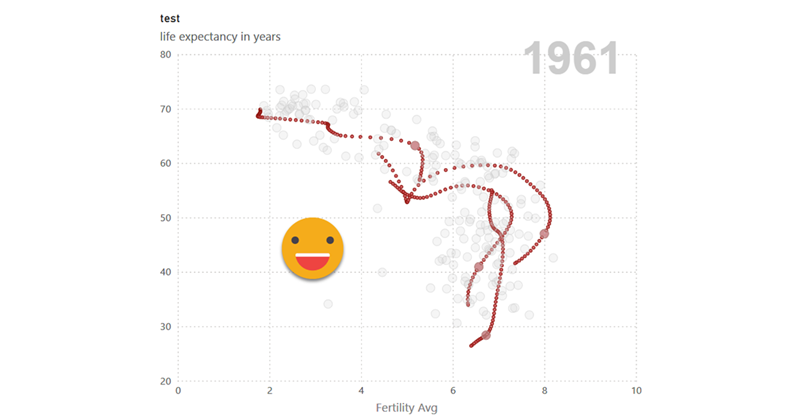
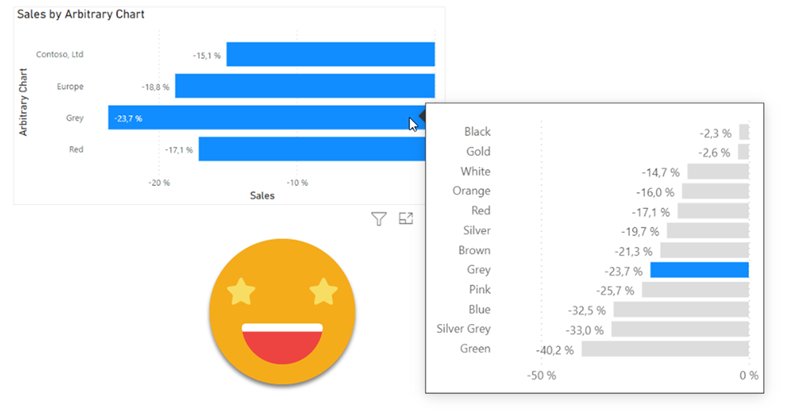
I realize that I use the word «arbitrary» a lot on my blog posts, but then I think, «so what?». Anyway, this blog post is mostly a remake on another blog post, the one called «A truly dynamic tooltip«. When I wrote that blog post, I had struggled a lot to get the effect I wanted, but even though I learned a lot in the process I ended up convinced that it was better to stay out of calculation groups when building such a chart. Well, this is no more. Calculation groups, are ususal, are just fine. You just need to know how to use them.
Contacta con nosotros y descubre el poder de la información.