The ultimate snapshot report

Lately I’ve been building a report, which had not happened for a while, and I enjoyed the process. The final result too is simple yet effective, so I thought I would share the approach here because, yes, there is a calc group in place that does some of the magic.
This approach is valid when you want to follow the status of something, warehouse inventory, accounts pending to be conciliated, parking occupation. In all these situations, you are likely to be more interested in the latest snapshot than the previous ones, but at the same time you might be interested in the trends that lead to the present picture, and maybe even go back to a previous shapshot to have a look, without too many clicks. As you can see we’ll need to be smart about the date filter. For some elements we want the last snapshot only for others all of them, and yet we want we want the charts to interact.
First of all, let’s get some data. Here, this could be a warehouse inventory for example
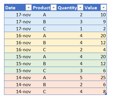
Of course this data would come in different files, or incrementally load from a database or whatever, we’ll just assume we have the data in Power BI.
The first challenge we face is how do we filter by the last snapshot available. For some it might be tempting to add a calculated column like this:
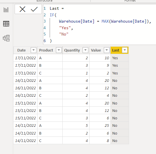
However, as we’ll now see this approach will limit our options (meaning, we’ll get nowhere). Something that I learned banging my head against DAX is that we cannot really remove filters from tables, we can only influence how such filters affect other tables. Still, let’s see what I mean by that. I create the measures for the numeric columns, and then I create a table and a piled area chart.
So far so good.
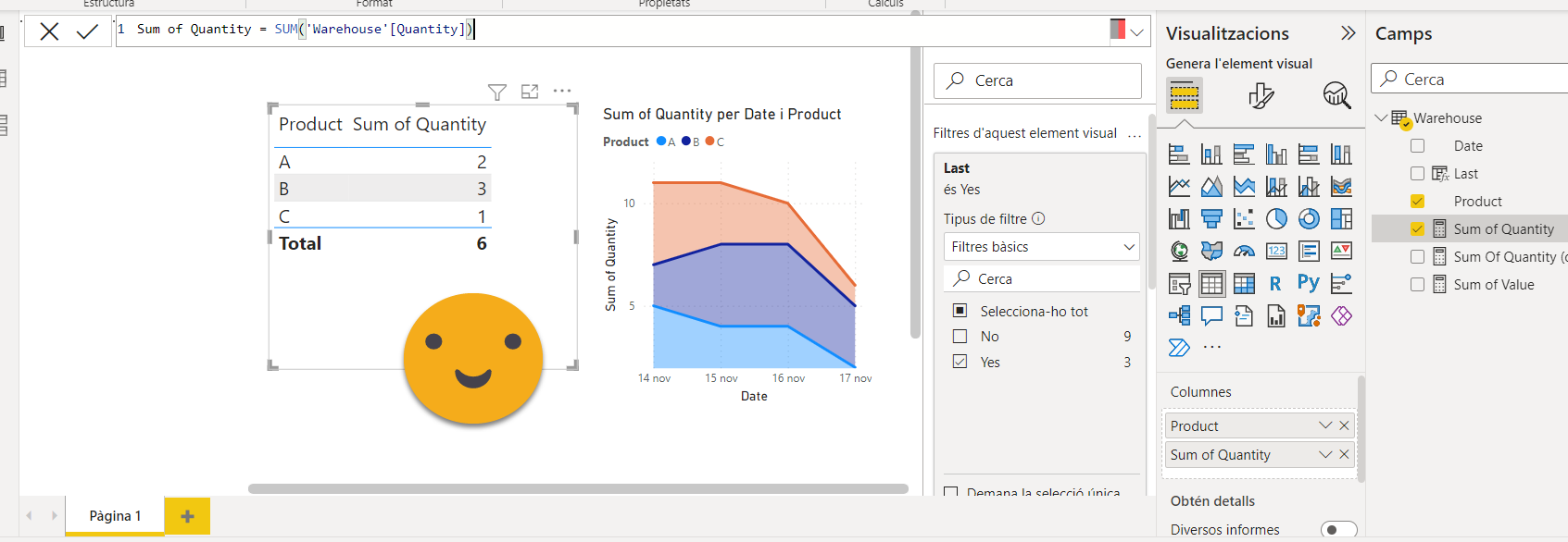
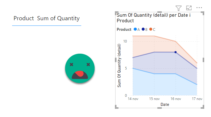
However, when we select a product from the table, I would like to see the evolution for that product. Let’s see what happens…
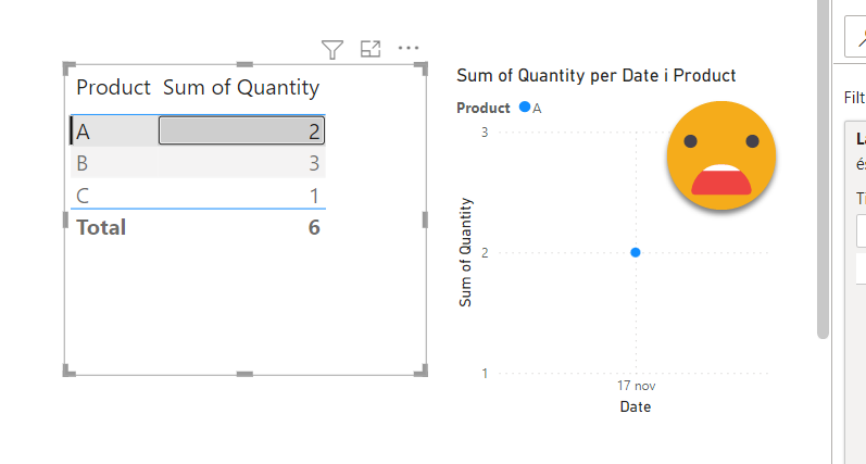
Ouch. But still, when we think about it, of course! it’s the filter on the column «Last» that is filtering also our piled area chart… Then, bringing up the «remove filters» card, you may think that you’ll be safe making a new measure for the piled area chart that looks like this
Sum Of Quantity (detail) =
CALCULATE ( [Sum of Quantity], REMOVEFILTERS ( Warehouse[Last] ) )
However, when we try the same with the new measure…. we get the exact same result!
Why is that??! I don’t have a sqlbi answer for that, although I’m sure I’ve watched a ton of videos that go into the topic. My understanding ist hat when we say «REMOVEFILTERS» this works well on other tables, but not on the very same table. So the fact that we are applying the filter on the fact table is obliterating our chances of removing the filter while evaluating the measure that sums a column from that same table. The whole star-schema thing is in part to be able to apply filters in tables that are not the fact table. DAX has also a dark and silent killer called auto-exist that comes to get you when you think you can get away with it without proper modeling. Google it! but add «sqlbi» on the searchbox or you’ll end up reading thinkers of the Old Greece
All this to say that a better approach is to add a calendar table (which we should do anyway) and specify there the date of the last snapshot. Create it in any method you like, I’ll go DAX.
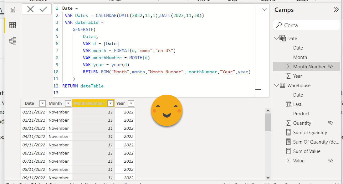
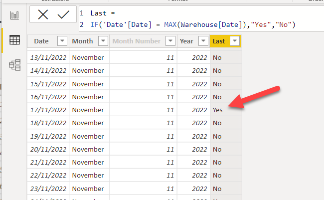
Now we’ll add a calculated column to filter by the last snapshot
So now let’s change the filter on the table to use the column Last of the calendar, and modify our detail measure to remove filters from the new column. Before that don’t forget to create the relationship on the model!
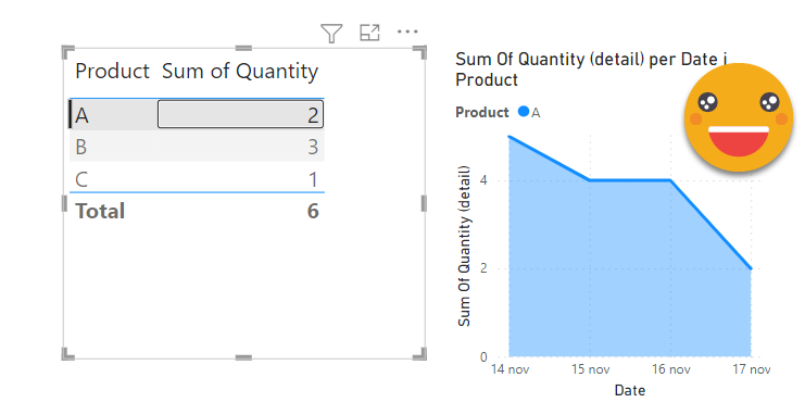
This looks indeed much better, when we select a product from the table, we see the evolution of it!
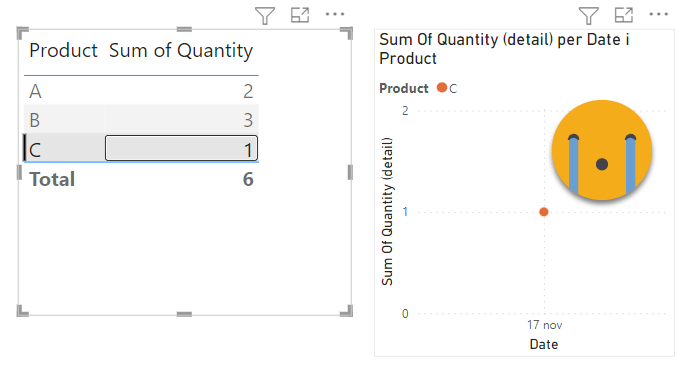
However, this is still not good enough. Charts are much more visual than tables, so it’s quite possible that someone clicks on the chart and expects to find the detail on the table as well. Let’s see what happens when we click on a data point of the chart
Why are we loosing all the rows from the table? that’s because we are filtering the fact table by Last = Yes and Date = 16 Nov and there’s no row fulfilling both filters. When we select a date from the chart, this filter should override the filter that we have currently on the table visual…
A solution that I’ve found and is quite convenient is… a calculation group!
Actually I discovered the approach a bit by accident. First of all I just wanted to get the first effect, and as Jeff Weir showed me a long time ago, in these cases is quite convenient to have two calendar tables. When you crossfilter (or tooltip or drillthrough) from a date filtered visual, you want to get rid of the filter and yet slice by date, so you remove filters from the original calendar and use secondary calendar table. Creating a secondary calendar is super-simple. Go to modeling > new table and go just:
Date (Detail) = ‘Date’
Don’t forget to create the relationship with the fact table (Warehouse in our example)
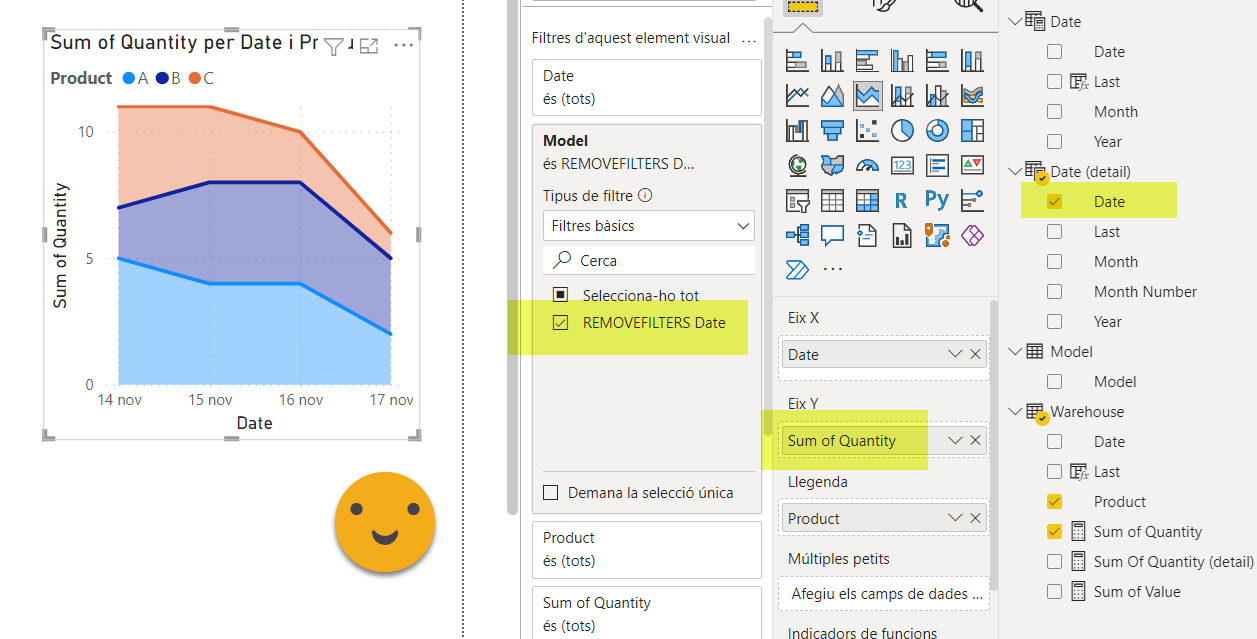
Now we’ll use this new calendar in the piled area chart. For the measure of the chart we’ll do some changes too. To be honest I don’t really like creating specific versions of measures, and I just create calc groups to achieve the same. As we’ll see, this has a very nice side effect in this use case. When we select a product from the table we want to move the filter on the product but not the date, so we’ll create a rather simple calc group with just this expression.
-----------------------------
-- Calculation Group: 'Model'
-----------------------------
CALCULATIONGROUP 'Model'[Model]

    CALCULATIONITEM "REMOVEFILTERS Date" =
        CALCULATE ( SELECTEDMEASURE (), REMOVEFILTERS ( Date ) )
By doing this we can use the regular measure on the piled area chart and achieve the same effect as before.
here checking that it still works when filtering the chart from the table:
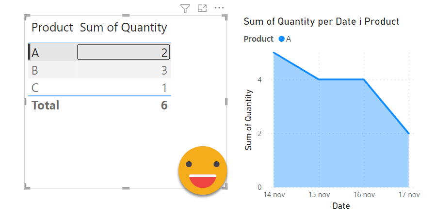
The magic is that now it works the other way too!
What is this sorcery?!
To be honest I was a bit surprised when I discovered the effect clicking around. But indeed it makes sense! When we select a date in the piled area chart (make sure to make it a categorical axis first!) we are moving all the filters of the chart to the table, including the "REMOVEFILTERS date" calculation item. This calculation item is applied at the measure level, so the visual level filter Last = "Yes" coming from the date table, it is neutralized. Yet the fact table is being filtered by the 'Date (detail)' table, so indeed only the selected snapshot remains visible and we can see the values in the table.
So with this approach we get pretty much all that we can wish for
- Latest available data by default
- Historical data leading to today’s data
- Possibility to analyze single data points to see the the trend in isolation
- Possibility to see all the values of a snapshot from the past with a single click
If you are using a matrix instead of a table you can add one more dimension to slice the measure, and it makes even more fun to play around. You can suddenly see the trend for any data point of the table, or see the detail for any data point of the chart. All that without dealing with any slicer. If you want to get fancy you can replace the measure on both sides for a field parameters, and switch between units and value, which is also very effective. Recently I’ve also become fond of the drill-through action in buttons, in case you want to give even further detail of any data point in particular, but that’s another matter.
As you see, even very simple calculation groups can bring super-powers to your report.
If you want to play with the report, here it is.