I know, it’s a terrible title, but it’s the best I could come up with. This blog post is to explain a workaround for a behavior I detected while playing with a field parameter (all measures) and a stacked column chart. The problem is as follows: If you have more than one measure in the chart, you can define a color for each measure and all works fine. However, if you filter your field parameter table in a way that only one measure is used in the chart, then that color is ignored and you get a default color. What’s even worse is that the same color will be used whenever a single measure is included, so you can’t even configure it again to get the right color. Fighting the same issue? Keep reading!
Our Blog
Hello!
Today (well yesterday by the time I have finished writing this) saw a great use case of calculation groups and I wished I had come up with the idea myself because it’s awesome and something that I’ve come across sometimes. In a table there’s a breakdown by month, and at the total they want to see sum, but also want to add another column with say the average, but could be also the value last year or growth. Yes, I’m talking about the latest video from Chandeep Chabbra. The video is beautifully set up so it’s definitively worth a watch.
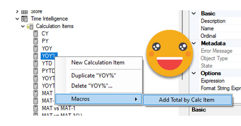
Even though there’s a few things I would change from the DAX of the format string expressions, that alone would not justify a blog post about the same use case. But yet I wanted to play with the calc group, so what I plan to do instead is to show you the process to «industrialize» this calculation group, i.e. how to create a script that will replicate similar logic whenever you want to use it. Yes, I mean a c# script. That’s something I’ve been doing lately in some sessions, but it’s not yet in the blog so why not use this occasion for it.
Hello,
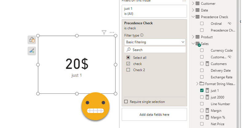
today I’m not writing any type of tutorial. I just want to share a weird behavior I have found in calculation groups, hoping that those that really know about the inner workings can help us comprehend why they behave like that. Calculation groups can be seen as groups of pairs of DAX expressions that replace measures and their format strings when they are in a filter context where they participate. There’s quite a few articles that explain calculation group precedence, but when a calculation item is applied, how are the values of SELECTEDMEASURE and SELECTEDMEASUREFORMATSTRING evaluated? are they the values and format string *before* anything is applied? What happens if we include SELECTEDMEASURE inside the format string expression or SELECTEDMEASUREFORMATSTRING inside the value expression? If your head is about to explode, you are not alone.
In the different posts of this blog I’ve reached different conclusions in different articles, so today I want to present two examples to deepen in this topic — during this process I hope to understand it more!


