Making single measure stacked column chart keep multi-measure color

I know, it’s a terrible title, but it’s the best I could come up with. This blog post is to explain a workaround for a behavior I detected while playing with a field parameter (all measures) and a stacked column chart. The problem is as follows: If you have more than one measure in the chart, you can define a color for each measure and all works fine. However, if you filter your field parameter table in a way that only one measure is used in the chart, then that color is ignored and you get a default color. What’s even worse is that the same color will be used whenever a single measure is included, so you can’t even configure it again to get the right color. Fighting the same issue? Keep reading!
I came up with a solution, which is basically ensuring that always at least two measures are displayed. Then I thought that maybe we can achieve the same effect with some conditional formatting, but that implies having the colors coded in two different places. So I’ll start with the same approach and then we might have a look at the second.
The model
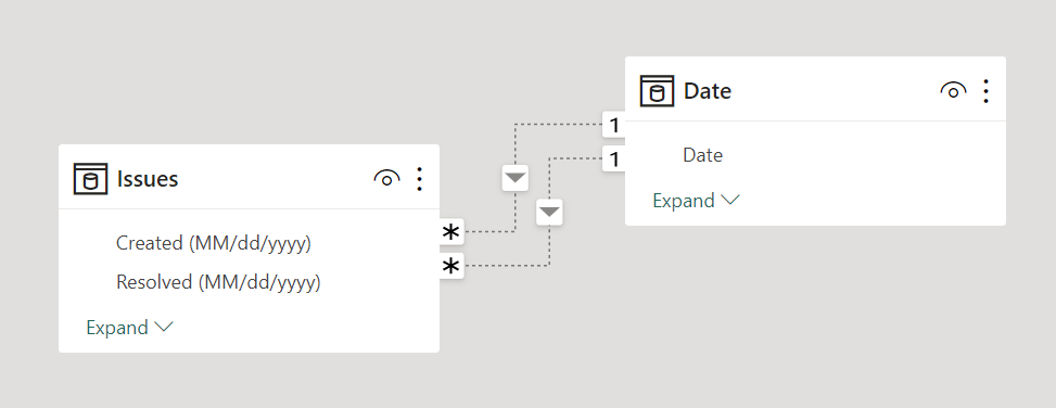
The simplified model looks like this. Issue table with creation and resolution date, as well as priority of the issue. Then a date table with a date column for «monday» of the week, which allows to have weekly aggregations and a continuous axis (so you don’t get that dreaded horizontal scroll bar). Since sometimes I want to check the created issues in the filter context, sometimes the resolved issues and sometime those «ongoing» I decided to have two inactive relationships between date and issues, and activate them only as needed.
The original field parameter
The chart was about service tickets of high, medium and low priority. Each priority has it’s own SLA, so high priority should be up to 5 days (green color meaning OK), otherwise they turn to yellow if they are up to 10 days (warning) or red otherwise (Late). The thresholds for medium are 10 and 15, and for Low priority are 30 and 60. So each measure return the number of ongoing tickets fulfilling each criteria. 9 measures in total. All are small variations of this one:
High Priority Warning :=
VAR maxDate =
    MAX ( 'Date'[Date] )
VAR onGoingIssues =
    CALCULATETABLE (
        Issues,
        ISBLANK ( Issues[Resolved (MM/dd/yyyy)] )
            || Issues[Resolved (MM/dd/yyyy)] > maxDate,
        Issues[Priority] = "High",
        Issues[Created (MM/dd/yyyy)] <= maxDate
    )
VAR IssuesInRange =
    FILTER (
        onGoingIssues,
        VAR onGoingDays =
            CONVERT ( maxDate - Issues[Created (MM/dd/yyyy)], INTEGER )
        RETURN
            onGoingDays > 5
                && onGoingDays <= 10
    )
VAR result =
    COUNTROWS ( IssuesInRange )
RETURN
    result
Of course, to be able to filter them by «only high priority tickets» or only «Late» tickets I extended the field parameter with two new columns:
Aging by Priority =
{
    ( "High Priority OK", NAMEOF ( 'Issues'[High Priority OK] ), 0, "High", "OK" ),
    ( "Medium Priority OK", NAMEOF ( 'Issues'[Medium Priority OK] ), 1, "Medium", "OK" ),
    ( "Low Priority OK", NAMEOF ( 'Issues'[Low Priority OK] ), 2, "Low", "Ok" ),
    ( "High Priority Warning", NAMEOF ( 'Issues'[High Priority Warning] ), 3, "High", "Warning" ),
    ( "Medium Priority Warning", NAMEOF ( 'Issues'[Medium Priority Warning] ), 4, "Medium", "Warning" ),
    ( "Low Priority Warning", NAMEOF ( 'Issues'[Low Priority Warning] ), 5, "Low", "Warning" ),
    ( "High Priority Late", NAMEOF ( 'Issues'[High Priority Late] ), 6, "High", "Late" ),
    ( "Medium Priority Late", NAMEOF ( 'Issues'[Medium Priority Late] ), 7, "Medium", "Late" ),
    ( "Low Priority Late", NAMEOF ( 'Issues'[Low Priority Late] ), 8, "Low", "Late" )
}
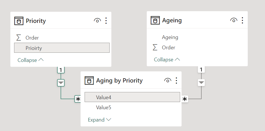
Then you can define a «Priority» and «Ageing» tables with a sort by column in each of them…
Priority =
SELECTCOLUMNS (
    { ( "High", 1 ), ( "Medium", 2 ), ( "Low", 3 ) },
    "Prioirty", [Value1],
    "Order", [Value2]
)
Ageing =
SELECTCOLUMNS (
    { ( "OK", 1 ), ( "Warning", 2 ), ( "Late", 3 ) },
    "Ageing", [Value1],
    "Order", [Value2]
)
…so you can build relationships with Value4 and Value5 of the field parameter
and then have nice Slicers on top of your chart, that with some color selection for each measure looks quite nice.
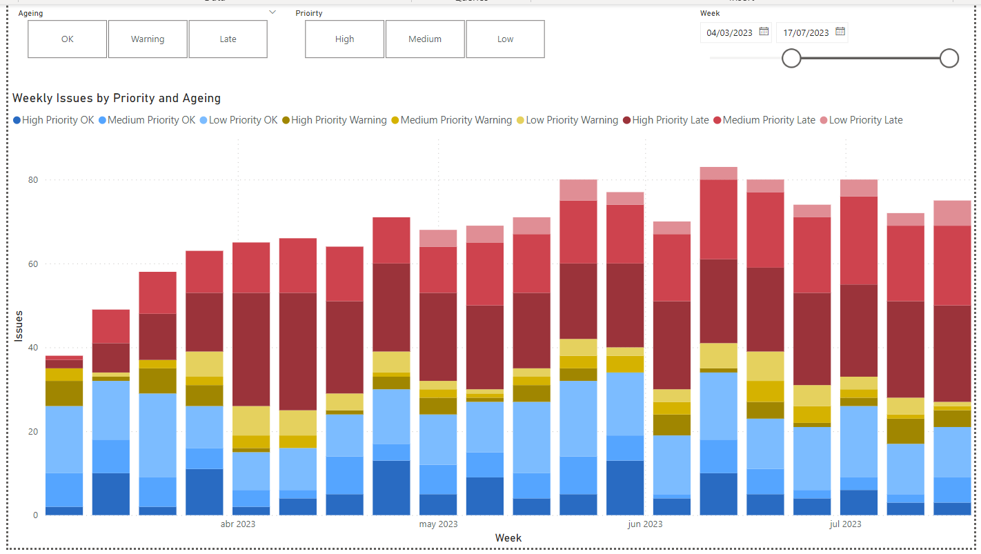
The problem
it’s all fun and laughs until you leave a single measure visible in the chart.
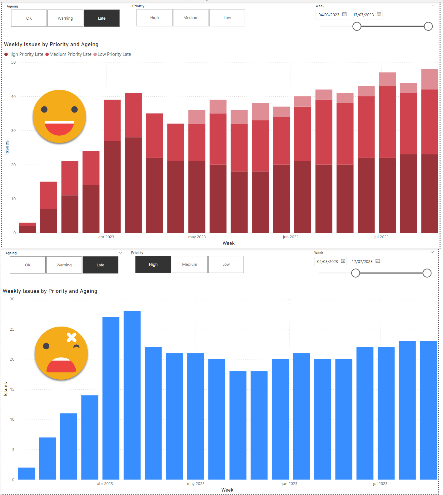
What the *french toast* ?
I think this has to do with how charts behave in Power BI Desktop. When you have a single measure, you can use conditional formatting for instance, but not when you have more than two. If you have one measure you can use the legend field, if you have more than one you can’t. So there’s intrinsic differences between having one measure or more than one.
All this is good, but how can we keep the color of the measure even if it’s the only one in the chart?
The workaround
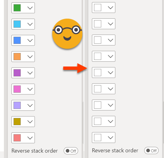
Basically the idea is to make sure that there will be always at least two measures include in the chart. If one of the measures is blank it does not matter, it will behave as a multi-measure chart. And that’s exactly what we’ll do. We’ll expand the field parameter to include a blank measure for each regular measure, and it will have the same extra columns that the original one, so that when we filter by, say, «High» and «Late» the original measure and it’s tween will remain in the chart. Of course this tween will have a BLANK value, and a name in the field parameter that does not show in the legend. As for the color we’ll pick white for all these blank measures to hide them from the legend too. Sadly we cannot repeat the measure in two or more rows of the field parameter, and the names (the first column) must be different too. While we are at it we might also want to filter out all these auxiliar measures, so we’ll add yet another column to our field parameter. With all this in mind, this is how the field parameter looks like:
Aging by Priority =
{
    ( "High Priority OK", NAMEOF ( 'Issues'[High Priority OK] ), 0, "High", "OK", "Real" ),
    ( "Medium Priority OK", NAMEOF ( 'Issues'[Medium Priority OK] ), 1, "Medium", "OK", "Real" ),
    ( "Low Priority OK", NAMEOF ( 'Issues'[Low Priority OK] ), 2, "Low", "Ok", "Real" ),
    ( "High Priority Warning", NAMEOF ( 'Issues'[High Priority Warning] ), 3, "High", "Warning", "Real" ),
    ( "Medium Priority Warning", NAMEOF ( 'Issues'[Medium Priority Warning] ), 4, "Medium", "Warning", "Real" ),
    ( "Low Priority Warning", NAMEOF ( 'Issues'[Low Priority Warning] ), 5, "Low", "Warning", "Real" ),
    ( "High Priority Late", NAMEOF ( 'Issues'[High Priority Late] ), 6, "High", "Late", "Real" ),
    ( "Medium Priority Late", NAMEOF ( 'Issues'[Medium Priority Late] ), 7, "Medium", "Late", "Real" ),
    ( "Low Priority Late", NAMEOF ( 'Issues'[Low Priority Late] ), 8, "Low", "Late", "Real" ),
    ( " ", NAMEOF ( 'Issues'[Blank 1] ), 9, "High", "OK", "Aux" ),
    ( "  ", NAMEOF ( 'Issues'[Blank 2] ), 10, "Medium", "OK", "Aux" ),
    ( "   ", NAMEOF ( 'Issues'[Blank 3] ), 11, "Low", "Ok", "Aux" ),
    ( "    ", NAMEOF ( 'Issues'[Blank 4] ), 12, "High", "Warning", "Aux" ),
    ( "     ", NAMEOF ( 'Issues'[Blank 5] ), 13, "Medium", "Warning", "Aux" ),
    ( "      ", NAMEOF ( 'Issues'[Blank 6] ), 14, "Low", "Warning", "Aux" ),
    ( "       ", NAMEOF ( 'Issues'[Blank 7] ), 15, "High", "Late", "Aux" ),
    ( "        ", NAMEOF ( 'Issues'[Blank 8] ), 16, "Medium", "Late", "Aux" ),
    ( "         ", NAMEOF ( 'Issues'[Blank 9] ), 17, "Low", "Late", "Aux" )
}
Then you configure all the «Blank» measures to white
the chart looks the same as before but now when you select a single measure it keeps its original color! Much better!!
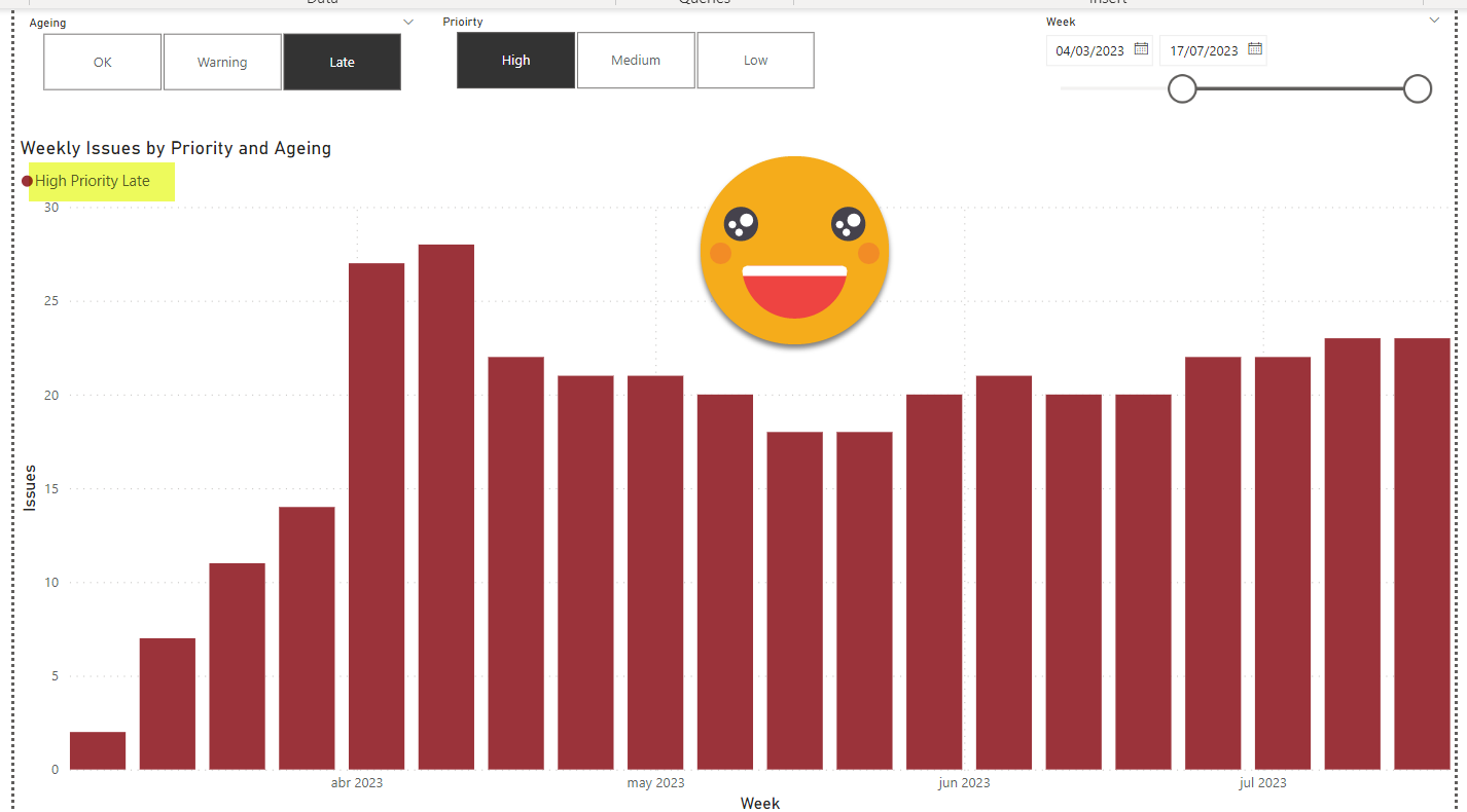
As an added bonus you keep the legend even when only one measure is displayed — isn’t that sweet?
And that’s pretty much it. Now it will display one or more measures depending on the filters, but it will always keep the same color for it.
What about the other workaround?
Oh yes, I almost forgot about it. The other way around is to configure conditional formatting when there’s a single measure. That makes you re-encode all the colors in a conditional formatting measure (I guess you could do it with rules too, but still you would have to reintroduce the colors selecting them). Yet is just a measure, so if you are confident that your colors will not change, you can go through this route too. I did it with the color picker of Power Toys for windows and it was not that bad, it’s just 9 hex codes.
The measure itself is not that tricky either:
Single Measure Color =
VAR selectedPriority =
    SELECTEDVALUE ( 'Priority'[Prioirty] )
VAR selectedAgeing =
    SELECTEDVALUE ( 'Ageing'[Ageing] )
VAR result =
    SWITCH (
        selectedPriority,
        "High",
            SWITCH (
                selectedAgeing,
                "OK", "#296bc2",
                "Warning", "#a08600",
                "Late", "#9b333a"
            ),
        "Medium",
            SWITCH (
                selectedAgeing,
                "OK", "#54a4fd",
                "Warning", "#d4b100",
                "Late", "#ce434e"
            ),
        "Low",
            SWITCH (
                selectedAgeing,
                "OK", "#7cbcff",
                "Warning", "#e5d15e",
                "Late", "#eab5b9"
            )
    )
RETURN
    result
The result is almost identical to the first approach, but you lose the legend.
Conclusion
As usual, knowing different ways of doing things gives you the advantage of being able to choose depending on the nuances of the current situation. The first approach is a bit more complex, but it’s easier to maintain. The second one is one little measure, but if colors change it might not be so easy for the one who inherits the report to identify why the color changes when there’s only one measure selected.
You want to play with this? Go ahead!
Follow the conversation on Twitter and LinkedIn