Overriding calculation items on the tooltip

In this post I’ll explain how to break the tyranny of the «all filters» that are passed to the tooltip in particular the filters set by a calculation group which are even nastier to get rid of than regular filters.
It wasn’t intended this way, but this post is sort of a sequel (and not SQL) of my post on dynamic labels for time calculation series, which itself builds on the post introducing the time intelligence calculation group script. If you have not read them you can also watch the video you’ll find on the end of each post — although from the sound quality maybe it’s less painful to read the blog!
Anyway, if you are here probably you know something about calculation groups, and that’s good, because there’s plenty of them coming.
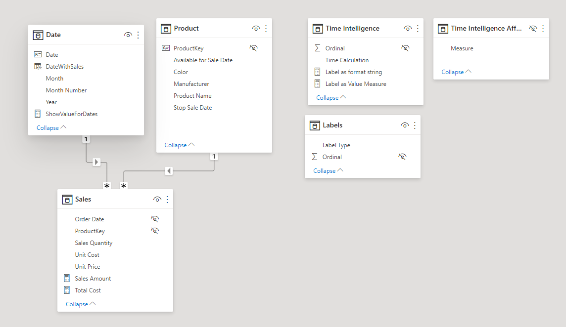
Doing a quick recap, we have a model with
- Date, Product, and Sales tables
- some no-frills measures like Sales Amount, Total Cost and so on.
- Time Intelligence calculation group with a calculation item for Current Year, Previous Year, Year over Year… and 4 or 5 more.
- Labels calculation group (with lower precedence that the Time Calculation calc group) which hides the labels except for the last point of the time series, in which it places a dynamic label identifying the series (e.g. 2008 YTD)
- Time Intelligence Affected Measures calculated table, which is just to store the names that are affected by the Time Intelligence and Labels calculation group
At the very end of the video where I showed the two scripts in action, I make the consideration that some people may miss the regular data labels to which I say, well, make yourself a report page tooltip! And indeed, if you just want to see information related to one data point, it is not complicated.
- Add a report page
- Configure it as tooltip
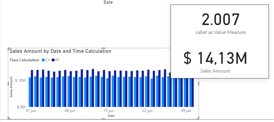
- Drag and drop two cards
- Place Dynamic Label as Value in one and Sales amount in the other
And you are good to go! Well. Maybe. Preparing this article I just realized that not all charts are created equal. In general all filters (up to the data point) are passed to the tooltip, but in the case of the line chart, the series filter is passed only to the visual level. Let me show you.
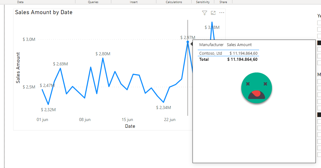
I created the tooltip described above and applied it to two different charts, a line chart and a clustered column chart. In the bar chart it works well and shows information on the data point I’m hovering.
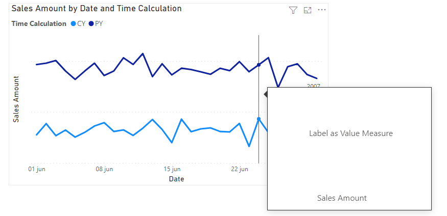
However on the line chart it does not work, because both calculation items are active simultaneously over the same measure and who knows what calculation is taking place when this happens. You are lucky if you get a blank and not a wrong number.
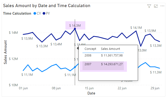
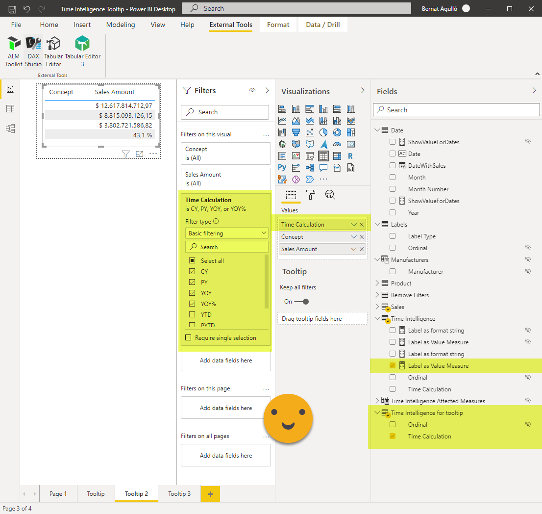
So in line charts we do not hover a data point, we hover a date. If we are happy with just seeing the two values of the chart we can do it by creating a table with the Time Intelligence Calculation group and selecting the two calculation items on the filter pane. We can include the dynamic label measure along with our target measure, renaming it to «Concept» for example. Then if we turn off Word Wrap for column headers, we can make the Time calculation Column small enough so that it will not show. The dynamic label will not show anything at the tooltip page because there is no single year in the filter context. That will come from the chart filter context.
And indeed it works beautifully
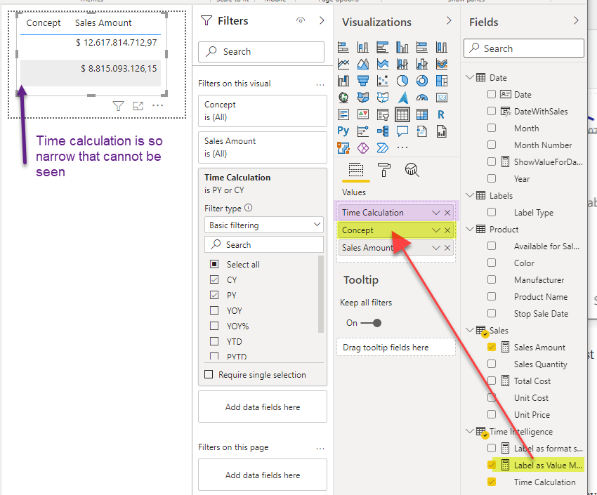
Now, what happens if you want to see the values of both Current Year, Last Year, Year over Year and Year over Year % ? Not so easy.
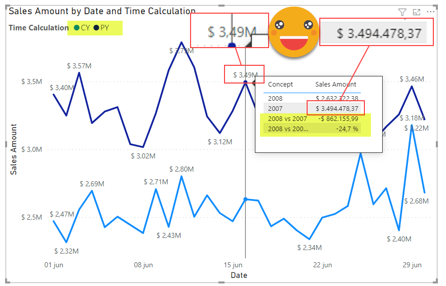
You may think «what are you talking Bernat, I’m checking my tooltip and I just added the other items and it looks like I’m all set». Well, be my guest.
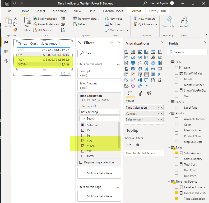
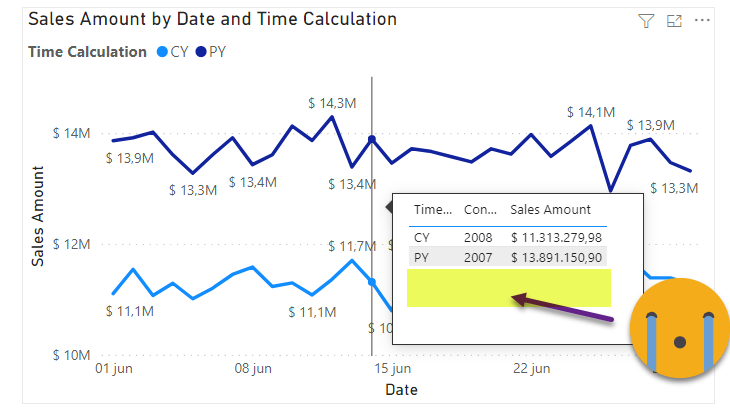
It may look fine while you build your tooltip page, but once you want to see it on your chart, the things get nasty. Even though you set all 4 calc items in the tooltip, since there is already a filter of two calc items in the chart (CY & PY), only these two are shown in the tooltip.
The first time I faced this issue it was not even calc groups and already took me like a week to understand what was going on. I had a chart filtered by one category (say a Manufacturer), but wanted to see all categories in the tooltip. I tried putting REMOVEFILTERS all over the place, but I would only see that category in the tooltip. Until one day, enlighted by Jeff Weir, I realized:
With DAX you cannot really change filters on a table. You can only modify how these filters affect other tables!
That was like an epiphany to me. REMOVEFILTERS it does not really remove the filters on the table. It removes the effects of that filter on other tables. If you go to that table and ask «Are you filtered?» She will say, «You bet I am. I have slicer right on top of my head». So if you use a column of that table to build a chart (or a table like in our case) items not selected in the filter context will simply not show. Forget it.
So is this post over?
No it’s not.
Maybe you still don’t believe me about the REMOVEFILTERS thing. So let’s dig in. Totally worth it.
Indeed, one may be tempted to think «Ok, so I have this filter coming from the chart, but I’ll just cancel it with a calculation item at the page level, and then I can use again my column and show all the items I want». Well, it does not work this way. But let’s see.
Let’s step back and do something easier. I filter the chart by one Manufacturer, but I want to see all manufactures in the tooltip. So following that initial strategy I create a Remove Filters calculation group with a single calculation item called «Manufacturer»
=
CALCULATE (
    SELECTEDMEASURE (),
    REMOVEFILTERS ( 'Product'[Manufacturer] )
)
When we set up this calculation item at page level, we already see the whole thing is going awry
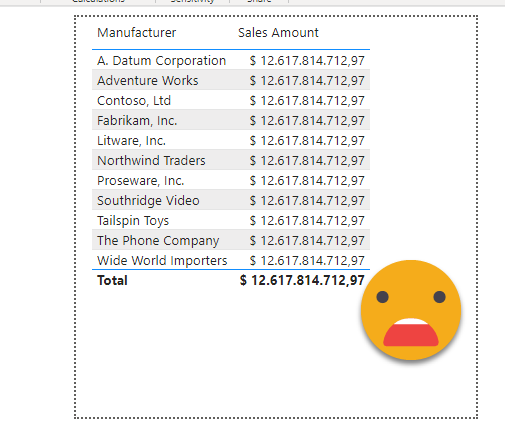
But it’s even worse when we check it from the chart
We have the worst from both worlds, a bad result and still don’t see all manufacturers on the tooltip. This is for the reason I was saying. The Product table is filtered, and this will not change by dax, that’s why we are not seeing the other manufacturers. You can only change the effect this has on calculations. Also important to remember that calculation groups replace the dax expressions of measures, and like measures, the resulting expression is evaluated for filter combination (i.e. each data point) of the visual. So the calculation item it’s even removing the filter coming from the table visual, and that’s why we’re getting an incorrect result.
So the strategy when we want to do this is simple (didn’t say easy). We need a copy of the table (or at least of the values of the column we want to use), connect it to the model and remove the effect of the filter in the original table via a modified measure with a CALCULATE( … REMOVEFILTERS( filtercolumn on the main chart) or the same via Calculation item. If you have read my twitter, or almost any other post in this blog you’ll know I’ll choose the calc group route. It’s just so tidy and scalable…
So let’s complete our warm-up exercise with the manufacturer column before we try to do the same with the Time Intelligence calc group.
We create a new table containing only the manufacturer names (like we did on the dynamic chart type video, but with no «others» category)
Manufacturers =
DISTINCT ( 'Product'[Manufacturer] )
And we connect it to the model through the manufacturer column of the product table.
So now we use the Manufacturers column from the new table in our tooltip and this already looks much much better.
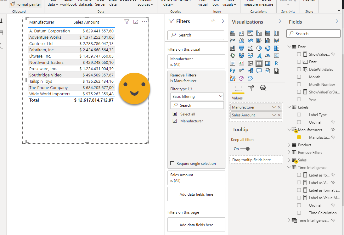
and from the chart is just beautiful: The value for Contoso matches and we see all other manufacturers as well.
Now, can we do something similar with the Time intelligence calc group?
Well, yes, but we need to understand a little bit about Calculation Group precedence. As in any complex DAX topic, it’s important to go to the source: an article from SQLBI of course. From the article:
The order of application depends on the Precedence property in the two calculation groups: The calculation group with the highest value is applied first; then the other calculation groups are applied according to their Precedence value in a descending order.
It’s important to understand that application is not the same thing as evaluation. Application refers to the process in which a calculation group replaces all the measures with its expression. In some cases it will return SELECTEDMEASURE() and it will be like nothing ever happened, but when it’s something more elaborated it’s important to understand this process. I tended to think that higher precedence would mean that it will be evaluated first, but it has nothing to do with it. At the end a big DAX expression will be created and it will be evaluated as if it was a regular measure. I recommend not using measures defined with calc groups, because it makes this process much more difficult to troubleshoot. At least to me.
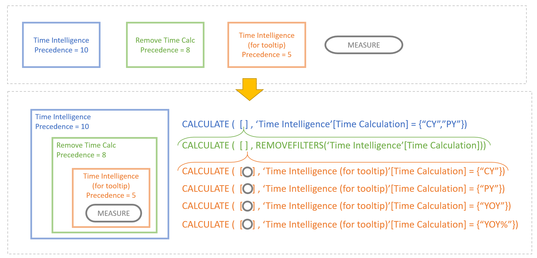
So if you think of it, the calculation group with highest precedence will become the most outer wrapper, so to say. Now if we think of how REMOVEFILTERS works, it removes filters coming from the the filter context, the outer part so to say. So we need to remove the effect of the Time Intelligence calculation group with another calculation group of lower precedence number. But remember, even if we managed to remove the effect of the calculation group, it does not mean we get to use it as we wish inside the tooltip, because the table representing it is filtered. So we’ll do as with the previous example and yes, we’ll create a copy of our Time Intelligence calculation group. And what precedence should it have? Since we want the REMOVEFILTERS to be in an outer layer, we’ll use an even lower precedence number.
I tried to make a figure out of it, I hope it makes sense
But wait, does it really work? Let’s check it out!
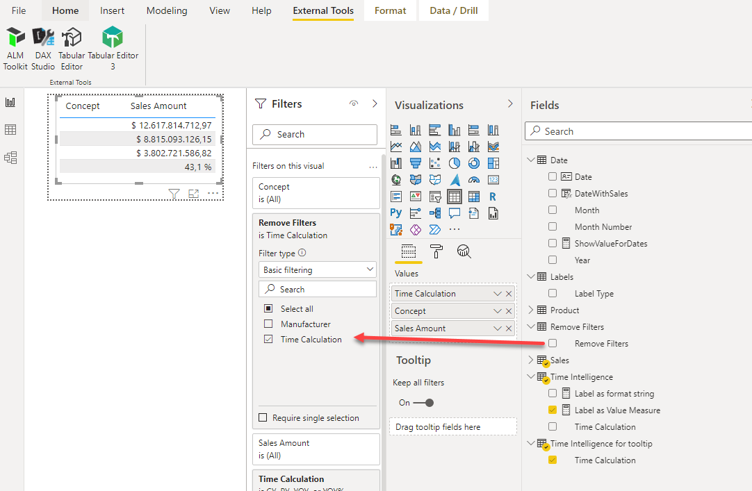
First we create a new calculation item in our Remove Filters calculation group removing filters from the column of the Time Intelligence calculation group.
=
CALCULATE (
    SELECTEDMEASURE (),
    REMOVEFILTERS ( 'Time Intelligence'[Time Calculation] )
)
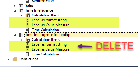
Now we duplicate the Time Intelligence calculation group, to something like Time Intelligence (for tooltip). Like anything in Tabular Editor is just a matter of copy and paste. At the time of this writing, the measures contained in the calculation group table are also duplicated, but with the exact same name which produces an error when trying to save back to the model. Having seen how other bugs are fixed I expect that this issue will be solved by the time I click «publish» this post. Actually in our case we really do not need the new measures. The calc groups are exactly the same and will act on the original «Label as format string» and «Label as Value Measure» measures. The entire calculation group table should be hidden not to confuse end users.
Now we need to pay attention to the precedence. As explained before we make sure that the original Time Intelligence calculation group has the highest precedence, then the Remove Filters calc group and then the Time Intelligence for tooltip calc group. Actually when copy-and-pasting a calculation group has the exact same precedence as the original one, which is not allowed and will produce an error when you save back to the model.
Running the two scripts of the previous two posts on a model with no calc groups will result in Time Intelligence calc group with precedence number = 1 and Lables calc group with precedence number = 0. We now change that to something like:
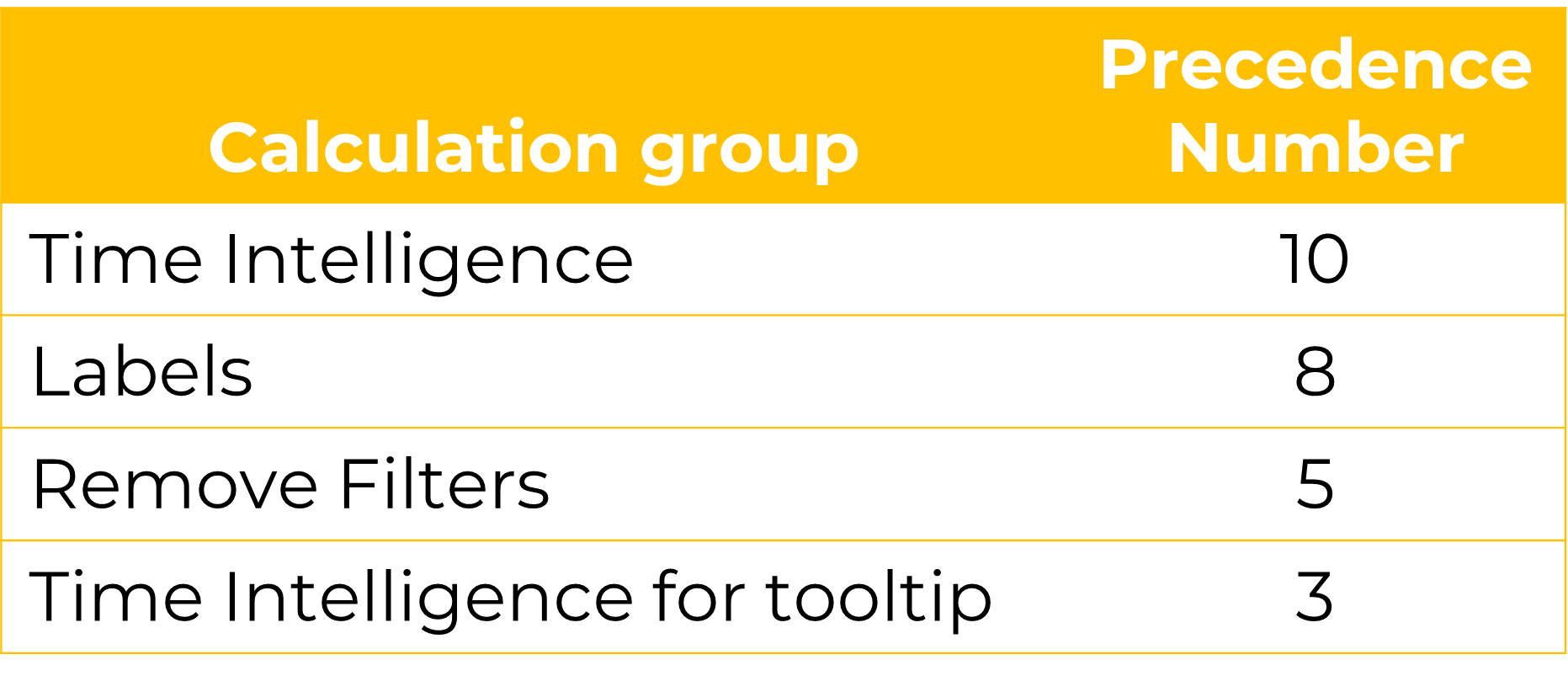
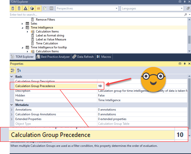
Here the exact numbers are not important, only which one the order. I open things a bit to reduce steps in case I need to squish in a calc group in the future. To change it we dig a bit into the properties of the calculation group
We change it for all calc groups and we save back to the model. Since there are new calculation groups we’ll need to manually refresh the model from Power BI Desktop.
Now we remake our time intelligence tooltip using the Time Calculation column from our brand new Time Intelligence for tooltip calculation group. Remove the filter from the original calc group and set it again with the new calc group. The measure for the dynamic label remember is the same, no change here.
Now do not forget about the remove filters calc group to avoid a clash of time intelligence calc groups!
Here I placed the filter on the visual level because I had just a table, but if you have a fancier tooltip feel free to set it at page level.
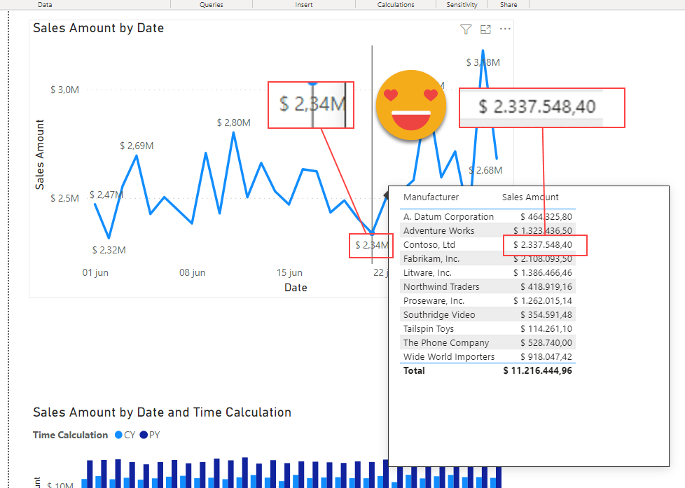
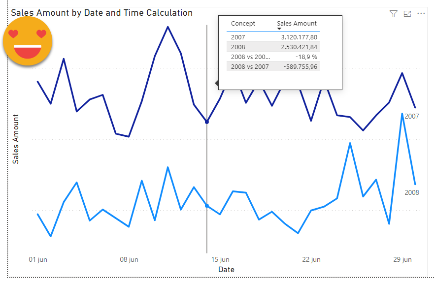
So, does it work?
You bet it does!
Once we validated that numbers match, we can set back our dynamic labeling of series
HOWEVER
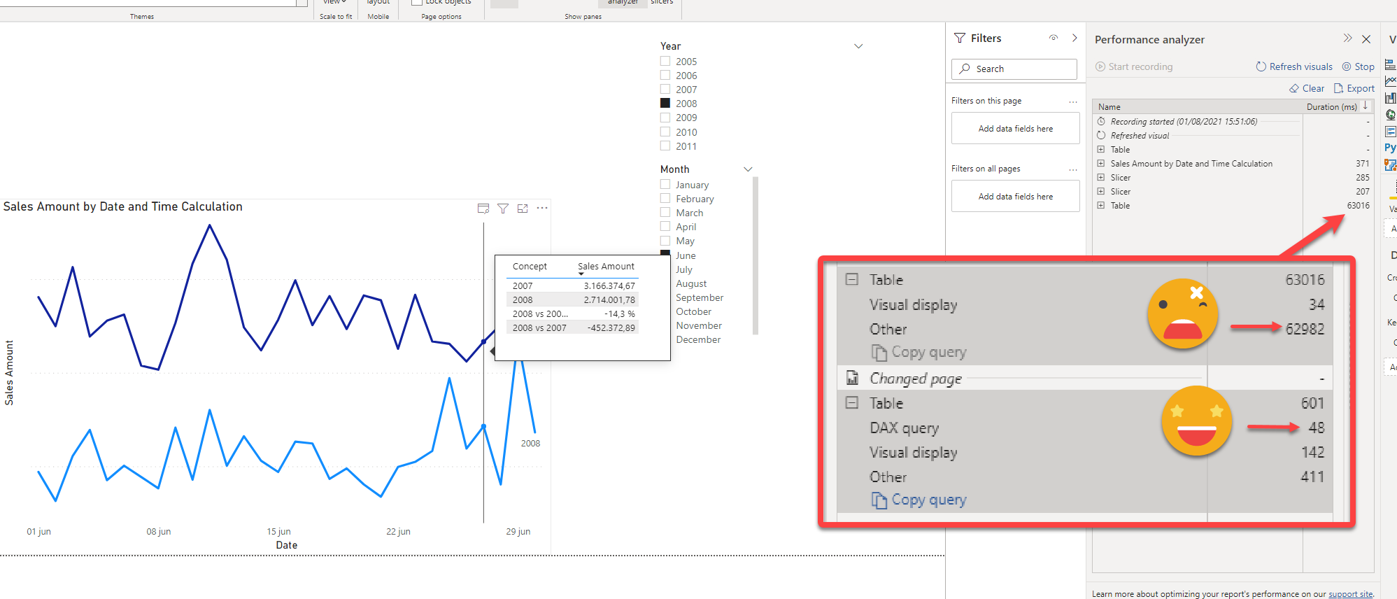
this tooltip took forever to load, really. It might have to do with the calc group overload. Maybe the dynamic labeling on the base chart is too much, I think. So the best would be if Power BI would allow to select which filters are passed to the tooltip. If anyone has a better method I am all ears!
Update: to see how bad this is I add here a screen shot. What is this Other?!? If I find out I’ll let you know — I realized I was in power-saving mode when I was doing this calculation, but even when charging, it’s still an staggering 30s to see a tooltip — a No-No kind of thing. I hope someone on twitter will shed some light on the causes (Marco? Alberto? please?)
I invide everyone to download the file and tell me what is PowerBI doing all these «other» seconds… here is the link.
Let me know your thoughts in the comments or on Twitter, LinkedIn… your choice.
Thank you for reading all the way to the end!