Setting up a «Data Problems» warning (and detail page) in Power BI reports

I’ve seen it many times. While there is a set of «official» attributes for a product, or a client or whatever, a department may choose to group them through one or more custom attributes. And what do they do? Of course, they create an excel file where they manually maintain a table with the key (hopefully) and all the custom columns. They will tell you that they update it whenever a new value appears in the datasource, but if you double check this statement you might get let’s say «mixed results» at best.
Nothing says «there is a problem» as a red button appearing in your report. And if it offers «actionable insight» on how to solve the problem, so much better. So this is what we’re going to do: A data problem button.
This idea didn’t come out of thin aire, but rather from this video from Patrick in the GuyInACube channel The only difference is that the measure will be signalling detected data problems and the detail page will show the problems in detail, like unmapped values for instance.
The Manually Maintained Table
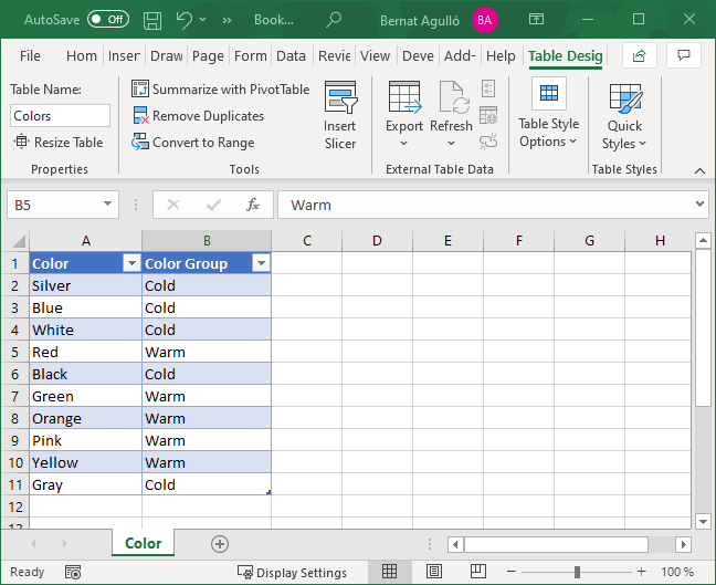
Let’s imagine we would like to group the colors of the products of the contoso model into warm and cold colors (according to our business-based criteria). Something like this (let’s imagine that these are all the colors present in the data when we set the table up):
The modeling
So we bring the data into Power Query…
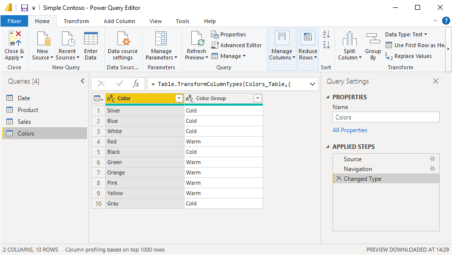
… and here we have two options:
- Load it «as-is» into the model
- Merge it with Product table as a new column
In this particular case, the second option makes more sense, but sometimes people may choose to create the entire dimension from the excel file, like «Master Product Table.xlsx», really, I’ve seen it. So we’ll explore both ways to see how we would go about into creating a «Data Problems» button in each case.
Manual table «as-is» into the model
And now let’s imagine that during the refresh new colors appear in the Product table… If we are analyzing the share of products of warm and cold products we will get either a blank column or incorrect data (I’ve seen reports where this blanks are shamelessly hidden from the filter panel as people sometimes do not understand where they come from).
![]()
Since we set up the problem, the reason is clear. Not all colors are mapped. But we need a measure to tell us this, so we can create a button that appears only when there is a data problem. Also we could have multiple data problems so we need a general approach.
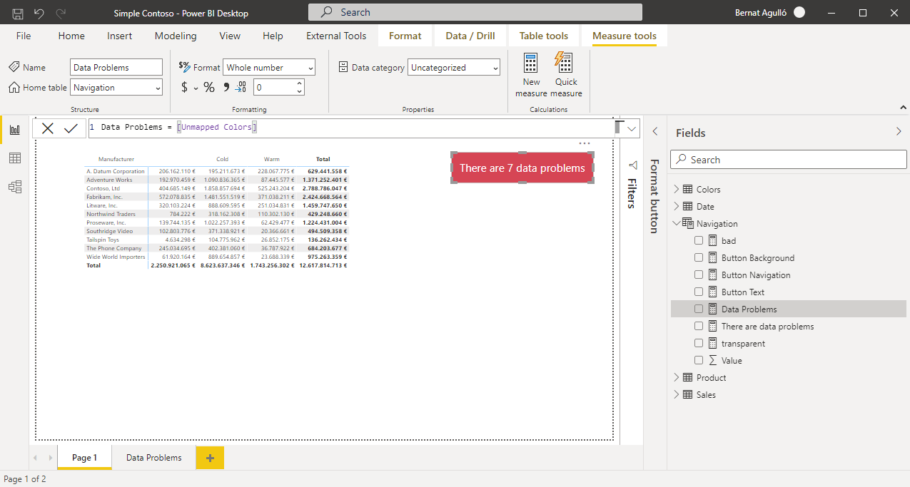
To make sure that everything is working as expected I like to first create the detail sheet where the problems are shown. Here we need a table that shows which colors are not being mapped. So we drag the Color field from the product table (that should be hidden if you are following best practices) and we filter it by blanks in the Colors table
Ok, so there are 7 colors that need mapping. But we need a measure that tells that. So we do the exact same thing but with DAX: Return the number of rows by this condition:
Unmapped Colors :=
CALCULATE (
    COUNTROWS ( VALUES ( 'Product'[Color] ) ),
    ISBLANK ( Colors[Color] )
)
Now, since we could have other measures counting ‘data problems’ we’ll set a general one that will be the sum of all of them. Right now, however we just have one measure, so it will look like:
Data Problems :=
[Unmapped Colors]
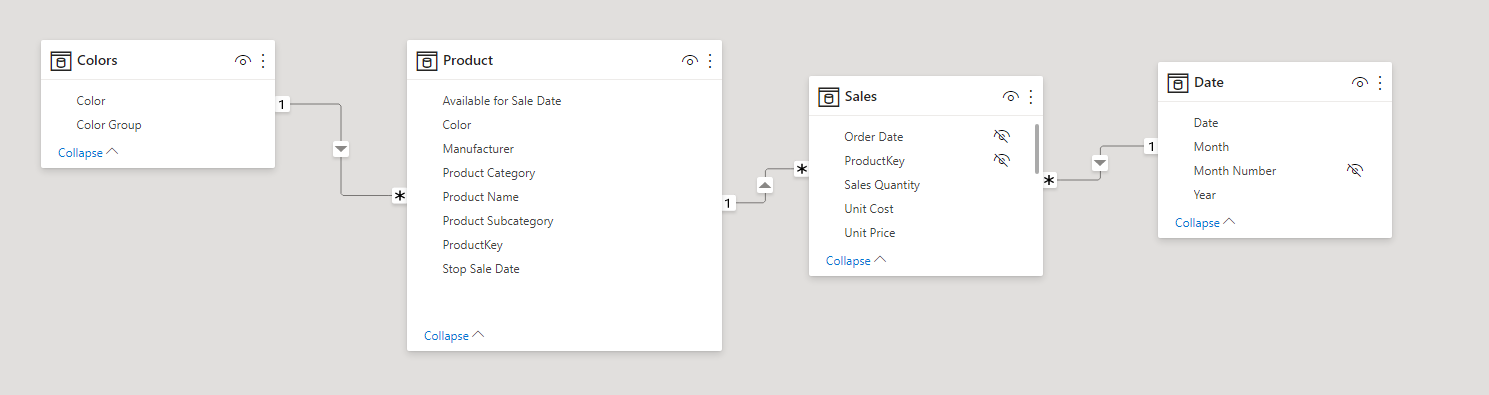
Manual Table merged with an existing table
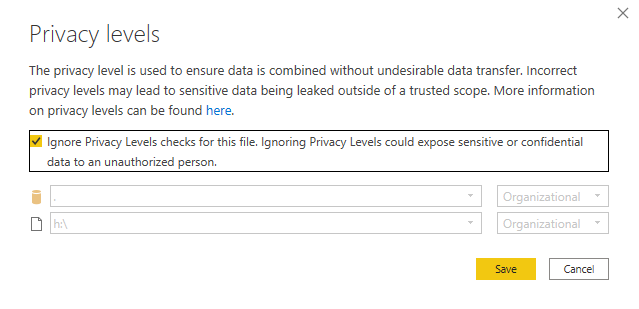
This is what would be more appropriate in this particular case, and the steps are not so different. When merging (Left Outer join) the tables we might get the following warning. Normally I just check ignore privacy levels to get around it.
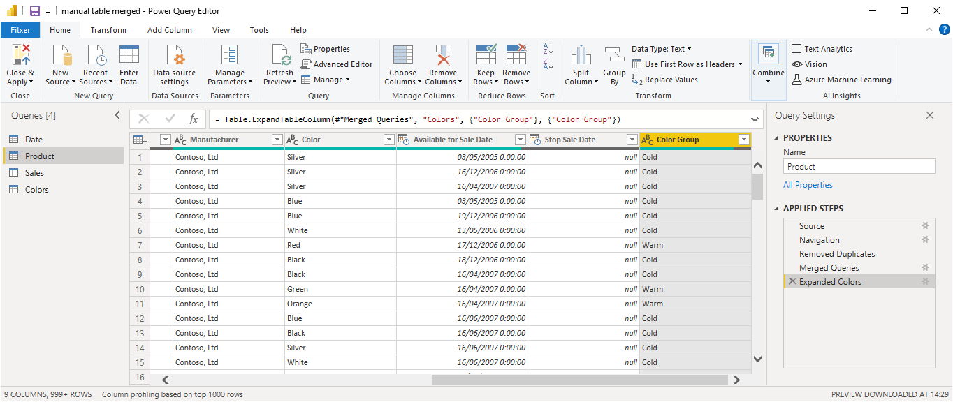
We select the two «color» columns to do the join and after that we expand to leave only the new column
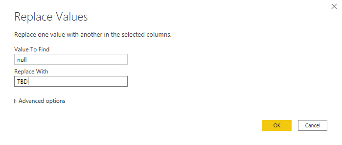
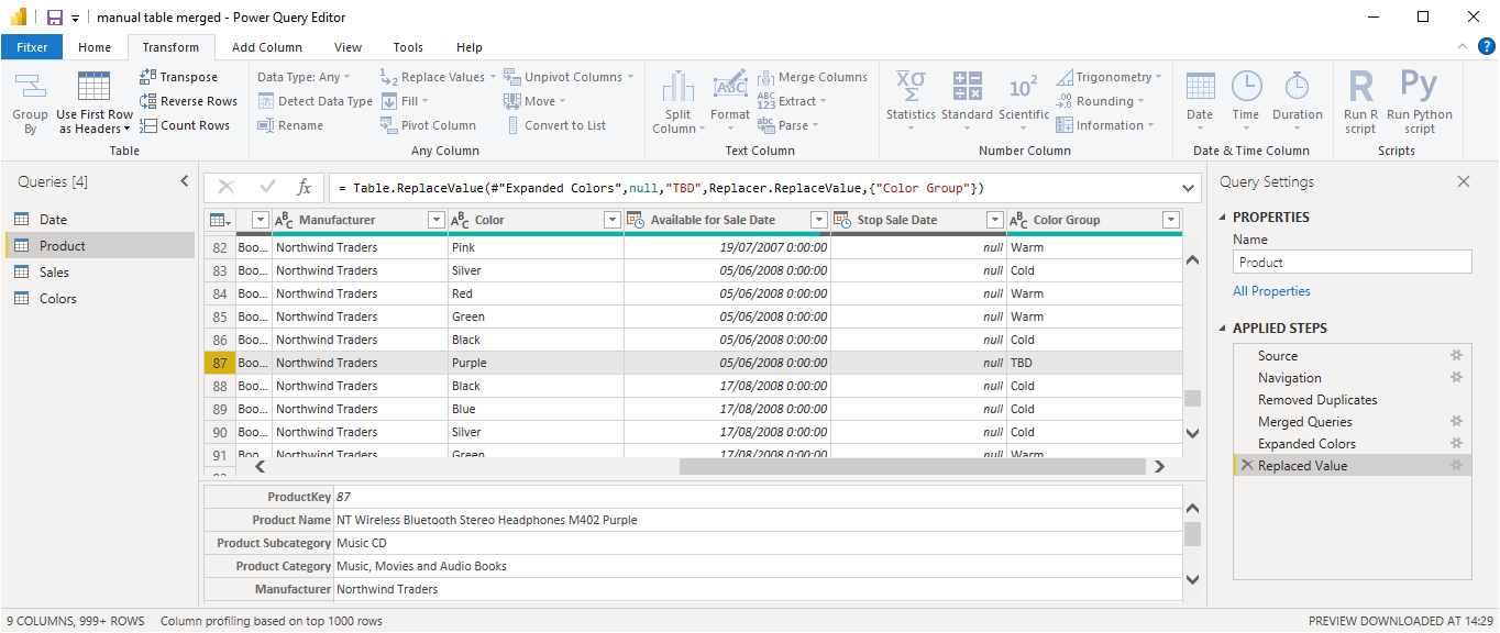
Leaving blanks for something that should not be blank is not great, so we shall change the nulls to something like «TBD» or similar
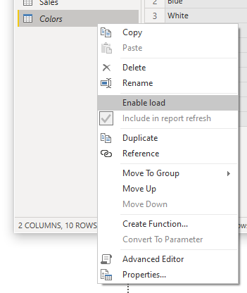
Before applying changes, remember to remove the flag «Load to model» from the «Colors» query as we do not need the table for our model.
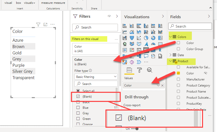
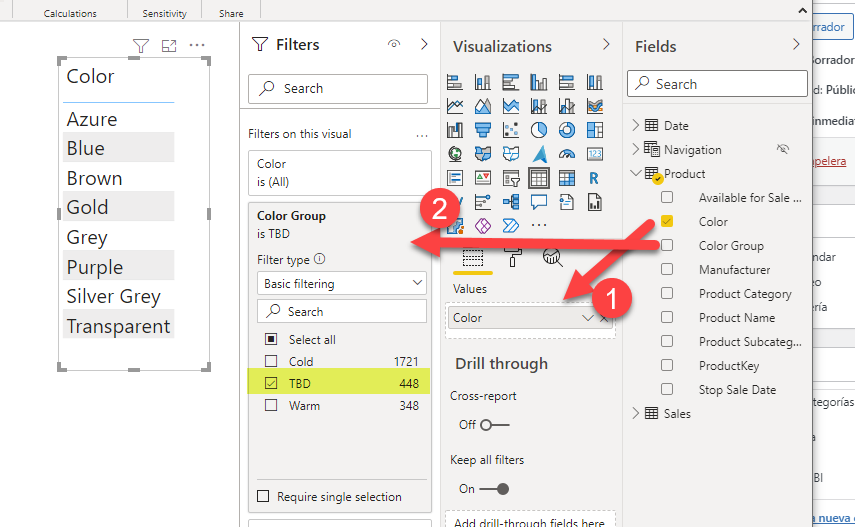
So now we just need to set our table filtering by TBDs and our measure to count the TBD colors from the Sales Table
For the table we just (1) drag the color column from the product table (the only table with color column now) and (2) we use the «color group» in the filter-level visual
So far so good, right?
Wrong. Check again. We are supposed to have 7 data problems, not 8! What the French Toast?
Welcome to the DAX vs PowerQuery shenanigans world. When I saw that while writing this article, I went back to the table, I saw that Blue was there (with capital B) and now I went into power query and added a step to filter all those TBDs and see where the blue came from. And bam, there it was…
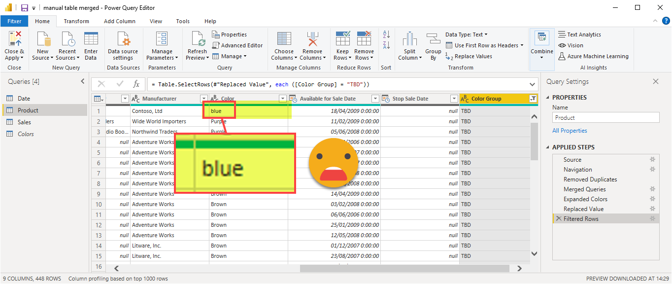
REMEMBER! POWER QUERY IS CASE SENSITIVE. VERY CASE SENSITIVE. But then you might say «Wait, the blue from the unmapped colors was with capital B» And you would be right, it is. But that’s because DAX (or indeed the vertipaq engine) creates a case insensitive dictionary taking the first appeance as the one. And in this case Blue was first, even though the only blue with a TBD color group would be lower case. DAX doesn’t care.
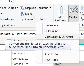
There might be a zillion ways to overcome this problem, I just added a step changing the capitalization of the color column of the source so it would match my mapping table (in general you might want to go with full uppercase in both sides)
The measure will be very similar to the other one, just with the different condition
Unmapped Colors :=
CALCULATE (
    COUNTROWS ( VALUES ( 'Product'[Color] ) ),
    'Product'[Color Group] = "TBD"
)
Ok, so now we are now at the same place where we were: we have a measure that signals some data problem that needs to be addressed.
Efficiently create all needed measures for the dynamic button
Now is when the magic happens. If you checked out Patrick’s video, you’ll see we’ll need 4 measures to create the button, and they will be all the same for any report we create: «If there are data problems do this, otherwise do that». The perfect scenario for a c# script in Tabular Editor.
- So we go to https://github.com/bernatagulloesbrina/data-problems-button or clone the repository locally if you so desire
- Open Tabular Editor (2 or 3, it doesn’t matter) and open the script
- Check out the configuration variables at the top of the script to match your report names (especially the dataProblemsSheetName which should match the detail sheet we just created)
- Execute the script
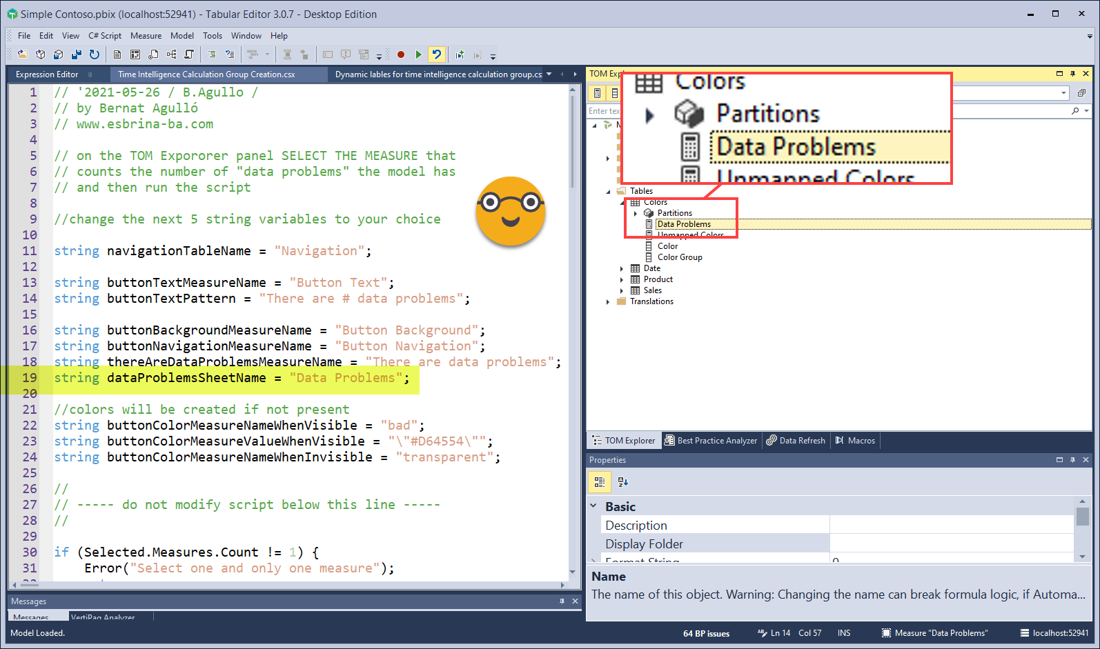
When the script runs a new calculated table (with no data) is created to store all the measures that will be needed for the button. For this reason you will need to have enabled the unsupported actions in Tabular Editor. If you are not comfortable with it I’m sure you can change the code to use an existing table of your model.
Since the Data Problems measure was created for this button, the scripts places it in this new table as well. (The table is set to be hidden, but in the report view appears visible by default. Once you close and reopen the file it is already hidden)
So, let’s build this button then. This part, unfortunately cannot be scripted, so we’ll need to work a little bit.
Go to Insert -> Buttons –> Blank
![]()
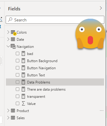
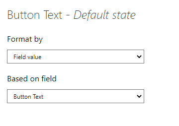
Now we enable button text, and through the fx button we select out «Button Text» measure (or the equivalent name you chose before running the script)
If you just left the default color of the script you might want to change the color text to white, as it is a pretty dark red, and maybe switch transparency to 0% but that’s your call.
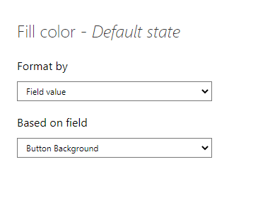
Now switch off icon and outline, and in the fill section for default state, click again on the fx button and select out «Button Background» measure
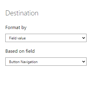
Last but not least (really) we need to set the action of the button. For type we’ll choose «Page Navigation» and in the destination sheet we’ll click one more time the fx button and select our «Button Navigation» measure
And that’s it!
now this button will «disappear» if the «Data Problems» measure is 0 (or blank).
Caution note! You might be tempted to use a transparent color for the «no problems» condition. Well, don’t do it. It does not work at this point. So the «transparent» measure, it should be just the background color, #FFFFFF for white.
To test it, modify the «Data Problems measure to set it to 0 or to a larger number

And try to click it! When there are no ‘data problems’ the button does not to anything. When there are, it brings you to the detailed page, as promised. While you are at it, do not forget to put a back button (Insert –> Buttons –> Back), and hide the page! This way the page will be only accesible through the button, which will only work when there is something to be seen.
Now that you see the colors that are not mapped, copy them, paste them into excel, complete the custom columns, and refresh! voila!
Now in this post we centered around the «unmapped» data problem but data can have all sorts of problems, dates which are not dates, duplicate primary key values, numbers which are not numbers, and so on. As I mentioned, as long as you can number them (or at least have a number saying if there are any or none of those problems) you can just include it into the «Data Problems» measure and the button will appear if any of these other problems happens as well. For inspiration on how to capture these errors, I recommend you this video from Reza Rad at Reid Havens show
If you just came to this post to grab the link to the script, here it is again
https://github.com/bernatagulloesbrina/data-problems-button
Soon I’ll be posting on a further improvement over this approach
Take care!