Another way of overriding calculation items in tooltips

Hello there, quite a while ago I wrote a blog post explaining how to override calculation items in tooltip. Basically, if I’m using calc item A and B in a chart, how can I use A B C and D in the tooltip. My solution was to add 2 extra calculation groups with lower precedence, one to remove filters from the calculation group on the main visual, an the other one (copy of the original calculation group) to recreate the desired calculations. This solution does work, but is quite tedious to maintain if you have changes in the original calc group, and (I’m not sure if it’s related) when combined with the time intel dynamic label calc group, it took A LOT to display the tooltip. I tested again a few days ago and even with my new laptop (i7 32GB of ram) it took like 10s, most of them going to «other» things, not the dax query, so little can be done.
Anyway, all these just to say, that there is a better way to do things, at least in most settings. While writing this, I revisited the blog entry from Sam Fischer. I was relieved to see that my approach is not exactly the same as the one he exposes. He is focused in removing the effect inside the tooltip of the calculation group coming from the main visual. To achieve that, he uses a remove filters calc group like I did in my previous blog post (well, he uses ALL but it’s exactly the same), and then instead of creating a copy of the original calculation group, he creates measures bases on the calculation group. He does use «FORMAT» to make sure they don’t inherit any format string from main calc group, which I try to avoid. I believe the logic of which measures need to be affected by the calc group should live inside the calc group. Not in all the other measures of the model.
Anyway, for use cases like this, lately I prefer to take the opposite route. Instead of neutralizing the calculation group in the tooltip, why not prevent it from getting there in the first place? It is unfortunate that Power BI does not offer any option to select which filters should travel to the tooltip, but the important thing here is that only FILTERS travel. Tooltips don’t care about the definitions of the MEASURES in the main visual. Thus, if you add a filter INSIDE a measure using the CALCULATE function, the tooltip will never know. Which is exactly what we want.
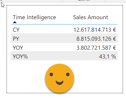
So to recap, here’s the problem and the solution. Let’s say you have a bar chart of sales amount by manufacturer, and you add the time intelligence calculation group in the legend. Since the chart becomes a total chaos with all the calc items, you reduce the visible calc items through the filter panel and keep only CY and PY. But then you think that it would be cool to allow the user to see the value of other calc items in the tooltip, such as YOY and YOY%. So you set up your tooltip report page…
then you configure the main visual and … fail. Only the same calc item shows.
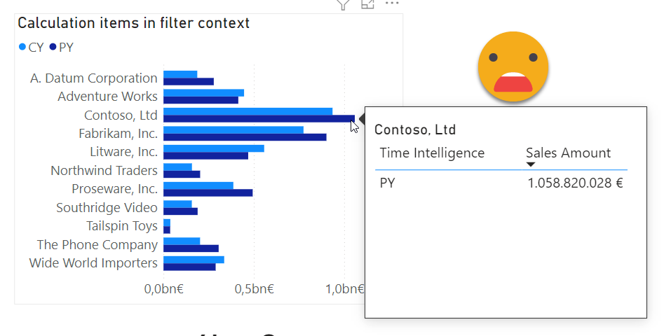
The reason is of course the filter context, in which only one calculation item is present for each bar.
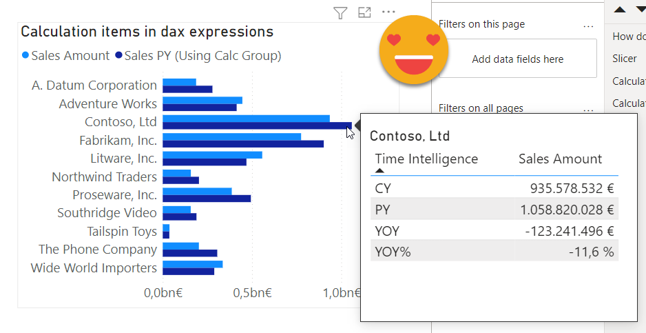
Now, as I was saying, one convenient way to avoid the calculation group from travelling to the tooltip is to hide it inside measures. So instead of using the calculation group column in the legend part of the chart, we remove it and add two measures in the values section: One can be just the [Sales Amount] Measure, as no transformations are taking place. The other one, can be something like
Sales PY (Using Calc Group) =
CALCULATE ( [Sales Amount], 'Time Intelligence'[Time Intelligence] = "PY" )
The calculation group will not travel to the tooltip so all calculation items will display! If you are following step by step what I’m doing here, remember to remove the calculation group column from the filter pane! I was completely puzzled for 4 min until I realized it was still there, even though I had removed it from the legend part of the chart! Anyway, if you use the measures (and remove the calc item from the filter pane) your tooltip should look beautiful like below.
Of course you can further embellish it by putting proper names to the measures, using decent color scheme and so on, but the trick is already there. I think it’s so fundamental that I decided to include it in my session «Introduction to Calculation Groups» , let’s see how it goes.
By the way, I talked all the time about tooltips, but the same is true for drill through pages, or even cross-filtering.
Thank you for reading and enjoy calc groups 🙂