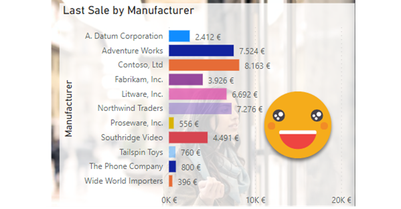
As soon as I learned how to define transparency in HEX encoding for Power BI, I started thinking on how to control it with a calculation group. After all, you can only define transparency through a color measure, so it made sense. If you have seen any of my most recent presentations on Calculation Groups you might have seen a use case in which I show it’s possible to control the transparency (and light level!) of a color measure with calculation groups. However in such presentations I also say that I’m still looking for a decent use case to put them into practice. Today I’m attempting to do just that with the transparency calculation group.
Transparency is not just any other graphical attribute, because in one end is invisible and in the other one is completely opaque, so it doesn’t make sense to show most dimensions this way. Then I thought, well, memories do kind of fade with time, so maybe this could translate somehow in a chart. So I thought, maybe I can build a chart in which bars show the amount of the last sale and the transparency level shows if it was very recent (0% transparent) to way too old (100% transparent). I’m not completely sure if this makes much sense to be honest. Maybe in industries where sales do not happen every day, like in Real Estate, you could have a chart like this showing the latest sale for each agent with a decreasing level of transparency. This could bring some balance on what is going on — along with plenty of other charts probably. Anyway, this idea has been there in my backlog for a while, so let’s get to it.
As usal I’m using the Contoso dataset, and I’ll use the Manufacturer to slice the data. Before anything else we need a measure showing the last sale which can be on the lastest date in the filter or before that. So it looks like this:
Last Sale :=
VAR currentDate =
    MAX ( 'Date'[Date] )
VAR previousDateWithSale =
    CALCULATE (
        MAX ( Sales[DateKey] ),
        Sales[DateKey] <= currentDate,
        REMOVEFILTERS ( 'Date' )
    )
VAR result =
    CALCULATE (
        [Sales],
        'Date'[Date] = previousDateWithSale
    )
RETURN
    result
Together with it now we need a measure that shows how many days passed since this last date. The measure looks like this:
Days since Last Sale :=
VAR currentDate =
    MAX ( 'Date'[Date] )
VAR previousDateWithSale =
    CALCULATE (
        MAX ( Sales[DateKey] ),
        Sales[DateKey] <= currentDate,
        REMOVEFILTERS ( 'Date' )
    )
VAR result =
    IF (
        ISBLANK ( previousDateWithSale ),
        BLANK (),
        CONVERT (
            currentDate - previousDateWithSale,
            INTEGER
        )
    )
RETURN
    result
Great. Now, though, we have another problem. In the Contoso dataset all manufacturers have sales every day, so there’s not much to show in terms of fading… unless we slice by something else. The product dimension is not great (color could work, but in my attempts it was no good), but the City column is pretty good. Filtering by Austin, we see that not all manufactures have sales every day, but they do have some sales sometimes so is exactly what we want.
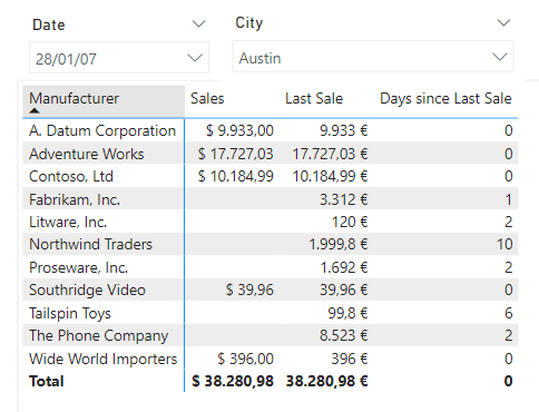
Nice, but this was the easy part. Now we need to define a transparency calculation group, and a way to assign the correct value of transparency to each bar. Maybe we could combine both things in a single calculation group, but I like separating both aspects of the logic as it makes it easier to understand, and enables reusing of the transparency calc group. But wait, we still do not have neither color measures nor the transparency calculation group, so let’s get this done.
In order to get the color measures based on the theme, I followed the steps of this blog post of mine. Basically use the JSON to get the colors, but they all need to be explicitly defined. This time I only wanted the 8 base colors so the transformations where quite straight forward. Once I had the hex codes I added a column with «Color 1», «Color 2» etc, and loaded it into the model. Then I realized that the script to create the measures (which was totally a break-through for me at the time) was a bit old-fashioned in the sense that you had to hardcode the name of the color table, the name of the color name column and the name of the color code column. So I made a few improvements so you can launch it as a macro on the table, and then it will even try to guess which column is which, but asking for confirmation, so in just two clicks (well 4 if you count the clicks to launch the macro) you’ll have your measures ready. The assumption is that the name column will contain the word «Name» and that the code column will contain the word «Hex». This assumptions can easily be changed in the code.
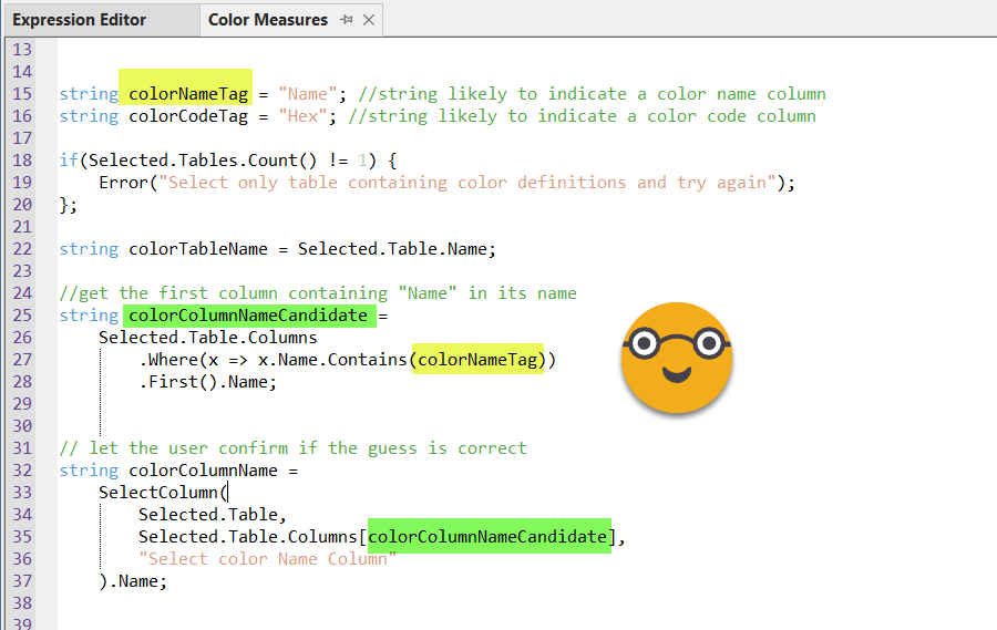
You can get the full stript from my fork of the tabular editor scripts from PowerBI.tips. A pull request is on the way as usual.
Anyway, if you don’t want to go this path you can just build your color measures as you wish, that’s not the point. Now that we have the color measures, we can think of the transparency calculation group.
In a recent presentation I discovered that I in the demo I show a calculation group that uses an auxiliary table to translate decimal numbers to hexadecimal and back. There’s nothing intrinsically wrong with that, but the whole thing can be done with DAX inside the calculation group, so I thought this would be a good time to get it done. As usual for such calculation groups, I like to use the same expression for all calculation items and use the calculation item name in the logic to achieve a different level of transparency. For the tricky part of translating from decimal to hexadecimal, I used –once again– the expression that Phil Seamark put together in his blog ages ago.
------------------------------------
-- Calculation Group: 'Transparency'
------------------------------------
CALCULATIONGROUP 'Transparency'[Transparency]

    CALCULATIONITEM "10% Transparency" =
        VAR selCalcItem =
            SELECTEDVALUE ( 'Transparency'[Transparency] )
        VAR selMeasureName =
            SELECTEDMEASURENAME ()
        VAR result =
            IF (
                selMeasureName IN VALUES ( 'Colors'[Name] ),
                VAR pctPosition =
                    FIND ( "%", selCalcItem, 1 )
                VAR pctDec =
                    1 - DIVIDE ( CONVERT ( LEFT ( selCalcItem, pctPosition - 1 ), DOUBLE ), 100 )
                VAR pct255 =
                    ROUND ( pctDec * 255, 0 )
                VAR Base = 16
                VAR BitTable =
                    GENERATESERIES ( 1, 2 )
                VAR DEC2HEX =
                    CONCATENATEX (
                        BitTable,
                        VAR c =
                            MOD ( TRUNC ( pct255 / POWER ( Base, [Value] - 1 ) ), Base )
                        RETURN
                            SWITCH ( c, 10, "A", 11, "B", 12, "C", 13, "D", 14, "E", 15, "F", c ),
                        ,
                        [Value], DESC
                    )
                RETURN
                    LEFT ( SELECTEDMEASURE (), 7 ) & DEC2HEX,
                SELECTEDMEASURE ()
            )
        RETURN
            result
        Ordinal = 1
For clarity only a single calculation item is shown, but there could be as many as necessary (up to 100) following the naming schema. In this case since we created the color measures based on a table, I’m using the same table to check if the measure about to be replaced is indeed a color measure or not, other approaches are possible of course. Also im portant is the fact that the two caracters that define the level of transparency, actually describe the level of opacity, so 00 means 0% opacity –> 100% transparent and FF means 100% opacity –> 0% transparency. That’s why the variable pctDec is 1 minus an expression.
To make sure we are on the right path we might as well set up a chart, use a color measure as conditional formatting and apply one of the calcualtion items of the transparency calculation group.

I know it’s terrible, but it’s so bad I went with it anyway. And it shows it’s transaprent, which is the point.
Now we just need to dynamically assign the appropriate calculation item based on the number of days since the last sale. To make things simple, 1 day = 10% transparent, and 10 days or more 100% transparent. If there are sales on the same day, then no transparency. We can put this logic in a different calculation group. While we are at it we can prepare the calculation group to allow for different fading speeds. In the logic we are just descriving we are fading at speed of 10x, but depending on the use case we might want to do it faster or slower. We just need to make sure that the calcualtion item will exists, otherwise Power BI will through an error and the dreaded grey box of death. Anyway the calculation group will look like this
------------------------------
-- Calculation Group: 'Fading'
------------------------------
CALCULATIONGROUP 'Fading'[Fading]
    Precedence = 1

    CALCULATIONITEM "10x Fading" =
        VAR selMeasureName =
            SELECTEDMEASURENAME ()
        VAR result =
            IF (
                selMeasureName IN VALUES ( 'Colors'[Name] ),
                VAR selCalcItem =
                    SELECTEDVALUE ( 'Fading'[Fading] )
                VAR xPos =
                    FIND ( "x", selCalcItem )
                VAR fadingSpeed =
                    CONVERT ( LEFT ( selCalcItem, xPos - 1 ), INTEGER )
                VAR daysSinceLastSale = [Days since Last Sale]
                VAR transp =
                    MIN ( daysSinceLastSale * fadingSpeed, 100 ) & "% Transparency"
                VAR fadingColor =
                    CALCULATE ( SELECTEDMEASURE (), 'Transparency'[Transparency] = transp )
                RETURN
                    CONVERT ( fadingColor, STRING ),
                SELECTEDMEASURE ()
            )
        RETURN
            result
If we wanted now to create a calculation group with twice the speed we just need to copy and paste the calculation item and change the name to «20x Fading» and it will work too. But let’s check if it works at all.
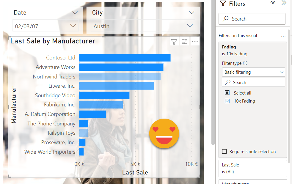
This looks indeed much better! But one more step — when I thought of it I wanted to see it as an animation, showing those bars without new values fading into oblivion. It took a while to find a date period that would illustrate that, but well, this is it, more or less. Check out what happens with Northwind Traders. Not having much luck in austin.
But now that we are playing with color measures we could go one more step beyond and solve a problem recurring in Power BI. How can we assign a color to a category so that every time it is used the same color is applied? The technique that we’ll see now it does not work in every situation, only those that allow for conditional formatting. Unfortunately in many visuals, once you apply categories you are out of conditional formatting for some reason, which is a shame. But anyway, if you play with a bar chart and a table, this technique can be handy. We’ll try to assign color 1 to the first Manufacturer (in alphabetical order) Color 2 to the second and so on. Yes, we do have more than 8 manufacturers, so we may have a problem. But let’s start easy and see where we get. After all we could have a color table with more colors with some effort on our side.
The strategy is to get the color name and then replace that by the value eof the measure of the same name. Calling measures by name is something we can do with the dynamic measure Calc Group as we have discussed here, and here. So we grab once again the latest version of the dynamic measure script, and execute it while selecting all the color measures. Now we need to assign each Manufacturer a color. My guess (after having done it) is that this should be probably be done in Power Query, especially one that it has a RANK function. Please feel free to explore this possibility. The solution I present here is a DAX implementation, but I already realized is quite heavy so if you are about to use it for real please check the ranking in power query option.
First things first, to be able to select «Dummy CF» as the measure for conditional format you will need to change its definition from BLANK() to «» so that Power BI recognizes it as a text measure. Now let’s create a new calculation group called «Manufacturer Color» that goes like this
------------------------------------------
-- Calculation Group: 'Manufacturer Color'
------------------------------------------
CALCULATIONGROUP 'Manufacturer Color'[Manufacturer Color]
    Precedence = 20

    CALCULATIONITEM "Manufacturer Color" =
        IF (
            ISSELECTEDMEASURE ( [Dummy CF] ),
            VAR selManufacturer =
                SELECTEDVALUE ( 'Product'[Manufacturer] )
            VAR result =
                IF (
                    ISBLANK ( selManufacturer ),
                    SELECTEDMEASURE (),
                    VAR manufacturers =
                        CALCULATETABLE ( VALUES ( 'Product'[Manufacturer] ), REMOVEFILTERS () )
                    VAR manufacturersWithRank =
                        ADDCOLUMNS (
                            manufacturers,
                            "@Rank", RANKX ( manufacturers, 'Product'[Manufacturer],, ASC )
                        )
                    VAR manufacturerRank =
                        SELECTCOLUMNS (
                            FILTER ( manufacturersWithRank, 'Product'[Manufacturer] = selManufacturer ),
                            "@Rank", [@Rank]
                        )
                    VAR manufacturerRankAdj =
                        IF ( manufacturerRank > 8, MOD ( manufacturerRank, 8 ), manufacturerRank )
                    VAR colorName = "Color " & manufacturerRankAdj
                    VAR colorCode =
                        CALCULATE ( [Dummy CF], 'Dynamic Measure'[Dynamic Measure] = colorName )
                    RETURN
                        colorCode
                )
            RETURN
                result,
            SELECTEDMEASURE ()
        )
Here I think my DAX is not as sharp as I would like — I always struggle with RANKX more than I like to confess. Anyway, here it ranks Manufacturer names alphabetically, and for those whose rank is larger than 8 it calculates the reminder when dividing by 8, so effectively starting over again the color wheel. The goal here is to end up with a color name that exists as measure, and then in the last VAR statement it replaces Dummy CF (the measure we are using for conditional formatting) with the value of the color measure that we assigned to the manufacturer. At this point is good to to rearrange calc groups in a way that makes sense. With some space in case we need to squish a new calc group in between later on.
- 30 – Fading
- 20 – Transparency
- 10 – Manufacturer Color
- 0 – Dynamic Measure
Once we have this all set up, does it even work? Since we used the base colors, these are a way to strong and dark to use as background colors in a table, so what I’ve done is to create a «Legend» measure which is blank, just to add an extra column to the table and show this background color there. Here is the idea. You can notice that on the table we can have the conditional transparency as well if we want to. I just displayed the same values, but now in decreasing order by Last Sale.
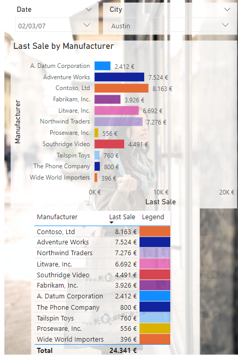
As you can see the table looks quite cool with the transparent effect on the rows, which can be set up using the «Transparent» measure as conditional formatting measure, but for the headers… well, you are out of luck. It quite destroys the moment, doesn’t it? I really do hope that microsoft gives some more love to the report layer at some point.
Anyway, I’m not sure if going multi-color is a good idea or not, but I just thought I would give it a go since we were dealing with color measures. It does look nicer, but it does not make it easier to read, maybe the opposite, I’m not sure. Any list of 11 things will never be super easy to spot a t first sight though.
So pick up any ideas you like, discard the rest, and keep going! Thnak you for reading all the way until here, and keep playing with Calc Groups! Building a fading bar chart was just an excuse, but if anyone uses it in production please let me know!
You want to play with the file? here it is!
