A dynamic color gradient for values and totals

It’s a loooong title (well, it was «Conditional Formatting with divergent color gradient for values and totals»), but it’s exactly what I wanted to achieve when I discovered the limitations of the conditional formatting options in the GUI of Power BI Desktop. The key words are «dynamic» in one hand and «values and totals in the other» I know, some of you may think I’ll be doing some copy-cat article of the crazy video from Bas in which he shows how to use the undocumented (that I know of) function hsla(). A function that you need to leave as text?!? Crazy, just crazy. But no, I take a complete different approach and I think it’s worth the effort! Of course you can take ideas from both me and Bas and come up with your own unique approach for dynamic conditional formatting.
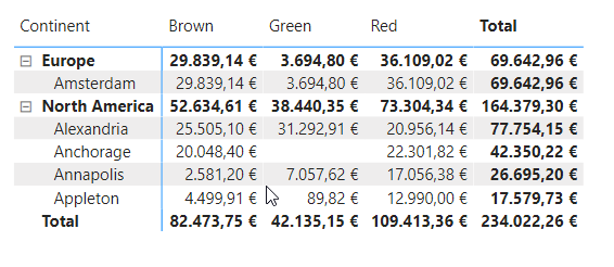
It all starts when you have a matrix (two fields on rows, one field in columns for example) and you apply conditional formatting. I like to show say, «Sales Amount», but conditionally format by «Sales Amount YOYTD %» so the color tells you which ones represent a higher percentual increase compared with the same period YTD from the previous year. For example.
You set it up and it’s all nice, you can set the colors for the maximum and minimum value….. as long as you select apply to Values Only!

The moment you select Values and Totals, things go downhill
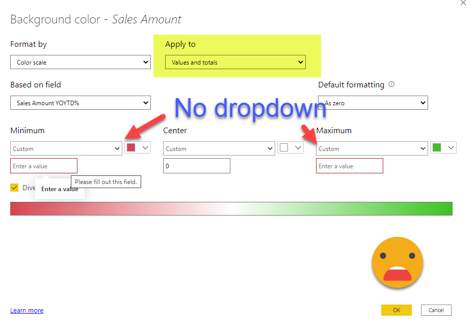
The minimum and maximum cannot be computed automatically, and neither can you link it to a measure either, you have to type in A HARD CODED VALUE! that’s to say it politely…. underwhelming. Update: If you to change that, vote for this idea
I understand there can be good reasons not to apply the same formatting for cells at different granularities, because you may end up painting super green the totals just because they have larger numbers, but hey, let the user decide. If he or she is doing Power BI reports, is most likely a grown up. As I was saying, I just want to color according to Sales Amount YOY% (actually I said YOYTD% but it’s the same point) and this works for all values and totals. Why can’t I have that? Or can I?
Well, we are using «Color Scale», but there’s other possibilities for conditional formatting. «Rules» is fine, but not very convenient if you want to set up a color gradient (how many rules are we talking about here??). So we are left with the almighty but tricky third option, the Field Value option, where you specify a measure that will return the color code to be used. This is super powerful because you can do almost anything if have enough time and imagination to fight with some DAX.
Even though it was not a hard requirement, I love this kind of challenges, so I started my quest to build a way to have such dynamic conditional formatting. As you might suspect, calculation groups are involved, and even though there’s some coding related to the actual dimensions used in the visual (you cannot refer to these dynamically yet), around 90% of the code is generic and you can just copy paste it.
We will go straight to the solution — the calc group has one generic calc item, and three other that need to be configured to your particular matrix.
This is the generic calc item (comments in the code!)
Bad Neutral Good =
//get the 3 colors (they can be measures too)
VAR badColor = "#FF0000" //red
VAR neutralColor = "#FFFFFF" //white
VAR goodColor = "#00FF00" //green
//get the min max and neutral value using the other calc items
VAR minValue =
    CALCULATE (
        SELECTEDMEASURE (),
        'Conditional Formatting'[Conditional Formatting] = "Min Value"
    )
VAR maxValue =
    CALCULATE (
        SELECTEDMEASURE (),
        'Conditional Formatting'[Conditional Formatting] = "Max Value"
    )
VAR neutralValue =
    CALCULATE (
        SELECTEDMEASURE (),
        'Conditional Formatting'[Conditional Formatting] = "Neutral Value"
    )
VAR currentValue =
    SELECTEDMEASURE () //calculate pct, -100% totally bad, 0 neutral, + 100% totally good
VAR pct =
    IF (
        currentValue >= neutralValue,
        DIVIDE ( currentValue - neutralvalue, maxValue - neutralValue, 0 ),
        DIVIDE ( currentValue - neutralValue, neutralValue - minValue, 0 )
    )
//initialize variables for hex to num  transformation
VAR Base = 16
VAR BitTable =
    SELECTCOLUMNS ( GENERATESERIES ( 1, 2 ), "bitNum", [Value] )
VAR t =
    GENERATE (
        //create 3 rows to transform each pair of letters independently
        //it starts on 2 to skip the "#"
        GENERATESERIES (
            2,
            6,
            2
        ),
        //in the first row it will extract chars 2 and 3, for 2nd row 4 and 5 and 3rd row 6 and 7
        //we prepare one column for each color to be able to interpolate between ther Red Green and Blue values
        VAR badHex =
            MID ( badColor, [Value], 2 )
        VAR neutralHex =
            MID ( neutralColor, [Value], 2 )
        VAR goodHex =
            MID ( goodColor, [Value], 2 )
        //translate each component (rows) of each color (Columns/Variables) to numeric -- credit to Phil Seamark
        //https://dax.tips/2019/10/02/dax-base-conversions/#HEX2DEC
        VAR badNum =
            SUMX (
                // Loop control
                GENERATESERIES ( 0, LEN ( badHex ) - 1 ),
                // Inner Calc
                VAR c =
                    MID ( badHex, LEN ( badHex ) - [value], 1 )
                VAR d =
                    SWITCH ( c, "A", 10, "B", 11, "C", 12, "D", 13, "E", 14, "F", 15, INT ( c ) )
                RETURN
                    d * POWER ( 16, [value] )
            )
        VAR neutralNum =
            SUMX (
                // Loop control
                GENERATESERIES ( 0, LEN ( neutralHex ) - 1 ),
                // Inner Calc
                VAR c =
                    MID ( neutralHex, LEN ( neutralHex ) - [value], 1 )
                VAR d =
                    SWITCH ( c, "A", 10, "B", 11, "C", 12, "D", 13, "E", 14, "F", 15, INT ( c ) )
                RETURN
                    d * POWER ( 16, [value] )
            )
        VAR goodNum =
            SUMX (
                // Loop control
                GENERATESERIES ( 0, LEN ( goodHex ) - 1 ),
                // Inner Calc
                VAR c =
                    MID ( goodHex, LEN ( goodHex ) - [value], 1 )
                VAR d =
                    SWITCH ( c, "A", 10, "B", 11, "C", 12, "D", 13, "E", 14, "F", 15, INT ( c ) )
                RETURN
                    d * POWER ( 16, [value] )
            ) //calculate the numeric value of each component for the output color
        VAR myNumTmp =
            IF (
                pct >= 0,
                ROUND ( neutralnum + pct * ( goodNum - neutralnum ), 0 ),
                ROUND ( neutralnum + pct * ( neutralnum - badnum ), 0 )
            )
        //ensure each value is between 0 and 255 for the output color
        VAR myNum =
            SWITCH ( TRUE (), myNumTmp > 255, 255, myNumTmp < 0, 0, myNumTmp ) //translate each RGB componenent (rows) for the output color back to HEX
        // Convert back to Hexadecimal encoding
        // Credit once again to Phil Seamark
        // https://dax.tips/2019/10/02/dax-base-conversions/#DEC2HEX
        VAR myHex =
            CONCATENATEX (
                BitTable,
                VAR c =
                    MOD ( TRUNC ( myNum / POWER ( base, [bitNum] - 1 ) ), base )
                RETURN
                    SWITCH ( c, 10, "A", 11, "B", 12, "C", 13, "D", 14, "E", 15, "F", c ),
                ,
                [bitNum], DESC
            )
        RETURN
            ROW (
                "BadHex", badHex,
                "NeutralHex", neutralHex,
                "GoodHEx", goodHex,
                "badnum", badNum,
                "neutralNum", neutralNum,
                "goodNum", goodNum,
                "myNum", myNum,
                "myHex", myhex
            )
    )
//concatenate the RGB components in HEX format for the output color, adding the # at the beginning
VAR myHex =
    "#" & CONCATENATEX ( t, [myHex],, [Value], ASC )
RETURN
    //this is our color!
    myHex
That was some fun dax.
Now, to get the maximum, minimum and neutral value is something that as with so many other things in BI (and life in general probably) IT DEPENDS!
Sometimes it will make sense to search it for each row, sometimes for each column, now you have the control! (for better or worse, of course)
In this example I’ll show the use case in which you want to compare pears with pears — so you search within the same filter context level. If you recall the matrix from the beginning, we have continent and city in the rows, and color in columns, and all subtotals enabled.
Max Value =
VAR cityInScope =
    ISINSCOPE ( 'Store'[City] )
VAR continentInScope =
    ISINSCOPE ( 'Store'[Continent] )
VAR colorInScope =
    ISINSCOPE ( 'Product'[Color] )
VAR result =
    SWITCH (
        TRUE (),
        cityInScope && continentInScope
            && colorinscope,
            CALCULATE (
                MAXX (
                    CROSSJOIN (
                        SUMMARIZE ( 'Store', 'Store'[Continent], 'Store'[City] ),
                        VALUES ( 'Product'[Color] )
                    ),
                    SELECTEDMEASURE ()
                ),
                ALLSELECTED ()
            ),
        cityInScope && continentInScope,
            //totals for all colors
            CALCULATE (
                MAXX (
                    SUMMARIZE ( 'Store', 'Store'[Continent], 'Store'[City] ),
                    SELECTEDMEASURE ()
                ),
                ALLSELECTED ()
            ),
        continentInScope && colorInScope,
            CALCULATE (
                MAXX (
                    CROSSJOIN (
                        SUMMARIZE ( 'Store', 'Store'[Continent] ),
                        VALUES ( 'Product'[Color] )
                    ),
                    SELECTEDMEASURE ()
                ),
                ALLSELECTED ()
            ),
        continentInScope,
            CALCULATE (
                MAXX ( SUMMARIZE ( 'Store', 'Store'[Continent] ), SELECTEDMEASURE () ),
                ALLSELECTED ()
            ),
        colorInScope,
            CALCULATE (
                MAXX ( VALUES ( 'Product'[Color] ), SELECTEDMEASURE () ),
                ALLSELECTED ()
            )
    )
RETURN
    result
It will search for max min and neutral within each of this filter context combinations (each color is a combination of fields context):
As we’ll see this precise approach makes sense on the paper but might make reading the colors a bit complicated. But anyway, do what works for you.
You can see that the DAX expression creates a table with all the combinations of values for each possible combination of scopes and iterates on it to get the max value in that case. The min calc item is exactly the same. For the neutral value you can also think if it should be the average or an absolute number like 0 (if you are analyzing YOY% change). In this case I am using the average just because I felt so (No end user requesting anything, rejoice!).
Now, here’s another little shenanigan. being a calc group, you should be able to apply it to the visual level and make it work on the measure that you specify in the conditional format settings, but it’s not so easy… Power BI will only allow you to pick measures that are text from the start. You can’t say, «Don’t worry, I’ll put a calc group around so this number will magically transform into a color string». Power BI desktop is not up for these businesses.
So what is to be done? Well, you can wrap your measure in a calc item and use it as the conditional formatting measure. The alternative would be to use text measures for numbers, and I tried and didn’t work (and it’s a mess from the beginning).
(If you want it to be dynamic with any measure you can still use a dynamic measure with yet another calc group — yes, you can do that in a click with that script from from Johnny Winter, which I tuned up to be one-click).
Anyway, does this wrapping around thing work? going back to our example — I decided that since we’re showing Sales Amount, the conditional formatting should be based on Sales Amount YOY%, so the resulting measure it’s something like
Sales Amount-CF =
VAR tmp =
    CALCULATE (
        [Sales Amount YOY% ],
        'Conditional Formatting'[Conditional Formatting] = "Bad Neutral Good"
    )
RETURN
    FORMAT ( tmp, "@" )
This Format thing at the end is important, otherwise Power BI does not recognize the measure as a text measure, and does not let you select it when configuring conditional formatting! This is the same thing we did on the very first post of this blog: using calc groups in calculated tables
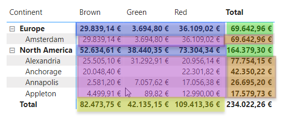
So finally we select our Sales Amount-CF measure in the «Field Value» conditional formatting menu and bam, we have our «Conditional formatting with a dynamic divergent color gradient for values and totals»
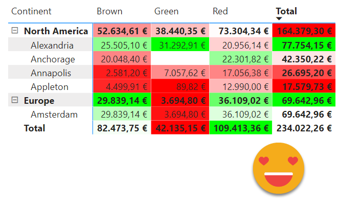
You can even make a tooltip using time intel calc items, the «Label as measure value» and the desired measure. if you disable word wrap for column headers and values, you can hide the calc item column since it does not add much value. This way people will understand why you are painting it red or green.
So hovering a city-color cell you can see, current vale previous year value, absolute change and percentual change — pretty cool huh? 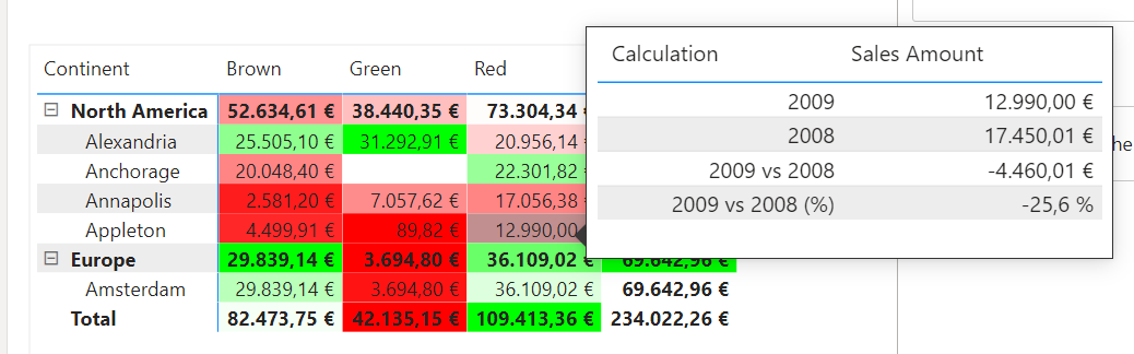
When deciding your logic though, be aware of weird (but logical) results… Why is total for Europe green if Sales Amount decreased in 22,3% ??

Well, the only other cell in the «comparison context» is even worse! -31,2%
 Anyway, now that you have control, you can touch, you can play… you can finally have a dynamic color gradient for values and totals.
check out the pbix here
Thanks for reading!