As soon as I learned how to define transparency in HEX encoding for Power BI, I started thinking on how to control it with a calculation group. After all, you can only define transparency through a color measure, so it made sense. If you have seen any of my most recent presentations on Calculation Groups you might have seen a use case in which I show it’s possible to control the transparency (and light level!) of a color measure with calculation groups. However in such presentations I also say that I’m still looking for a decent use case to put them into practice. Today I’m attempting to do just that with the transparency calculation group.
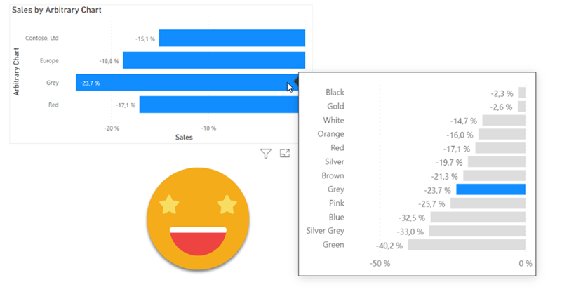
I realize that I use the word «arbitrary» a lot on my blog posts, but then I think, «so what?». Anyway, this blog post is mostly a remake on another blog post, the one called «A truly dynamic tooltip«. When I wrote that blog post, I had struggled a lot to get the effect I wanted, but even though I learned a lot in the process I ended up convinced that it was better to stay out of calculation groups when building such a chart. Well, this is no more. Calculation groups, are ususal, are just fine. You just need to know how to use them.
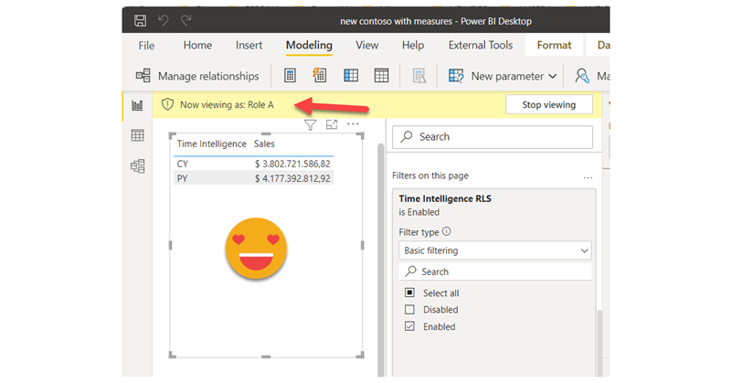
I thought I would let the blog rest for a few days, but I figured out I would write a short one on a topic that Rick brouhgt up on LinkedIn: Controlling Calculation Items with RLS. I lived under the impression that being a table you could just apply RLS like in any other table, but he told me that Power BI throws and error when you try, and sure enough I got the same result. Tried cheating by creating a calculated column in the Calculation group, but the same result. But then I remembered the technique I used on my article on arbitrary two row header tables, and I gave it a try. It does work, so if you’re interested, keep reading. Continue Reading..
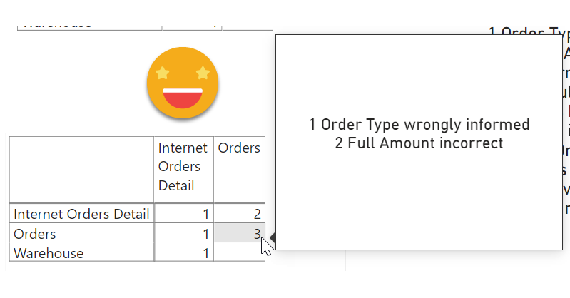
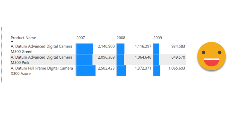
I know, I’m back again at validations, but this time is a bit different. Recently I’ve found myselft in a project where the data that was coming in was not fulfilling the sepcified requirements. We tend to thing that data that comes out of a system will always be pristine, but well, at least in one instance it was not. There were some validations set in place in Access + VBA. But then, even if the access was set out to execute every day you have to go in, check the output, and each file had it’s own validation access. Well, not great. Since the patience was running thin (errors kept apprearing in different places) it was decided that a full validatino check was to be set out. Or at least something much deeper than we had now. I figured out that we might be able to build something in Power BI. Data Validation with Power BI. Odd? yes, but hey, you gotta do what you gotta do.
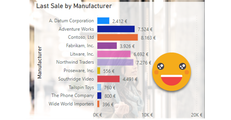
Ok, this is one of those things that I might not do in production unless I have the CEO shouting on my ear «I want the bars of the matrix to be smaller so I can read the numbers, and no, you may not use a custom visual for that!». I know that might be quite a narrow use case, but hey, if the CEO wants it, so be it.
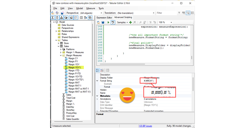
Calculation Groups biggest contribution is to help us reduce the number of measures that we have to create and manage. However, sometimes, me might want measures again… Of course we can forgo the calc group altogether, but we might want to keep the centralized logic while having actual measures, and not measures + a filter as we usually do with calculation groups. The most relevant use case that comes to mind is when we do not want our calculation items to travel to the tooltip or drill through pages, as I discussed in this post not long ago. I guess that for most use cases, creating the measures manually is not the end of the world, but hey, scripting is fun and is cool, so let’s automate that a bit.
It’s a terrible title, but by the end I hope it makes sense
Today I had some spare time and I thought I would do some c# that is always good to keep your mind going. The goal was to create a script that given a base measure, you can then specify a column and a new measure will be generated for each diferent value of the column, in a pattern like CALCULATE([Base Measure], tbl[Column] = Value1 ) and the same for value2, 3 etc of that same column.
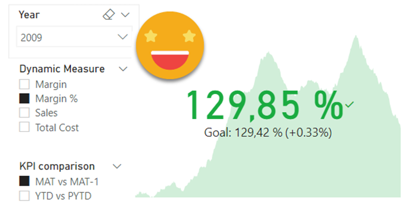
I’m always keep an eye open for potential new members of the Barcelona Power BI User Group. When I see a potential candidate I try to connect and get to know him/her. Today I was surprised that one of these unsuspected new members told me he was already using my script for Time Intelligence (yay!) and followed with a question on calc groups (double yay!). He was trying to build a KPI card which used a measure as the main KPI and wanted to use the previous year value as target, and was struggling to apply the calculation group just to the target one. I gave it some thought and I think the final set up might be useful to more people, so here I come.
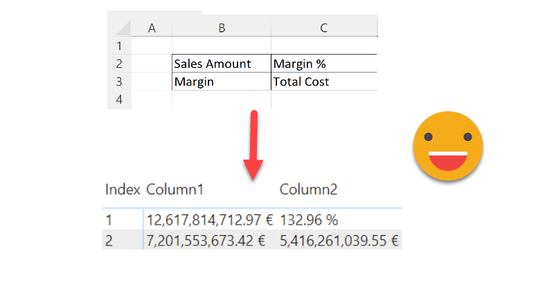
Hello there, this is not an entirely new technique, but then again, maybe the use case will be useful to someone, so I’ll go ahead and put it here. Indeed the idea came once again from the whatsapp group of Power BI User Group Barcelona, great people all around. Paul shared with the rest of us a solution he brought to a question in the Power BI Community Forum. I that thread (and answering the particular use case) a few solutions involved doing it all in Power Query, while Paul brought in a DAX approach to the solution. Beyond the particular use case of the question, this raises the question: how can we show individual measures in a tabular format? Continue Reading..
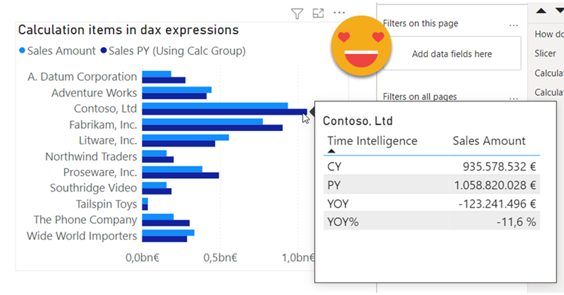
Hello there, quite a while ago I wrote a blog post explaining how to override calculation items in tooltip. Basically, if I’m using calc item A and B in a chart, how can I use A B C and D in the tooltip. My solution was to add 2 extra calculation groups with lower precedence, one to remove filters from the calculation group on the main visual, an the other one (copy of the original calculation group) to recreate the desired calculations. This solution does work, but is quite tedious to maintain if you have changes in the original calc group, and (I’m not sure if it’s related) when combined with the time intel dynamic label calc group, it took A LOT to display the tooltip. I tested again a few days ago and even with my new laptop (i7 32GB of ram) it took like 10s, most of them going to «other» things, not the dax query, so little can be done.