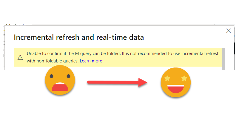
Category: Power BI

Is no secret that if you work daily with Power BI, you should be using Tabular Editor,  but if you are working with lots of different datasets you probably feel like you are doing the same thing over and over again. Then it’s time to bit the bullet and get your hands dirty with Tabular Editor scripts. If you do, don’t start with a blank sheet. Always copy from someone and build from there (that’s what I did!) — there are lots of great scripts out there. Maybe not tons, but certainly lots.

But anyway, once you get going with Tabular Editor C# scripts (now we need to specify if we are talking c# or DAX scripts) you may feel that you are repeating code, and as in any kind of programming, that’s not just a waste of time, it’s bad practice. So, today I’ll share how I’m starting to move my scripting to the next level, creating a custom DLL for Tabular Editor C# Scripts (never did that before!) and making use of intellisense by moving development (or at least the bulk of code typing) to Visual studio.

Continue Reading..

I’ve been meaning to write this post for quite a few weeks if not months, and looks like today I may start finally to do it. The detonator has been that I had to do it at work, and Yuki asked about it on twitter. Too much of a coincidence to let it go.

Conditional formatting when calc groups are involved is a bit more challenging, but as usual with calc groups, once you grasp how they work you can do almost anything you want with it.

Continue Reading..

After a long break due to a truckload of presentations (for my standards) here I’m back again with the blog.

I have a pile of ideas, but always the latest idea takes priority as it is hot, it’s burning in my head.

A guy from the Barcelona Power BI User Group asked me if calc groups could help him in a measure he was running. It’s like a measure of measures. There are several measures that represent different organizational KPIs, and they have a disconnected table in which there’s a target for each measure. He wants to know the percentage of targets that were met.

Continue Reading..

It’s a loooong title (well, it was «Conditional Formatting with divergent color gradient for values and totals»), but it’s exactly what I wanted to achieve when I discovered the limitations of the conditional formatting options in the GUI of Power BI Desktop. The key words are «dynamic» in one hand and «values and totals in the other» I know, some of you may think I’ll be doing some copy-cat article of the crazy video from Bas in which he shows how to use the undocumented (that I know of) function hsla(). A function that you need to leave as text?!? Crazy, just crazy. But no, I take a complete different approach and I think it’s worth the effort! Of course you can take ideas from both me and Bas and come up with your own unique approach for dynamic conditional formatting.

Continue Reading..

If you have worked with Matrix visual you probably have faced the problem: Your end user would like to group all the measures that are thrown in into neat little groups, putting all de Quantity- related measures in one group, all the value measures in another, for example. What I’ve seen so far is that people just struggle with the fact that this is not possible in the Matrix visual, and add text boxes on top, as if the header was indeed a two-row header. But it’s not. And if you have a large matrix that requires horizontal scroll, you’ll know what I am talking about. Can we do any better? Yes. Are calculation groups involved? You bet. Difficult DAX? Not at all!

Continue Reading..

Today’s topic is more like an academic exercise than a production use case, but there are a lot of learnings along the way and I think it’s worth the effort.

The other day I saw a tweet by Igor Cotruta that talked about «text fingerprinting». The idea is embedding the user id in invisible characters so that if the exported data get’s eventually leaked it can be traced back  to whoever exported it. Looks like stuff from a spy movie, so I was quickly on-board in the attempt to reproduce that with Power BI with a Calc Group.

Continue Reading..

Ok, I have maybe gone a bit overboard with the title, but I think it has some advantages over other hacks out there to establish the column widths of matrix, so here I am to explain how I came up with it and how to use it.

The first hack I saw was from Ben Ferris (aka The Power BI Guy) which added a dummy measure with a number of 0 to make the width (having automatic width enabled) and then it would disable automatic widths and remove the measure. Nice. But of course, if new columns appear you’ll  need to set the thing again. Something similar happens with the approach of Bas, who skips the dummy measure thing and instead just plays with the format string to show the evenly wide number. His approach is cooler because you skip the measure thing, but you have the same weak points.

However, Bas’s video got me thinking on the topic and the role of format strings…

Continue Reading..

Ok, it’s a long title, but it’s the best I came up with.

So here’s the story. At work there was a sales report with a nice matrix. On the rows, we had several product attributes like category, subcategory and so on. On the columns it was a bit weird because they wanted to show the day of sale, but also compare with the day of sale from the previous year, and with some particular logic for  comparison: if current year had equal or more days of sale than the previous one, it should match day one with day one and so on. However, if previous year had more days of sale, it should match starting from the back, so day one of sale would be matched with day 2 or 3 of previous year. Anyway, this is just to say that I put a measure saying what was the actual day of sale for current year, and previous year, as well as the actual date, because sales are different depending on the day of the week. Then we had cumulative sales, daily sales, for current and previous year. So far so good. Oh I forgot. On top of that there was like % over forecast measure that was the source of all ills.

Continue Reading..

This may seem trivial, but it did not pop up in my head at first, so might be useful to somebody else.

In sales reports, there are lots of numbers. And if it’s a large company these numbers may be very large. So depending on the visual, the full number may be a bit too much, and having just thousands or millions is more than enough.

Continue Reading..

Hi there. In my previous post on how to set up a «data problems» button I did mention that there was a further improvement to the approach, so here I am to explain what is this about.

As you may recall, in my previous installment on the topic, the user is warned that there is some issue with the data through a button that brings him or her to a page where can see exactly what are the issues, such as unmapped items or any other data issues (dates which are not dates, numbers which are not numbers, duplicates…). Today will stick with the mapping problems. In such case you had to copy the offending items, add them to the excel table, and complete the (manually maintained) extended attribute columns.

Wouldn’t it be wonderful if those items could automatically travel to the excel file?

Well, this is exactly what we’ll try to get to in this post. We are going to do data mapping with table connected to the dataset

Continue Reading..


Contacto

Contacta con nosotros y descubre el poder de la información.

Nombre
Email
Consulta

Ok! Mensaje enviado.
Error! Verifica los campos.
© Copyright 2022 - Esbrina