After a long break due to a truckload of presentations (for my standards) here I’m back again with the blog.
I have a pile of ideas, but always the latest idea takes priority as it is hot, it’s burning in my head.
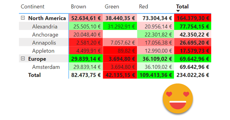
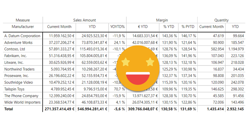
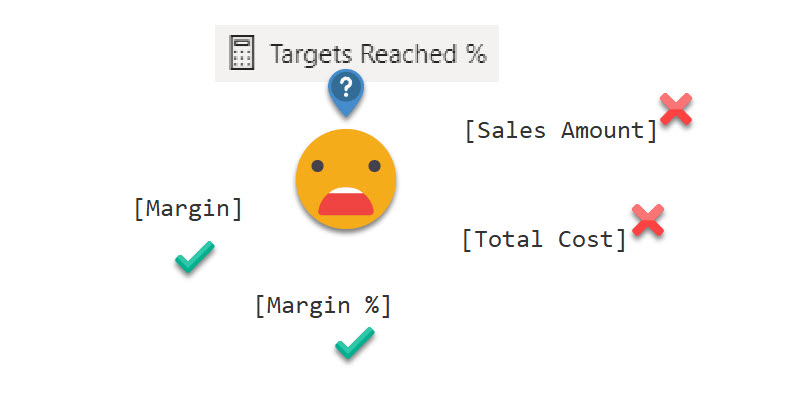
A guy from the Barcelona Power BI User Group asked me if calc groups could help him in a measure he was running. It’s like a measure of measures. There are several measures that represent different organizational KPIs, and they have a disconnected table in which there’s a target for each measure. He wants to know the percentage of targets that were met.