Mysteries of filtering by Measure Value and a Calc Group Workaround

Ok, it’s a long title, but it’s the best I came up with.
So here’s the story. At work there was a sales report with a nice matrix. On the rows, we had several product attributes like category, subcategory and so on. On the columns it was a bit weird because they wanted to show the day of sale, but also compare with the day of sale from the previous year, and with some particular logic for comparison: if current year had equal or more days of sale than the previous one, it should match day one with day one and so on. However, if previous year had more days of sale, it should match starting from the back, so day one of sale would be matched with day 2 or 3 of previous year. Anyway, this is just to say that I put a measure saying what was the actual day of sale for current year, and previous year, as well as the actual date, because sales are different depending on the day of the week. Then we had cumulative sales, daily sales, for current and previous year. So far so good. Oh I forgot. On top of that there was like % over forecast measure that was the source of all ills.
Here for simplicity I created some basic model based on contoso dataset. The forecast is in an unconnected table, like in the original model. There it had an even worse design, where ids of different attributes where in the same column… Forecast was defined at different level depending on the category… stuff of nightmares. In this version is just the forecast at continent-manufacturer-month level.
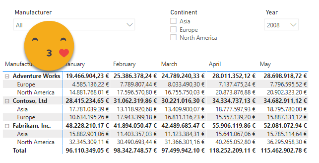
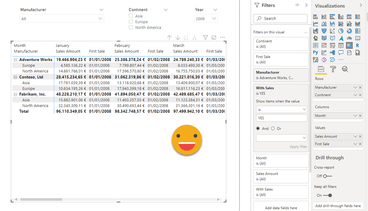
Also important : in this model I did some modifications to make my case, I kept only Adventure Works, Contoso and Fabrikam and I selected rows as if each manufacturer sold in only two continents, but not all three. So a matrix by month and continent looks like this
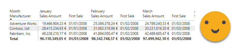
It was all fun and laughs until they said they wanted to include a field from a different dimension (business I think). All of the sudden very weird combinations would show up in the matrix. Combinations which obviously had no sales, but the rows where there. They were very confused because they had used a similar structure in a different sheet without issue. In retrospect, the reason is super obvious: If you have measure that will always return a value, then it will show rows for all possible combinations, regardless if they happen or not in the fact table. To show the effect in our model, let’s imagine we have another measure which does not depend weather or not there are sales, it was the date, but here we’ll just put the date of the first sale, or the last day of the month if there are none. At first without the continent it looks fine.
However, if we add the continent things get weird —
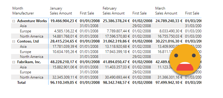
it was weirder in the original but it’s the best I came up with. Why was it showing Asia for Adventure works if *everybody knew* that Adventure works does not sell to asia? Of course Power BI does not know that, and while it’s true the sales measure is blank, the first sale (the way it is formulated) is not, so it shows up in the matrix. And the customer does not like that. What is to be done? Probably make sure that the first sale measure is blank when there are no sales, but I didn’t think in that direction and instead I went on a strategy I had seen in a SQLBI video where a measure is created to check if there are visible rows from the fact table, and used as a visual level filter. Of course he did it on a simple slicer and I went on a big fat matrix, but hey, it worked! so I celebrated and forgot about it completely.
The measure is just
With Sales :=
IF ( ISEMPTY ( 'Sales' ), "NO", "YES" )
And when applied as a visual level filter with «YES» as value, it does the job
Then one day they say, hey, we’re not seeing measureX for that product category, but the rest are fine. Hmmm… looks like data problem. But it was not a data problem. After playing around quite a bit with it, we discovered that the issue came when adding either the weird field to the rows section, or indeed when we filtered by the measure. I tried «the Alberto way» and copied the DAX query from the performance analyzer and tried to make sense of what was going on, as he did on this unplugged video, or even on the lighter version aimed at lay humans. Well, let’s just say that DAX won and I lost. The super-weird thing is that we are 94% sure that this used to work…
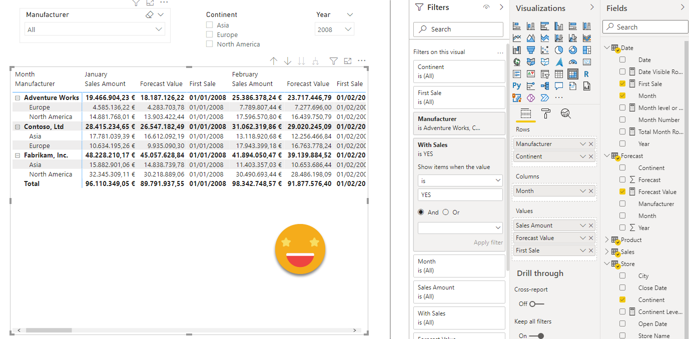
Anyway, in our model the measure will be the forecast, and of course we’ll have the problem from day one, but it’s still quite a mystery (to me at least) what actually happens.
The measure is:
Forecast Value :=
IF (
    [Month level or above] && [Continent Level or Above],
    CALCULATE (
        SUMX ( Forecast, Forecast[Forecast] ),
        TREATAS ( VALUES ( Store[Continent] ), Forecast[Continent] ),
        TREATAS ( VALUES ( 'Product'[Manufacturer] ), Forecast[Manufacturer] ),
        TREATAS (
            SUMMARIZE ( 'Date', 'Date'[Month], 'Date'[Year] ),
            Forecast[Month],
            Forecast[Year]
        )
    )
)
And on itself it has no problems. Here you can see it seems to work fine even when we throw in the continent and the measure value filter
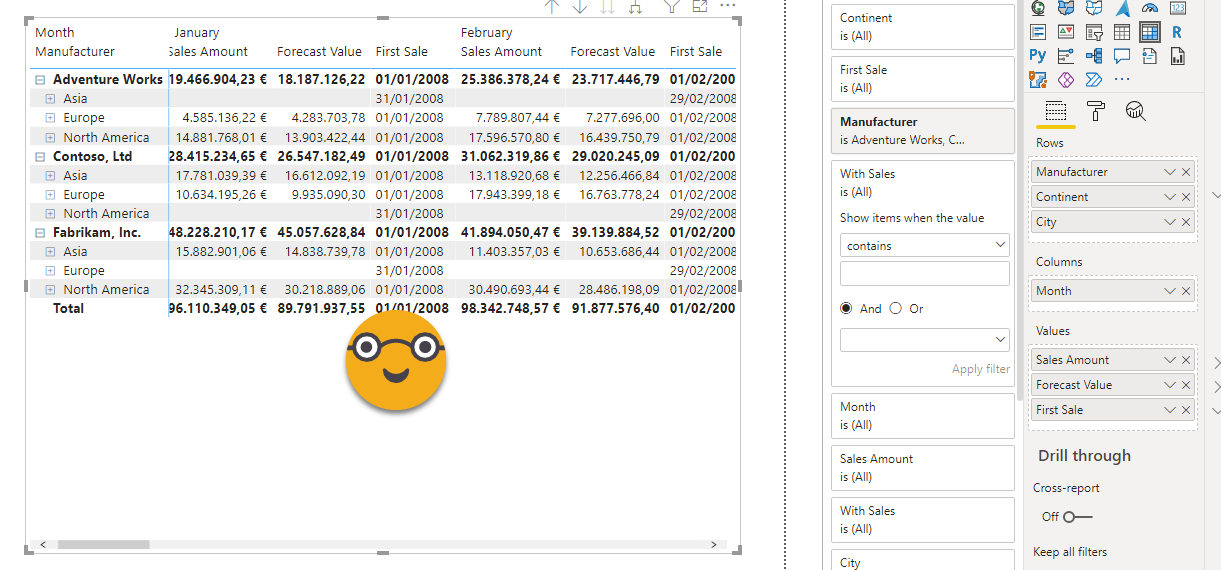
So what’s the problem, you may ask… the problem comes when you add another category in the rows. Even though the forecast is at the Continent level, they want to see the sales at the city level, and nothing fancy, forecast shall be blank at the city level.
see what happens when I do:
![]()
Sooooooooooo weird! it does not even blank for all cells, just some of them! But the values it does show are correct! It’s not auto-exist (I think) because I don’t place two filters on the same table, so it must be some optimization of the matrix visual that messes the filter context in which Forecast measure is evaluated. Here’s the challenge. If anyone manages to formulate the forecast measure in a way that it shows up, it will have my eternal admiration as a DAX God.
But I am no Dax God, and more importantly I had to come up to some solution because lots of people happen to closely look at that very measure in that report. I realized that when removing the measure level filter, even though I saw many irrelevant rows, at least the measure would show all the values. Look for instance at Adventure Works – Europe.
So the question changed — instead of why is power bi not showing my measure, now the question was, can I get rid of the extra rows in any other way?
Let’s go back to the very basics:
Only filter context combinations in which one measure is not blank are displayed.
I had a bunch of measures in the table and I really didn’t want to rewrite them all. If only I could wrap them all with a DAX jacket… wait, this looks like yet another use case for CALCULATION GROUPS! ?
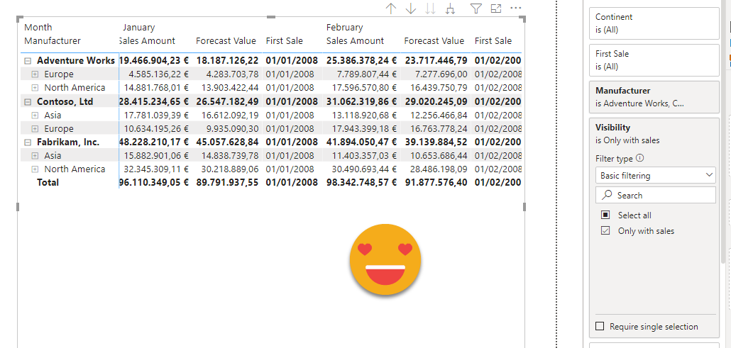
Once you do it, it becomes deceptively obvious — I created a Visibility calc group, with just one calc item:
Only with Sales =
IF ( NOT ISEMPTY ( 'Sales' ), SELECTEDMEASURE () )
And when you place it on the matrix, it just works!
And that’s it! So the main takeaway might be, if you can stay away of measure filters in matrix visuals, do it! If you need more arguments to convince yourself, read this thread by Alex Dupler
Download the pibx, play with it, and take the challenge if you are brave. The real matrix was way worse, believe me. And it is over DQ to PBI dataset, even though the local model has next to nothing and plays no role in this visual. I tried understanding the performance analyzer queries on a copy I did that was over Live connection to keep things «easier» but did not help either.
Thank you for reading! I really appreciate it
Regards!