Category: Esbrina

Ok, it’s a long title, but it’s the best I came up with.

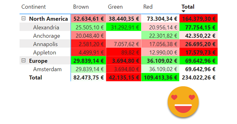
So here’s the story. At work there was a sales report with a nice matrix. On the rows, we had several product attributes like category, subcategory and so on. On the columns it was a bit weird because they wanted to show the day of sale, but also compare with the day of sale from the previous year, and with some particular logic for  comparison: if current year had equal or more days of sale than the previous one, it should match day one with day one and so on. However, if previous year had more days of sale, it should match starting from the back, so day one of sale would be matched with day 2 or 3 of previous year. Anyway, this is just to say that I put a measure saying what was the actual day of sale for current year, and previous year, as well as the actual date, because sales are different depending on the day of the week. Then we had cumulative sales, daily sales, for current and previous year. So far so good. Oh I forgot. On top of that there was like % over forecast measure that was the source of all ills.

Continue Reading..

This may seem trivial, but it did not pop up in my head at first, so might be useful to somebody else.

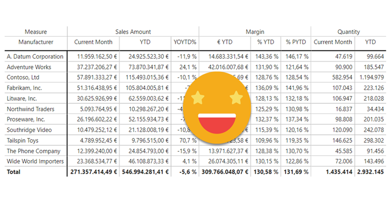
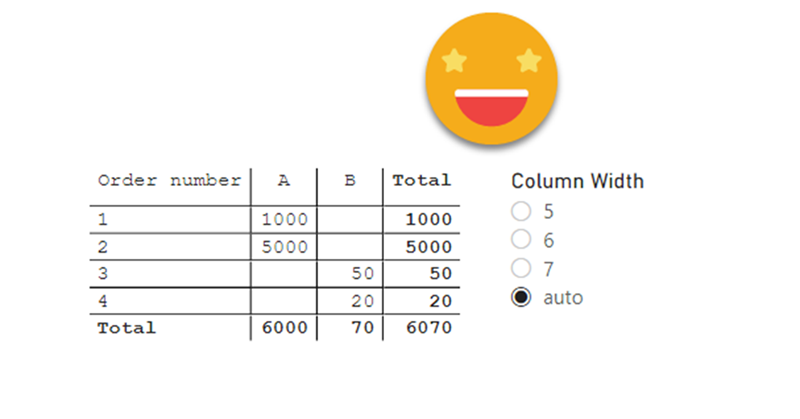
In sales reports, there are lots of numbers. And if it’s a large company these numbers may be very large. So depending on the visual, the full number may be a bit too much, and having just thousands or millions is more than enough.

Continue Reading..

Hi there. In my previous post on how to set up a «data problems» button I did mention that there was a further improvement to the approach, so here I am to explain what is this about.

As you may recall, in my previous installment on the topic, the user is warned that there is some issue with the data through a button that brings him or her to a page where can see exactly what are the issues, such as unmapped items or any other data issues (dates which are not dates, numbers which are not numbers, duplicates…). Today will stick with the mapping problems. In such case you had to copy the offending items, add them to the excel table, and complete the (manually maintained) extended attribute columns.

Wouldn’t it be wonderful if those items could automatically travel to the excel file?

Well, this is exactly what we’ll try to get to in this post. We are going to do data mapping with table connected to the dataset

Continue Reading..

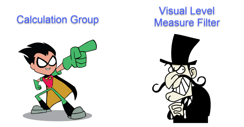
In this post I’ll explain how to break the tyranny of the «all filters» that are passed to the tooltip in particular the filters set by a calculation group which are even nastier to get rid of than regular filters.

It wasn’t intended this way, but this post is sort of a sequel (and not SQL) of my post on dynamic labels for time calculation series, which itself builds on the post introducing the time intelligence calculation group script. If you have not read them you can also watch the video you’ll find on the end of each post — although from the sound quality maybe it’s less painful to read the blog!

Anyway, if you are here probably you know something about calculation groups, and that’s good, because there’s plenty of them coming.

Continue Reading..

I’ve seen it many times. While there is a set of «official» attributes for a product, or a client or whatever, a department may choose to group them through one or more custom attributes. And what do they do? Of course, they create an excel file where they manually maintain a table with the key (hopefully) and all the custom columns. They will tell you that they update it whenever a new value appears in the datasource, but if you double check this statement you might get let’s say «mixed results» at best.

Nothing says «there is a problem» as a red button appearing in your report. And if it offers «actionable insight» on how to solve the problem, so much better. So this is what we’re going to do: A data problem button.

Continue Reading..

As I continue my journey with calculation groups I realize that fewer and fewer people may be interested in what I write, but then I think, «so what?» So here I am.

My script to create a Time Intelligence Calculation Group based on Daxpatterns.com definitions got a lot of attention (for my standards, anyway), so I kept on thinking if there’s anything that would go nice with it.

Indeed, in the latest iteration of the script, there are two measures that aim at providing some sort of dynamic labeling. «Label as Value Measure» is a measure that when in the scope of a Time Calculation of the calculation group, will show the appropriate label taking into account the filters on the date table. For instance, if you select YTD calculation item and year 2008, the measure will show «2008 YTD». And so on. (Label as Format String does the same but using the format string expression so it can be used as sort of dynamic axis labels if you want to place several calculations as the X-axis, but we’ll focus on «Label as Value Measure» which has more general applications)

Continue Reading..

Sometimes we face models which can’t be built because we fall into the circular relationship (which Power BI protects us against) or ambiguity (which sits there silently making all our results meaningless). I faced one of this situations the other day at work and found a workaround with –you guessed it– a calculation group.

Continue Reading..

This is one problem that you don’t realize it’s a problem until you face it.

Happened to me designing a P&L report. For this report, an arbitrary list of items (arbitrary to me of course) has to be displayed in certain order, each with it’s own arbitrary calculation, and even with some hierarchy indentation. Easier said than done, really.

Continue Reading..

This post is based in a true use case. The customer followed the market share trends, to see how it compared to the rest, as a manufacturer, and at a brand level.

So far so good. But coming from excel they were used to build charts any way they saw fit, so they liked to see on the same chart their own year-on-year growth in general as a manufacturer, then in different distribution channels, then specifically the growth of their two main brands, and then the growth on different regions. That alone was my first challenge. But then they said that that they would like to know how others were doing on the tooltip. But of course, when looking at a manufacturer-level value, they would like to see their value together with that for other manufacturers, and when looking at a brand level then wanted to see it with all  the other brands. I added to the mix that it would be nice to see highlighted their own value in the tooltip of course.

Continue Reading..

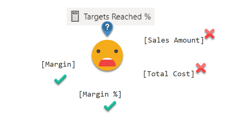
Ok, by now you probably know I’m a liiiiitle too much into calculation groups. Once you try calculation groups there’s no going back. Particularly if you do time intelligence analysis (that is comparing values with the previous year, but many other things as well). The reason is that normally you would create a new measure for each pair of calculation – measure, (e.g. Sales Amout PY, Sales Amount YTD,  Total Cost PY, Total Cost YTD … ). With calculation groups you just create the box that shifts a measure into producing the time calculation that you want.

Continue Reading..


Contacto

Contacta con nosotros y descubre el poder de la información.

Nombre
Email
Consulta

Ok! Mensaje enviado.
Error! Verifica los campos.
© Copyright 2022 - Esbrina