Hello there!
Today’s post comes from an actual requirement that I had heard before but never handled directly. There is some nifty DAX and modeling so lets get to it!
Hello there!
Today’s post comes from an actual requirement that I had heard before but never handled directly. There is some nifty DAX and modeling so lets get to it!
UPDATE: I was kindly asked by Kerry Kolosko to make a Work-Out-Wednesday challenge for this chart, and when I did, I realized that it’s much more simple than I laid out on this article. I keep as proof that finding the best approach is an iterative process! Building the model from scratch also helps. Check out the challenge (and explanation video) here!
Hello there! Time is crazy and I haven’t been updating the blog as much as I’d like to. But here I am and I hope you enjoy it.
This 2024 I took the decision to step up my involvement at Power BI User Group Barcelona and started organizing online events from international speakers. For those that present in English I even do some live interpretation that is recorded and remastered with the video stream so that we get the renowned presenters in both English and in a not-perfect Spanish translation (check out the events here and the recordings here). But why am I speaking about that? Well, first of all to brag about it because these sessions have been awesome, but also because the most recent one is the starting point for this blog post.
Hello everyone
With sqlbits, Easter holidays and a bunch of other stuff i haven’t posted in a while, but I’m back!
Full disclosure, this is a sponsored post, but for a good cause, you’ll see in a minute.
If you follow me on Twitter you’ll know I like swag almost as much as Johnny Winter, and man there was a LOT of swag at sqlbits!
And among all the swag, there is a type of swag that every sponsor and plenty of attendees are into: stickers! Stickers are over the place. Many of the fellow attendees had also plenty of carefully curated collection of stickers on their laptops.
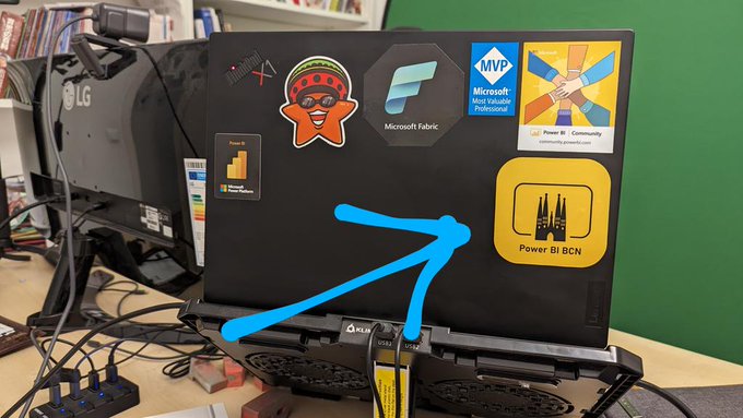
I have around 8 stickers so far on mine, very proud of each of them. The latest member is a sticker from Tabular Editor 3! But I have to confess that the one I’m most proud ofis the one of PUG Barcelona 😀
At PUG Barcelona we have a lively whatsapp group –285 members as of today– where the group exists everyday, so it’s not just the events. We share doubts and resources and we congratulate each other on new certifications or even new MVPs of the group (Mar Lizana just became the 6th current MVP of the group! along with Alex Ayala, Diana Aguilera, Iván Arribas, Ricardo Rincón and myself )
Coming back to the stickers… I have shared the super-short run of stickers I ordered at Stickermule with fellow organizers and I want to share similar stickers with those that come to speak at PUG Barcelona and ultimately, ALL members of PUG Barcelona
All these thoughts though go along with another thought… How am I going to pay for them? The super short run is one thing, but like my wallet, it does not scale. So when stickermule offered a nice amount of credit for a blog post with a link I thought it was an offer too good to pass. (Besides the link, the content of the blog post is completely free)
I did three-inch stickers and they look awesome but are a bit big for today’s laptops, so I think I’ll use the credit to create a bunch of two-inch stickers and give them out at PUG BARCELONA events.
If you want to speak at PUG Barcelona (either in-person or online) let me know! We’ll try to make it work, and if we do, you’ll get a sticker! Think about it!
And if you rather create your own stickers, follow this beautiful link!
–>> custom stickers <<–
Be good and take care!
Hello!
The other day on the PUG Barcelona whatsapp group there was a question regarding the possibility of reversing the selection on a slicer, with a single click. Apparently this is something you can do on Qlik and the fellow member was trying to migrate that to Power BI as the users are used to be able to do it. I thought that you can get somewhat close to that with a calculation group, so why not write a nice short article on it. Let’s do it!
This is a very recurring topic. You carefully build a dataset semantic model for each business process, and when it all looks good in your Power BI App, some top brass requests a top level summary with key visuals from pretty much all the different models. And they ask for it like for tomorrow. What is to be said? In this post I want to go over the different alternatives, each with pros and cons. Some with fewer pros than cons, but still. At the end I’ll present an alternative when the standard options don’t make the cut. Let’s get started.
Hello! Today we leave PowerApps aside, but we head into yet another area way out of my confort zone: Programmatic creation and refresh of custom M Partitions! this is not something I really wanted to do, but I found myself with no other option available. Are you ready? Let’s do it. Continue Reading..
Hello,
The other day I was watching a video from SQLBI and for the first time I had a surprising thought. I thought «Hey, I would not do it like this». In DAX as in other languages, there are some things that are just a matter of style, sometimes is more. Which case is this, is up to you. Today it’s not going to be super-long, I promise.
Hello hello, before the topic cools down, let’s complete what we started the other day. As a quick recap we built a Power Automate flow that will launch refreshes of Power BI datasets only when certain ETL jobs of the server have successfully completed. And not only that, those datasets that read from certain high-demand databases will be limited to a certain number of simultaneous refreshes. If you haven’t read it, go and do it. In this article I want to share how I built the PowerApp to manage the ‘Datasets table’ and the ‘Preceeding jobs table’ we discussed on Part 1 of this series. I’m no expert in PowerApps. What I’ll share is what I’ve learned very recently by googling, asking around and tons of trial and error. If there are better ways of doing it, please let me know! with this out of the way, let’s get started!
Hello hello, it’s been a while since my last post because, well because… stuff, you know.
Anyway, today I want to talk about a solution I put together at one of my customers in order to orchestrate refreshes, so that dataset refresh once the precedent ETL jobs have successfully completed (never before that) and at the same time do not overwhelm the server. I’m sure that there are a thousand other ways to do it, but I have not seen many articles on «Dataset refresh orchestration with Power Automate» so I thought that could help others facing the same struggle. In this first part I’ll focus on the Power Automate side of things and I’ll leave the Power App for the second part. Let’s start:
I know, it’s a terrible title, but it’s the best I could come up with. This blog post is to explain a workaround for a behavior I detected while playing with a field parameter (all measures) and a stacked column chart. The problem is as follows: If you have more than one measure in the chart, you can define a color for each measure and all works fine. However, if you filter your field parameter table in a way that only one measure is used in the chart, then that color is ignored and you get a default color. What’s even worse is that the same color will be used whenever a single measure is included, so you can’t even configure it again to get the right color. Fighting the same issue? Keep reading!