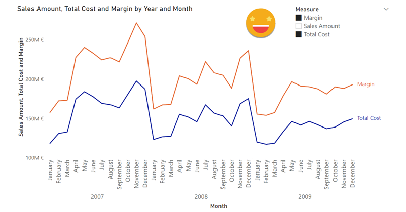
Hello, hello. After another round of presentations that dried my spare time to blog, just today a new use case came to me through a question in the whatsapp group of the Power BI User Group Barcelona. The goal was to be able to select the measures that should be displayed simultaneously on the same chart. The key here is the plural thing. Otherwise just use the famous script to create a dynamic measure calc group from Johnny Winter and off you go. But here the need is to select the measures from a simple slicer. I want to se measure A, B and D but not C.
******
Update 2022-06-24: This whole article both wrong and obsolete. First of all it’s wrong, because all the fuss I go about not being able to select more than one measure with a regular dynamic measure calculation group is just plain wrong. You just need to add the calculation group to the legend part of the visual and voilà, each series will be applying a single calculation item and all will be fine. You can use an external slicer to control which items should be displayed. Heads up to Jeff Weir for pointing it out — totally embarrassing from my side! The thing though is that the article is also obsolete, since as of today you don’t really need any calcualtion group for this use case anyway. Just use a Field parameter and that’s it, end of the story. So yes, I’m just leaving this here as a proof that I can be completely wrong sometimes and that the community (and Power BI itself) is awesome.
*****
It’s true we could just run several time Johnny’s script and create several calc groups, but that would be awful in several ways, the main one being that we would have to select one measure in each selector. Also, the color of the line would relate to the dummy measure underneath, so «sales amount» would display in different colors depending on the slicer in which was selected. Also you would have to create a new calc group for each new measure you want to put in the chart and redo all of the existing ones. it’s a big NO-NO.
The approach I suggest is much easier than this and the result much more convenient too.
Step one: Disconnected Table
Create a disconnected table with all the names of the measures that you want to display in the chart. The names must match the exact names of the measures that you have. If you don’t like the names of the measures (because it’s too long or weird) create a table with two columns, the measure name and the display name you want to use. If you do it with DAX, something like
'Measure Names' =
SELECTCOLUMNS (
    { "Total Cost", "Sales Amount", "Margin %", "Margin" },
    "Measure", [Value]
)
Step two: Throw all the measures into the chart
You need to put the actual measures in the chart. Of course you cannot use the «Legend» box, but that makes sense, what is supposed to happen if you put more than one measure and a legend field? Anyway, your chart might get crowded, but we’ll solve that in a minute.
While you are at it, disable the regular legend and enable the Series Labels.
Step three: Jump in to Tabular Editor and create a calculation group
I would call it «Measure Visibility» but it’s your call. You can create a «no effect» calc item if you want, but the one that will produce the effect should be named something like «Only Selected» to get an idea. Following Marco Russo’s lead, I’ll paste here the DAX Script for it (do not paste it as is into the value expression!)
------------------------------------------
-- Calculation Group: 'Measure Visibility'
------------------------------------------
CALCULATIONGROUP 'Measure Visibility'[Measure Visibility]
    Precedence = 1

    CALCULATIONITEM "No Effect" =
        SELECTEDMEASURE ()

    CALCULATIONITEM "Only Selected" =
        IF (
            SELECTEDMEASURENAME () IN VALUES ( 'Measure Names'[Measure] ),
            SELECTEDMEASURE ()
        )
Step four: make it work!
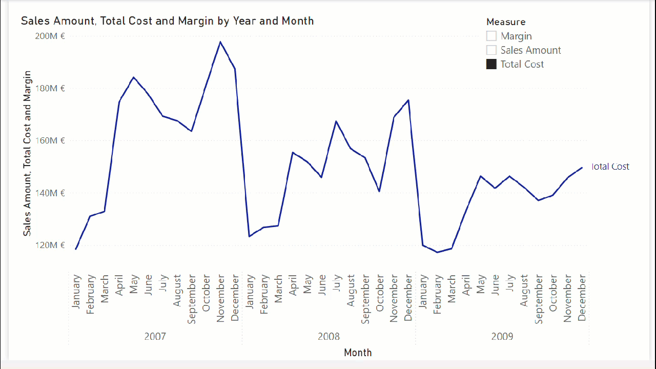
Put the column of the disconnected table into a slicer and the calculation item «only selected» in the visual level filters of the chart. And that’s it really.
If you don’t believe me download the PBIX and check it out directly. A Multiple Measure Selector in Chart is possible after all.
That’s all, thank you for reading!
PS. you may have realized why I asked you to turn on the series labels, and the reason is that it does not really make sense to use a regular legend if not all series are displayed. Also for the Y-Axis labels, you might want to hide the title, or use a dynamic one.