This is a very recurring topic. You carefully build a dataset semantic model for each business process, and when it all looks good in your Power BI App, some top brass requests a top level summary with key visuals from pretty much all the different models. And they ask for it like for tomorrow. What is to be said? In this post I want to go over the different alternatives, each with pros and cons. Some with fewer pros than cons, but still. At the end I’ll present an alternative when the standard options don’t make the cut. Let’s get started.
Context
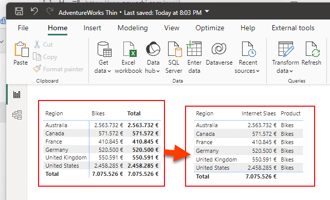
We’ll play with two models and two reports, like this:
For each report we already prepared an aggregated visual, which might be the one that the CEO wants to see.


Option 1: Dashboards
There is a functionality that has been there forever for this specific use case, give an overall glimpse of key visual objects of different reports. They are called «dashboards».
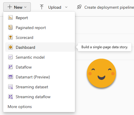
They are created in the service and allow you to bring together visual objects from different reports of the same workspace. The pros include that they are very simple to set up, and with some patience you can somehow configure them a bit, put some titles and so on. If you really need to, you can even pin a whole report page.
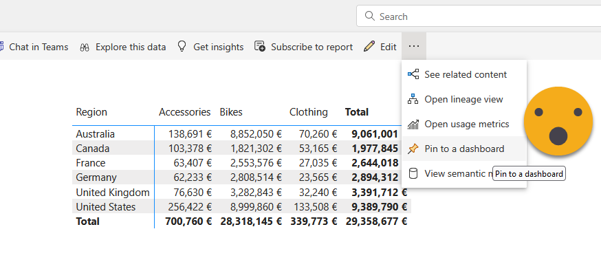
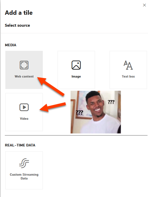
Oh, if you want you can also add other stuff — including stuff that you don’t really need.
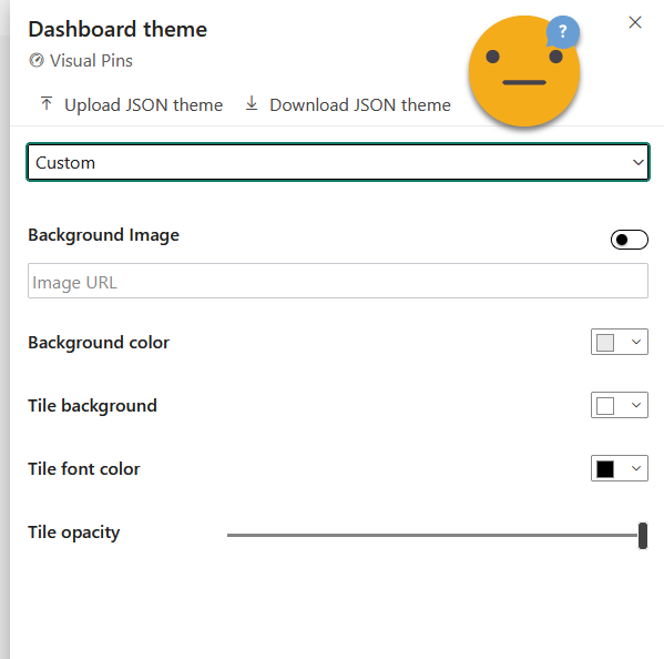
If you really want to get fancy, you can even change the Theme of the dashboard, although the options are quite limited. I wonder if more is possible through the JSON, but I swear I have NEVER seen anybody even talk about that possibility.
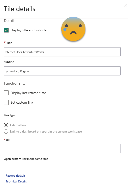
The problem? For starters, the configuration options are rather limited in general. Particularly if you resize things, there are rather large steps on size, so chances are that you will not find a size that suits you. Also, you can’t change any of the formatting of the charts directly, so you’ll have to prepare them in the original report and hope for the best or try your luck through the Dashboard theme thing. Manually for each tile you can change only the text of title, subtitle, show the refresh time (even though this one does not seem to reflect the truth on my end at least) and change the link. Forget about fonts, size, colors etc. By default the link brings you to the same visual but inside the report. At best you land on a page that offers some more detail or possibilities to drill through or filter the data.
I’m not finished with the cons yet. You can’t really change the filters that are applied to a tile, beyond removing the tile and adding it again with some filters. So if you want to show the current month, you will need a «Current month» column on your date table and have the filter set to «current month». That makes inconvenient to say the least. Yet the big deal breaker is yet to come: The different tiles are disconnected from each other, and whenever you click a visual object you jump into the original report (or elsewhere if you modified the link). They are smart enough so that if you add the dashboard in an app, clicking on a visual will bring you to the report in the app. From my experience in different customers, people mostly hate them. Both developers and consumers. Even beyond the limitations «by design» the overall experience feels half-baked. There has not been any improvement there for years, so don’t expect improvements. They are likely to stay as they are today.
Oh and I almost forgot: All reports must be in the same workspace. That’s a deal breaker in many cases, because even if you are willing to have a thin report on that workspace pointing to a dataset in another workspace, you will need to manage the dataset permissions so that everyone who can see the dashboard has at least read permission on the dataset.
Option 2: Scorecards
This option was sold as a revolutionary breakthrough. The answer to the Dashboards that everyone was waiting for. Like dashboards, they are created in the service.

Basically you can define KPIs either manually or by connecting with a value in a report. If you do the latter, the scorecard will go pick the value every day and then you can see how it evolves over time. You can do the same with the target for that KPI and even set a status.
The status can be set to automatically change with Power Automate depending on the values, and you can even trigger actions if the status changes and so on. Oh and you can even bring in qualitative data via «check ins» in which you can explain why are on track or not for example. The reports can be from any workspace and the scorecard has it’s own dataset where it will historify the values of the KPI. So far so good.
But I have not seen yet a single successful implementation of a score card. There are quite a few things that make them undesirable. While preparing this article I forced myself to revisit the feature and since I last tried them there have been some improvement, although I think the last improvements came already long time ago so well, they might stay as they are now.
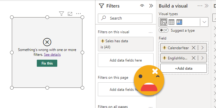
Information density was a problem. Normally you just don’t follow a KPI per se, you follow a KPI across one or more dimensions, like Sales per country, or per store, or per product category and so on. When I tried scorecards for the first time (when they were called «Goals») the only way was to create n KPIs, each from the same measure but with a different filter. Now you can define one or more hierarchies built by columns of the model (I wonder what it does if you have different models…) and from there you can use the hierarchies to either filter the values of the scorecard, or to build a heatmap where you end up seeing sort of a matrix, sliced by the selected levels of the hierarchy. From what I’ve seen though more than one level of the hierarchy does not display in a way that makes it easy to understand that is being filtered by 2 dimensions. In the image, the first «Red» represents Red product sales in germany, the second Red is the total Red product sales. Pretty much impossible to tell without showing the tooltip, and not customizable at all.

So there has been some improvements, even though these remain in preview for a long time already. Also, score cards look all the same and it’s not easy to see progression over time, so use cases are quite limited in my opinion. Anyway, in some use cases it might be an option, but in general there’s at least one hard requirement at some point that you will not be able to fulfill with scorecards and then you need to forget about them completeley. Proceed with caution. Also I’ve heard terror stories in which KPI’s stop refreshing. I was let down once when I tried to implement one scorecard for real, so I’ll think twice before trying it again. The fact that there have not been any improvements lately makes me think that Microsoft has given up on Scorecards too.
Option 3: Direct Query all the things
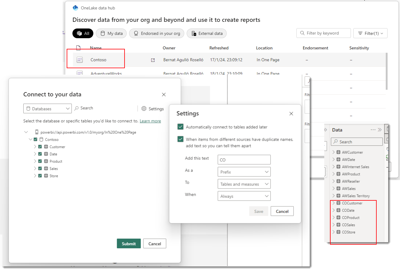
Believe it or not, some people are building terrible composite models just to satisfy the «one page» rule of their bosses. One way to build such a report is to download one of its reports as a «thin report» connected to the dataset in Power BI Service. Of course you can also start from scratch by selecting a Power BI dataset from the possible data sources.
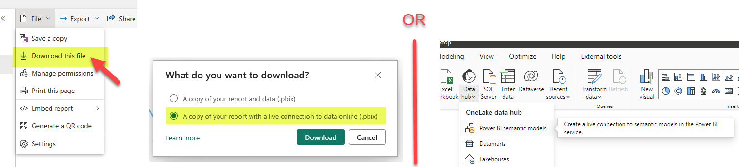
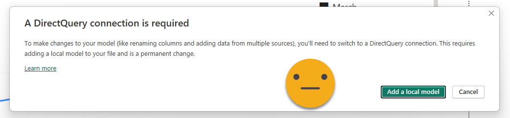
The next step is to connect to the other dataset. This time we have to do it as adding a new data source, and will be prompted to add a local model.
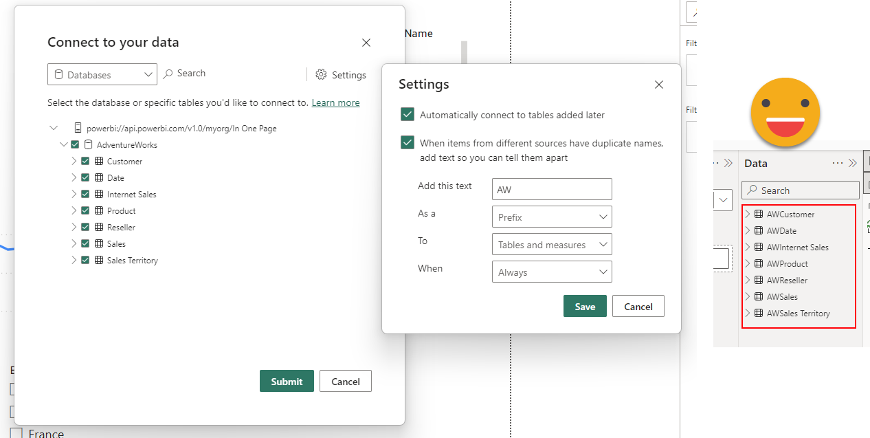
The first thing that we’ll see is that it will ask if we want to keep all the tables of the (now remote) model and if we want to add some prefix to prevent a full mess later when we add more tables. If our plan is to connect to more than one model, definitely use this.
However, will not fix the report for you, so if you want to go down this path you might as well want to start from scratch…
Once the connection to the original model is transformed into direct query, we can select other models to connect to. This was AdventureWorks, let’s connect to Contoso.
Connecting to a second dataset will prompt us about the data risks of doing so
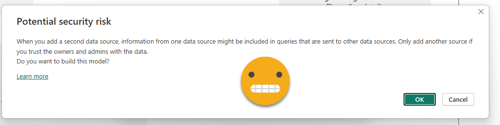
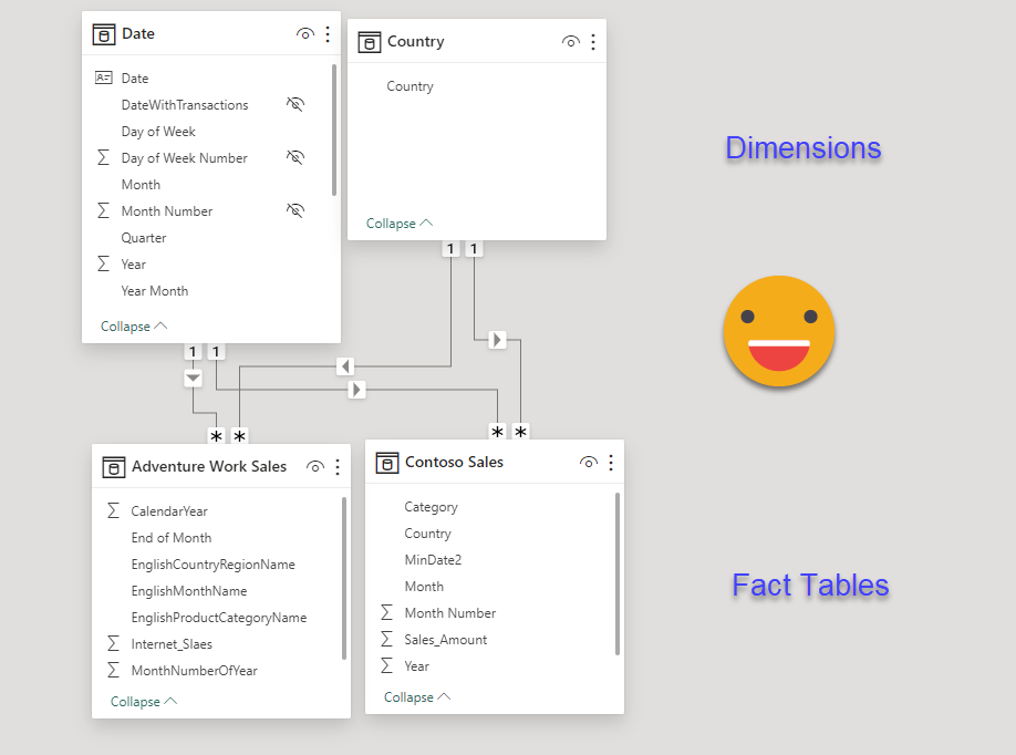
From that point on, instead of a live connection we will have DirectQuery connection with both datasets. Meaning that queries will travel from our local model to each of the remote models, and data will flow back which might in turn be further transformed to be able to render the visual object. If you head over to the model you can see which tables belong to each model, by the color of the header. If we had any local tables they would be displayed without any color (or black, can’t remember).
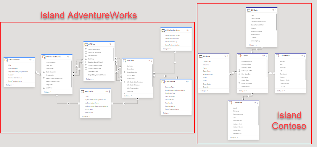
So we have them somehow in the same place, but now what? One option is to build the visuals using only tables from the same model. That will make the performance be less bad, since at least all the values will be calculated on the same place. But what if you want to put some common filters, such as Date? One terrible option is to start creating relationships between tables of different islands. Don’t do it. Another is to create some local tables that will filter both islands, but that might be a bit tricky too if the tables are not coming from the same original table. In any case do not add any more granularity than you need in this local tables. If you just need to slice by brand, don’t bring the product Id on the local table, the key here is to try to limit the size of the filters traveling back and forth.
There is yet another way of syncing filters from tables in different islands that is very effective and it will not be a mess to set up. It has probably been there forever, but I have learned about it only very recently in a master class by Claudio Trombini. Basically you can sync slicers from different fields if both slicers belong to the same «slicer group». This is a setting that you can configure in the advanced options of the slicer sync panel! I’m not lying, go and check it out.
So, on the plus side, with DirectQuery approach you are reusing the logics of the original model, and since it’s direct query you don’t have to worry about orquestrating refreshes. Also you are not limited to datasets of a single workspace, but of course anyone who should be seeing the report needs at least read permission of all the remote models, so keep that in mind. In DirectQuery performance can easily be bad or terrible if you add local tables filtering the remote islands, or create relationships between islands, but they also have another shortcoming: Reports do not render if consumed through an embedded capacity. Not a report I built personally, but I saw the problem first-hand. So I’m not saying there is no use case where this might be the best approach, but really, don’t.
Option 4: The mother of all models
Some people feel they are left with no other option but to just bring all the tables in the same model and hope for the best. This is of course a terrible solution as it requires (1) managing a monster model (2) make sure that the monster model and the regular models use the same logic for data transformation and analytics. On the plus side of things it is import, so performance should be ok-ish (it’s huge, remember) and is a proper report so you can put things the way you like. Having a single date table is now fine, but you’ll have to take care on how to keep your mental sanity if you are loading diferent «sales» tables that for some reasaon cannot be combined into a single table. Actually if you combine them, you will have to be careful with developing a logic that returns the result of the independent model, so it’s not fun. And having only a single model for the company with a zillion reports hanging from it does not look like a great idea either even though some purists may like it, it’s not quite feasible in the real world.
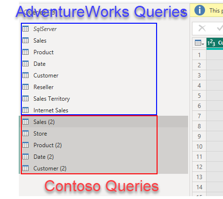
One possibility is to just copy all the queries, and take it from there:
Of course it does not make sense to bring it much more detail than you’ll need for the visualizations that you need for the CEO. Unless of course you plan on using this model for everything, but this is a terrible idea IMO. The model is huge so people connecting to it might get easily confused. Perspectives help in that front, but in some orgs they have defined a «master model» and automated the creation of smaller verions of it — Michael Kovalski’s blog post is the place to go if you want to try this. Not easy, be warned.
Anyway, if you are building it just for the CEO, you should pre-aggregate data and bring only the tables you need. You will still be in charge of replicating the logic of the measures of the models you are integrating, and of course keep updating it if these logics change. Not a great life-plan if you ask me.
What if we could import aggregated data reusing the logic of each model? What if we could bring just the data we need for the visuals we need to keep it simple? Well, be my guest and follow me on the next option.
Option 5: The «daughter» of all models
Wait what? Yes! «The daughter of all models». This is the option I really came here to talk about but ended up doing a full article on the different options. The idea is: Instead of building from scratch a model that includes all the data from separate models and needs to replicate all the logic, we can build a model that brings some aggregated data using the original measures of the different models, just enough to build the high-level visuals. For this we’ll need premium capacity on the workspaces where the different data models are stored, but with Premium Per User and the new fabric capacities that’s not such a tall order as it use to be (fabric = premium).
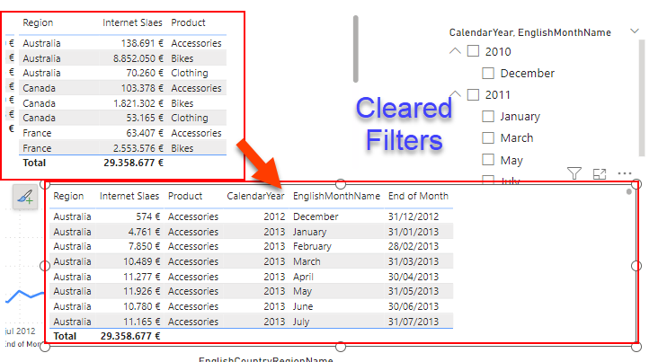
Step 1: For each of the models, create a thin report and build the visual object that you would like to have in your unified report.
(we already have that and we’ve seen how to create a thin report in Option 3)
Step 2: If it’s not a table, convert it into a table.
Step 3: If it needs to be filtered by one or more slicers, add the fields of the slicers in the table.
Step 4: Look at the measures, are they additive? If they are a percentage, add the measures required to calculate the percentage. If they are distinct count, add the column over which the distinct count is calculated.
Step 5: Open the performance analyzer, and refresh the visual object.
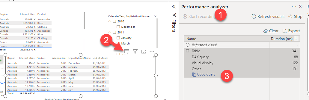
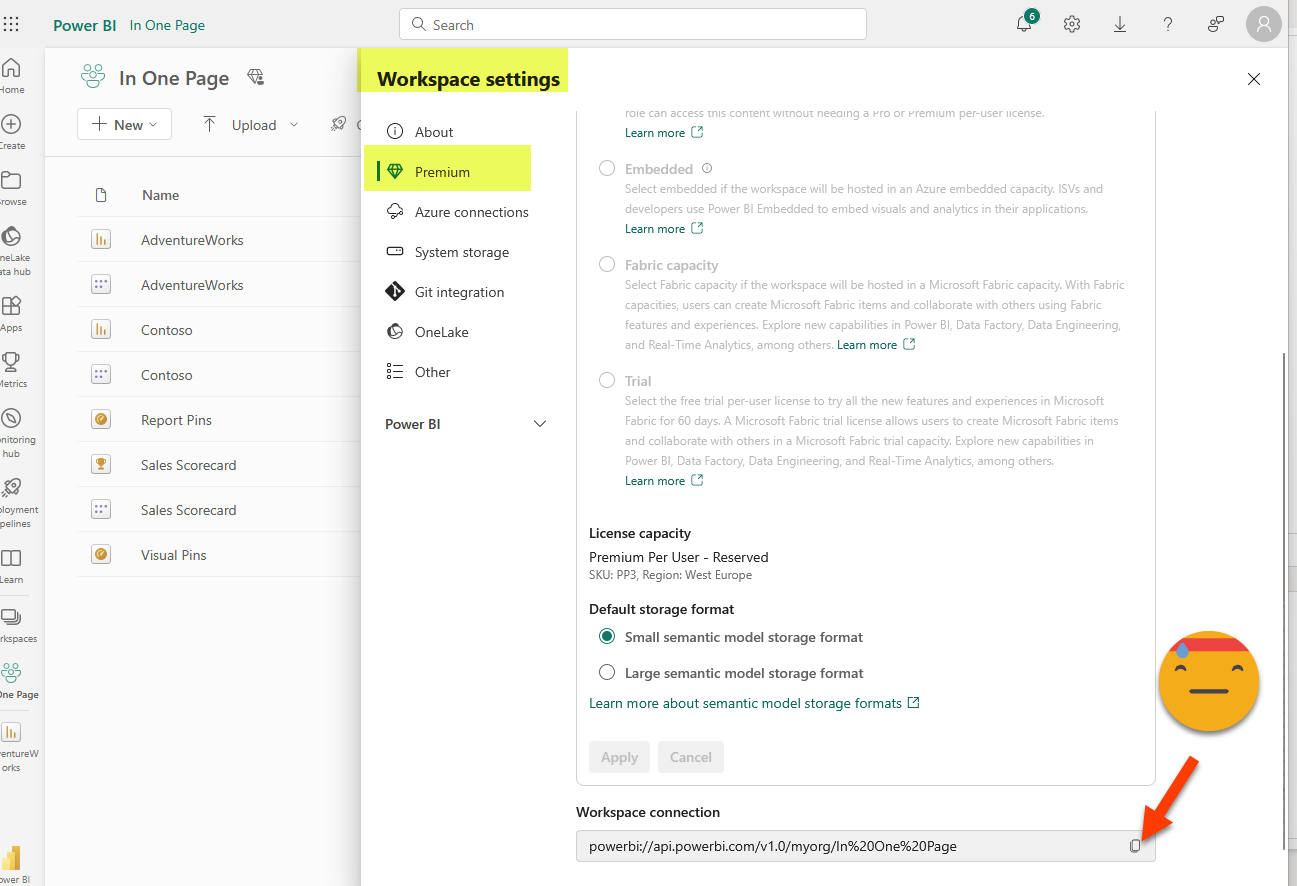
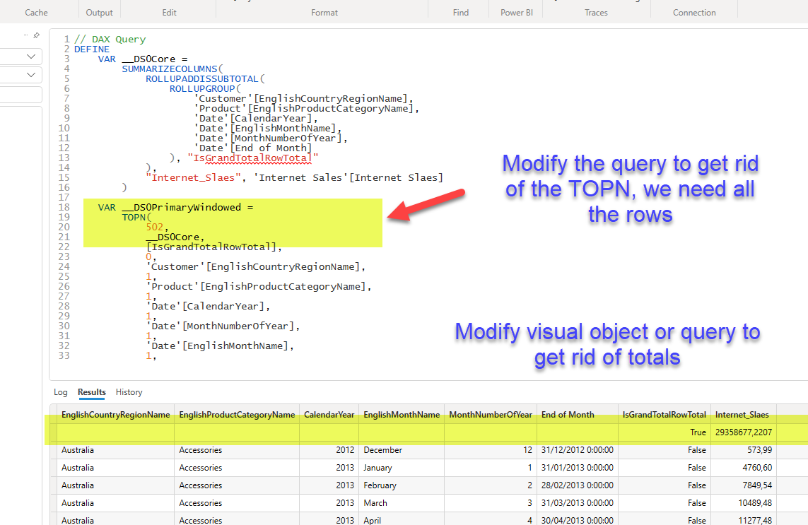
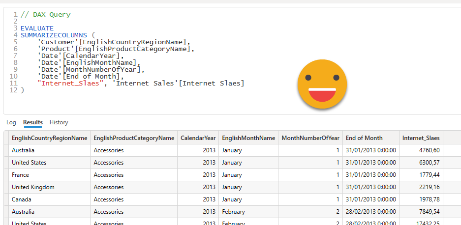
Step 6: Either copy the query into DAX studio (or open it in the Query view: not available yet in thin reports). Confirm that using the result of the query as source data, you can build the visual object you need. You might need to modify the query to avoid having total rows. To connect to the model from DAX studio you’ll need the XMLA endpoint. You’ll find it in the workspace settings, under «premium» at the very end.
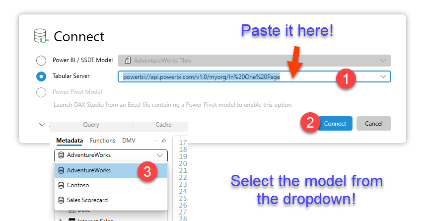
Paste the query copied from the Performance Analyzer «Copy query» link
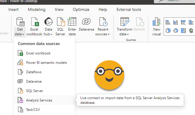
Step 7: In your new model (the daughter of all models) go to Get Data and chose «Analysis Services»
Step 8: For server, use the XMLA endpoint of the workspace where the source dataset is stored. For database use the name of the source dataset. Under advanced options, paste the DAX Query from Step 6.

If you happen to be a guest user on the tenant where the source dataset is stored, make sure to modify «myorg» in the XMLA endpoint with the tenant id of that tenant. You can get it by clicking on the question mark on the top right in Power BI Service, then going to the very bottom on «About Power BI» and you’ll find the id at the end of the «URL of the tenant»

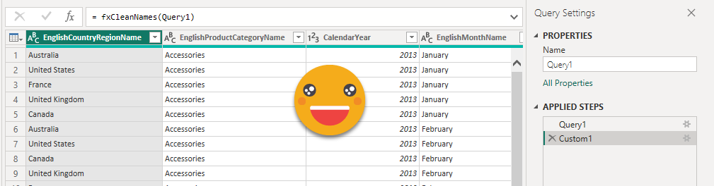
Step 9: The result of the query from step 6 should now be a table of your new model. Headers of DAX queries come with table prefixes and ugly square brackets. Clean these up with some power query before you load them into the model. Since you’ll have to do it for all tables, you might as well use a function fxCleanNames, defined as:
(t as table) =>
let
    Source = Table.TransformColumnNames(t,each Text.BetweenDelimiters(_,"[","]"))
in
    Source
Repeat for each visual object required from each model. Of course if two visual objects are aggregations of the same data, you might be better of with a single table combining dimensions from both visuals. Remember that non-additive measures need especial care. That being said, CEOs basically care about sales, and that’s additive.
Step 10: Load the required dimensions or aggregated dimensions necessary to be able to filter the different tables if so required. Create the necessary relationships. For a Date table, feel free to create it with dax «if you so desire». Or you can even get Bravo to do that for you (not super fan of all the auxiliary tables it builds if you add holidays and so on though). For the countries we can do something like this:
Country =
VAR contosoCountries =
    ALLNOBLANKROW ( 'Contoso Sales'[Country] )
VAR adventureworkscountris =
    ALLNOBLANKROW ( 'Adventure Work Sales'[EnglishCountryRegionName] )
VAR result =
    DISTINCT (
        UNION (
            contosoCountries,
            adventureworkscountris
        )
    )
RETURN
    result
Step 11: Create the measures on the new model. These measures will always be super-simple, as a SUM of a column, or a Distinctcount. If we are dealing with a percentage, like a Margin %, then it will be just an AVERAGEX on the table by the column of the measure. If you find yourself doing more difficult stuff maybe you need to rethink the shape of your queries. Remember that the idea is to reuse the logic of the original models.
Contoso Sales = SUM('Contoso Sales'[Sales_Amount])
Step 12: Create the relationships in the model
Step 13: Create the visual objects that the CEO needs and publish to Power BI Service. The report will not win any design prize, but hopefully is enough to make my point
Step 14: Last but not least, schedule the refresh of the new model to happen after all the source models. This time we are doing Import which is all nice and good, but we need to make sure that «the daugher» of all models is refreshed *after* all the source models have been refreshed. This solution I wrote about might come in handy.
Recap
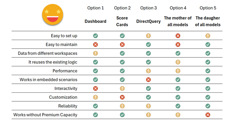
By now you probably wish a summary table comparing all 5 approaches, and me too. Let’s have a look at it and call it a day.
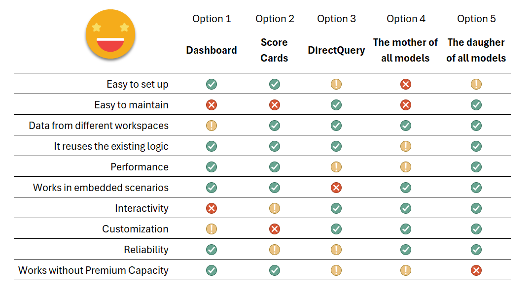
As you see it’s not one size fits all, so depending on what is most important for you (and your CEO!) you might want to choose one way or the other. It’s good to know all the possibilities because this is something that comes back time and time again so it’s best to have a good preparation before diving headfirst into any of these solutions as they all have weak points. I hope you discovered Option 5 and may consider it in the future.
And without further ado, I’ll wrap it up here. This turned out to be waaaay longer than I anticipated.
Take care, and follow the conversation on Twitter and LinkedIn.