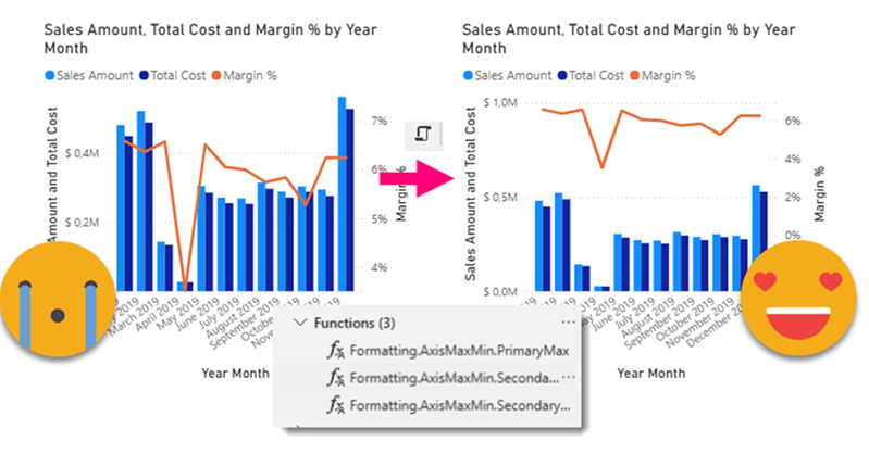
Ok, this article brings together all the topics that I’ve had in my mind lately. I have talked in the past about Visual calcs and how they break when you swap a field by another, and also how you can play with them to make the line of a combo-chart fly above the columns. As I said at the moment… «I can’t wait to encapsulate all this logic» or something to that effect. Well, the day has come. But just encapsulating logic in a UDF still leaves with the hassle of creating each of the visual calcs, and assigning them to the max and min of both axis (whats the plural of axis??). What if we could automate *ALL* of this in a C# Script??
So, we want to automate the whole trick of making the line of a combo chart fly always above the columns, no overlaps allowed. In order to achieve this we will need to:
- Identify the Combo chart to modify in a PBIP+PBIR report
- Add (if necessary) 3 DAX UDFs to the model
- Add (if necessary) 2 measures to the model that we’ll use as global parameters
- Add the two measures to the columns of the combo chart, hidden
- Create 3 visual calcs (hidden) using the recently added functions, passing the new measures and values of the chart as parameters.
- Configure the main and secondary axis to use the visual calcs and ensure the line flies always above the columns
The first key aspect to keep in mind is that we will need to modify the model and the report. Unless you have them separate from each other in different files, this is problematic as we need to save the file to keep the changes on the model, but we don’t want to overwrite the modifications done in the report layer.
What do we do then?
So the idea is to check if any changes are need on the model were necessary and if so ask the user to commit changes and save the file and run again the script. Of course the script will need to check if all the elements needed (the functions the measures etc) are in place before running the modifications on the report layer.
As I explained in this article avoiding asking the users things that can be queried automatically is a best practice when writing scripts. And annotations are a great way to keep track of who is who, so even if the user changes the name of the item, the macro will continue to recognize the element.
This is something I’ve done one way or another in many scripts so finally I decided to encapsulate it properly in the custom class.
public static Measure CreateMeasure(
    Table table,
    string measureName,
    string measureExpression,
    out bool measureCreated,
    string formatString = null,
    string displayFolder = null,
    string description = null,
    string annotationLabel = null,
    string annotationValue = null,
    bool isHidden = false)
{
    measureCreated = false;


    IEnumerable<Measure> matchingMeasures = null as IEnumerable<Measure>;
    if (!string.IsNullOrEmpty(annotationLabel) && !string.IsNullOrEmpty(annotationValue))
    {
        matchingMeasures = table.Measures.Where(m => m.GetAnnotation(annotationLabel) == annotationValue);
    }
    else
    {
        matchingMeasures = table.Measures.Where(m => m.Name == measureName);
    }

    if (matchingMeasures.Count() == 1)
    {
        return matchingMeasures.First();
    }
    else if (matchingMeasures.Count() == 0)
    {
        Measure measure = table.AddMeasure(measureName, measureExpression);
        measure.Description = description;
        measure.DisplayFolder = displayFolder;
        measure.FormatString = formatString;
        measureCreated = true;

        if (!string.IsNullOrEmpty(annotationLabel) && !string.IsNullOrEmpty(annotationValue))
        {
            measure.SetAnnotation(annotationLabel, annotationValue);
        }
        measure.IsHidden = isHidden;
        return measure;
    }
    else
    {
        Error("More than one measure found with annoation " + annotationLabel + " value " + annotationValue);
        Output(matchingMeasures);
        return null as Measure;
    }
}
This is the script to create a measure. You see even a simple thing becomes long when you want it to be a bit more sophisticated. You just pass all the parameters to create it, but it will check for you if a measure with the same annotation, or the same name already exists. If so it will return it, otherwise it will create it. Then of course, even if the annotation is supposed to be unique, nothing prevents the user from copy pasting it with Tabular Editor or TMDL View. In such cases you could make the user choose, but maybe that’s overkill as it’s highly unlikely. So the alternative is to give a controlled error and call it a day.
The best part is that this long code gets tucked away in the custom class, and in your main script it looks super clean, like this:
Measure globalPaddingMeasure = Fx.CreateMeasure(
    table: formattingTable,
    measureName: "GlobalPadding",
    measureExpression: "0.1",
    out globalPaddingCreated,
    description: "Global padding to apply to secondary axis max calculation (10% by default)",
    annotationLabel: "@AgulloBernat",
    annotationValue: "GlobalPadding",
    isHidden: true);
if(globalPaddingMeasure == null) return;
Similar code can be created for any object of the tabular model, including DAX UDFs or tables. If you want to create a measure in certain table, maybe the table is already there, maybe you need to create it. The code would be quite close.
A key aspect of this script is the «measureCreated» boolean parameter. This is a value that will be assigned on the variable (globalPaddingCreated variable in the example above) that was passed to the function and will work as flag to know if the measure was created (rather than just found) in the model. If something was created is time to commit the changes and save the file, otherwise the show can go on with the report layer modifications.
if (globalPaddingCreated
    || lineChartHeightCreated
    || secondaryMaxFunctionCreated
    || secondaryMinFunctionCreated
    || primaryMaxFunctionCreated)
{
    Info("Some elements were added to the semantic model. Commit changes to the model, save your progress and run this script again");
    return;
}
Obviously this system is not fool-proof. If you run the script again even without commiting the changes, it will find everything and will continue with the report layer modifications, but then when you want to see the changes in the report as of today (Oct. 10, 2025) you will need to close the pbix file and open again and then what are you going to do? If you save the file you might loose the modifications on the report layer (not 100% sure on this one, but sounds like a very bad idea). If you don’t save the file you will lose the modifications on the model, so the report will fail as it will be calling elements not present in the model. So, do the right thing and commit and save the changes when asked to do so.
Report layer scripting baby!
As usual, the bit on the reporting layer was much more challenging, but the beauty is that all the code that I’ve built so far can be easily reused as it’s already in custom classes. Thus, initiating the report (i.e. converting all those files of the PBIR format into a usable object) and asking the user to select a visual was quite straight forward. I added a list parameter where you can specify what types of visuals do you want to let the user select:
ReportExtended report = Rx.InitReport();
if (report == null) return;

List<string> visualTypes = new List<string>() { "lineClusteredColumnComboChart" };
VisualExtended selectedVisual = Rx.SelectVisual(report, visualTypes);
if (selectedVisual == null) return;
Beautiful isn’t it? The init report will have a list with all the pbir reports you have opened recently and the ability to pick a new one, like we’ve seen in other scripts on the reporting layer. Of course each of this calls hides quite a lot of code.
Another cool thing we can do before we go on is to check that the chart has enough fields:
var queryState = selectedVisual.Content?.Visual?.Query?.QueryState;

var categories = queryState?.Category?.Projections ?? new List<VisualDto.Projection>();
var columns = queryState?.Y?.Projections ?? new List<VisualDto.Projection>();
var lines = queryState?.Y2?.Projections ?? new List<VisualDto.Projection>();


if (categories.Count() == 0 || columns.Count() == 0 || lines.Count() == 0)
{
    Error("Chart not completely configured. Please configure at least a field for x-axis, one for the columns and one for the line");
    return;
}
Here you will need to be a bit familiar on how visual.json files are organized. But it’s just a matter of having a look on the file long enough to figure out how it works. Each of the «buckets» of a visual configuration is a QueryState. The name of the querystate does not quite match what you see in the UI (something we discussed in this article). And for each of them you can have Projections (actual columns, measures or visual calcs) or Field Parameters. For now we’re sticking with the projections. Actually if you are using field parameters, the selected fields will show up in projections, so you could still use those for some use cases, but any visual calc will break if the field that it depends on was there through a field parameter and now that field is not selected. I wonder if they will offer some way of managing this.
Anyway, with this lines of code we can check if there’s enough fields in each bucket. Actually, at the time of this writting, I have only implemented the functions asuming there’s only one field on the x-Axis. The reason is that the DAX for the visual calc will need a different number of parameters, so I’ll need different DAX UDFs depending on the number of fields defining the X axis. And I don’t feel like making this script even more complex right now. Just use Year-Month ok?
Creating chart elements out of thin air
It’s a bit tricky to work with the VisualExtended object (basically the object that encapsulates each visual.json plus some extras). It’s not like you can initialize the property that you want right away. If it was not configured before with a non-default value, there’s nothing there to be seen. The object holds that string property, is just not there, and maybe its parent neither and so on. So you need to be aware of what you have and build from there.
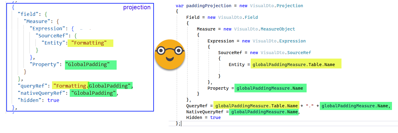
In this case we know we have the three queryStates we checked earlier (categories, y and y2). And we just need to add a couple measures and 3 visual calcs. Needless to say, the best way to know what you need to do is to do it first manually and have a look at the visual.json. Ok, we need to add everything to the querystate y (Columns in the UI). Since Projections is a list of the object Projection, we’ll first create the different projection objects and then we’ll add them all to the list.
This would be the «easy» one. Creating the projection object of a measure.
The visual calcs themselves are Projections too, but the properties are quite different. Since some of them like the expression are a bit complex, we prepare them in advance.
As an example let’s take the first function we’ll use. This one can be used in a visual calc to get the value we need to configure in as the maximum value of the secondary Y axis:
FUNCTION Formatting.AxisMaxMin.SecondaryMax =
    (
        lineMaxExpression: ANYREF EXPR,
        xAxisColumn: ANYREF EXPR,
        paddingScalar:ANYVAL
    ) =>

    EXPAND( MAXX( ROWS, lineMaxExpression ), xAxisColumn ) * ( 1 + paddingScalar )
This function is already in the model and we are referencing it with the «secondaryMaxFunction» variable.
Now our task is to create the projection that contains the visual calc that calls this function with the correct parameters. As mentioned before this script has the limitation that only 1 field can be present in the xAxis, but you can have as many measures as you want for lines. As argument we will pass an expression like
MAXX({[Measure1],[Measure2],...[MeasureN]},[Value1])The unexpected tricky part here is that we are using { } for both building the DAX expression and to specify placeholders for the string. I know, this script needs to run in C# 12 or so, so I could use interpolated strings here, but old habits die hard and I discovered the hard way that when you are using string format and you want a literal { in your final tring you need to double it {{ and then of course the place holder will have its own curly brackets to, so we end up with 3 curly brackets by side.
Also notice that the inside visual calculations of course we do not refer to the original measure anymore, but rather to the «NativeQueryRef» property of the projection.
//variables used in different visual calculations
string xAxisColumn = "[" + categories[0].NativeQueryRef + "]";
string paddingScalar = "[" + paddingProjection.NativeQueryRef + "]";
string lineChartWeight = "[" + lineChartHeightProjection.NativeQueryRef + "]";
string secondaryMaxLineMaxExpression = String.Format(
"MAXX({{{0}}},[Value])",
"[" + string.Join(
"],[",
lines.Select(l=> l.NativeQueryRef)) + "]"
);
string secondaryMaxVisualCalcExpression =
String.Format(
@"{0}({1},{2},{3})",
secondaryMaxFunction.Name,
secondaryMaxLineMaxExpression,
xAxisColumn,
paddingScalar
);
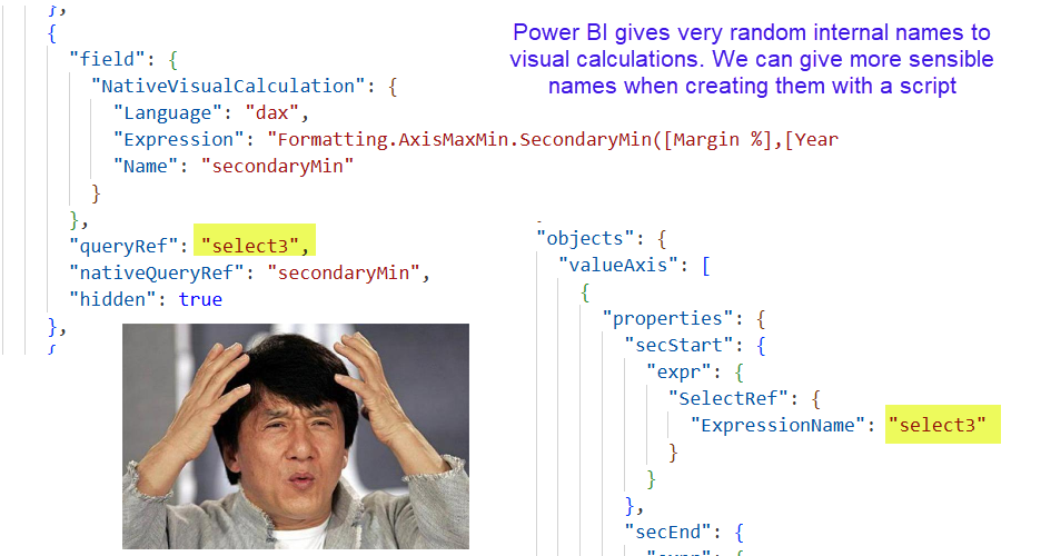
var secondaryMaxVisualCalcProjection = new VisualDto.Projection
{
Field = new VisualDto.Field
{
NativeVisualCalculation = new VisualDto.NativeVisualCalculation
{
Language = "dax",
Expression= secondaryMaxVisualCalcExpression,
Name = "secondaryMax"
}
},
QueryRef = "secondaryMax",
NativeQueryRef = "secondaryMax",
Hidden = true
};Just a couple more comments about this piece of code: I want a slow applause for the case-sensitive system that somehow ended up with «dax» in lowercase. Seriously. And also, in the script we give the visual calc a sensible «QueryRef» name, but Power BI if you do it manually it will call them like «Select1», «Select2» and so on. Very, very weird. And for some even weirder reason is this QueryRef (and not NativeQueryRef ) what is used when you select a visual calc on the max value for the axis. So many questions. It’s a fun exercise of reverse engineering though.
But let’s not get ahead of ourselves, we have just created the Projection objects but we have not added them to the visual. To do that we just need to include them on the querystate.y.projections we saw earlier. We know we need to do that because the visual.json file of the chart we modified manually literally tells us so.
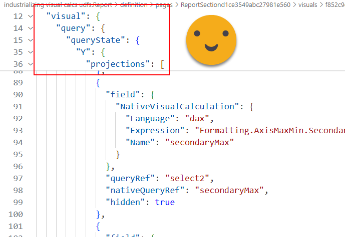
In the code, this part is very very easy. We have each projection object in a projection type variable, so it’s just:
columns.Add(paddingProjection);
columns.Add(lineChartHeightProjection);
columns.Add(secondaryMaxVisualCalcProjection);
columns.Add(secondaryMinVisualCalcProjection);
columns.Add(primaryMaxVisualCalcProjection);
With this the two measures and the three visual calculations are now part of the columns bucket of our combo chart.
Setting up properties that may or may not have value set up already
The way PBIR works is that it defines only what it needs to define. If you never played with max and min values of the axis, they will not show up at all in the visual.json file. But in this case is not like this List where we can add new objects. We need to go and check if the object is there or not, and only create it if it’s not already there. A little bit like we did for the measures and DAX UDFs, but different.
So everything is underneath Visual –> Objects –> valueAxis (which is a 1 element list?? not sure what else could be in there) and then again a big object with many properties which in turn have other properties. Oh well, let’s do it.
if (selectedVisual.Content.Visual.Objects == null)
selectedVisual.Content.Visual.Objects = new VisualDto.Objects();
if (selectedVisual.Content.Visual.Objects.ValueAxis == null)
selectedVisual.Content.Visual.Objects.ValueAxis = new List<VisualDto.ObjectProperties>();
// Ensure there's at least one ObjectProperties entry
if (selectedVisual.Content.Visual.Objects.ValueAxis.Count == 0)
{
selectedVisual.Content.Visual.Objects.ValueAxis.Add(new VisualDto.ObjectProperties
{
Properties = new Dictionary<string, object>()
});
}
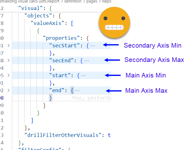
var valueAxisProperties = selectedVisual.Content.Visual.Objects.ValueAxis[0].Properties;
// secondary axis min
valueAxisProperties["secStart"] = new VisualDto.VisualObjectProperty
{
Expr = new VisualDto.VisualPropertyExpr
{
SelectRef = new VisualDto.SelectRefExpression
{
ExpressionName = "secondaryMin"
}
}
};
...
//main axis min
valueAxisProperties["start"] = new VisualDto.VisualObjectProperty
{
Expr = new VisualDto.VisualPropertyExpr
{
Literal = new VisualDto.VisualLiteral
{
Value = "0D"
}
}
};
So after we make sure the preceding objects exist, we initialize our valueAxisProperties variable and start defining the different objects as we saw we need in the visual.json of the manually modified combo chart. Looking at it you see that the axis max and min can be set up in three different ways, one is this «SelectRef» which corresponds to the «Data in this visual» elements, that’s why we can use visual calcs there too. Then of course we can hard-code the max or min values. In this case we hard-coded the minimum for columns to 0 (as many teachers would say «the implementation that allows negative values in columns is your homework!» ). And one more way that we are not using is to bind the value directly to a measure! Which makes me thing that I probably need to add that to the code that retrieves all the measures used in a report. I’m not 100% sure what happens if the measure used for a max value of the axis is not there, but most likely it will crash your visual and it will not even let you fix it either. Oh and yes, for some reason to say 0 you need to type «0D». Don’t ask. I don’t know why.
Last but not least we need to modify the actual visual.json file and tell the user to reload everything to see the changes. This is called serialization, and it’s taken care of automatically with a piece of code already in place from previous scripts. As mentioned earlier, to reload, today the only choice we have is to close the report (most likely tied to our model) and open back again…
Rx.SaveVisual(selectedVisual);
Info("Visual on page '"
    + selectedVisual.ParentPage.Page.Name
    + "' has been modified. Close and reopen the report to see the changes");
That’s pretty much it, but you may not believe me yet, so yes, here’s a video of the script doing it’s thing. Remember, to execute this in Tabular Editor 2 you will need to use the Roslyn Compiler as explained here. For Tabular Editor 3 your are good to go!
Last but not least
Oh, last but not least I realized that since we are going to add DAX UDFs to the model we need to check for model compatibility level, something we did already in the previous script. Instead of copy pasting, I encapsulated the code in yet another method of the General Functions custom class.
public static void CheckCompatibilityVersion(Model model, int requiredVersion, string customMessage = "Compatibility level must be raised to {0} to run this script. Do you want raise the compatibility level?")
{
    if (model.Database.CompatibilityLevel < requiredVersion)
    {
        if (Fx.IsAnswerYes(String.Format("The model compatibility level is below {0}. " + customMessage, requiredVersion)))
        {
            model.Database.CompatibilityLevel = requiredVersion;
        }
        else
        {
            Info("Operation cancelled.");
            return;
        }
    }
}
Then makes the check much more elegant in the main script.
// Check model compatibility level
Fx.CheckCompatibilityVersion(Model, 1702);
if (Model.Database.CompatibilityLevel < 1702) return;
Show me the demo!
Alright, I get it, you may not be in front of your computer ready to test out everything, so a video goes a long way it getting my point across. Here you go! In the video, a model that is not even at compatibility level 1702 and has a few visuals in a page will get the modification we’ve been building all along. Enjoy!
And yes, the max and min of the axis are connected to the visual calcs shown in the video.
If you want to play around this, be my guest.
- The script can be downloaded here
- If you just want to have a look at the final result, check it out here
- if you want the whole authoring environment, clone this repo
And that’s it! Thank you for reading it all, and don’t forget to give your feedback on Bluesky or LinkedIn