It’s a terrible title, but by the end I hope it makes sense
Today I had some spare time and I thought I would do some c# that is always good to keep your mind going. The goal was to create a script that given a base measure, you can then specify a column and a new measure will be generated for each diferent value of the column, in a pattern like CALCULATE([Base Measure], tbl[Column] = Value1 ) and the same for value2, 3 etc of that same column.
The script by itself might not be worthy of a whole blog post, but I want to emphasize the joy of writing code in Visual Studio 2022. I know many digg VS Code but I don’t know, I was recommeded to use Visual Studio and I like it. I feel the intellisense on the new version is even more awesome than the previous version. Almost scarily good.
I wanted to remind to be c# script developers (for Tabular Editor I mean) that it is possible to query your model from the code and use the result to do things. I did that long ago — copying some code from Darren Gosbell of course. It’s from one of my first –and probably least popular– blog posts, the one about «Theme Compliant Conditional Formatting Measures»
anyway, this little piece of code:
string query = "EVALUATE DISTINCT(" + column.DaxObjectFullName + ")";

using (var reader = Model.Database.ExecuteReader(query))
{
    // Create a loop for every row in the resultset
    while (reader.Read())
    {
        string columnValue = reader.GetValue(0).ToString();
This is where magic happens, the while loop will be executed for eahc different value of the column, and that value is stored inside the variable columnValue. From here your imagination can fly to whatever use case you may think of.
Why would I want to do that again?
For most charts you can set columns to create different series, such as the Legend field for line charts. However, if you want to show a base mase sliced by different categories along with say, the average of them all, you are out of luck. Your only way out is to create invidiual measures for each of the categories and drag them all to the values section along with any other measure you want to show (first getting rid of the legend field of course). It is in such cases that this script may come in handy as it will automate the different category measures.
So let’s do it!
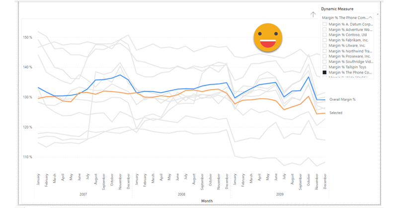
Say you want to chart the Margin % by manufacurer and see how it compares with the overall Margin %. Let’s imagine you cannot install any fancy custom visual either (I have no idea if any does something like that, but just in case). You would first create measures for each manufacturer (and there are quite a few) and then dragg them all to the values section allong with the base measure. Let’s see how can we skip the part of creating manually so many measures.
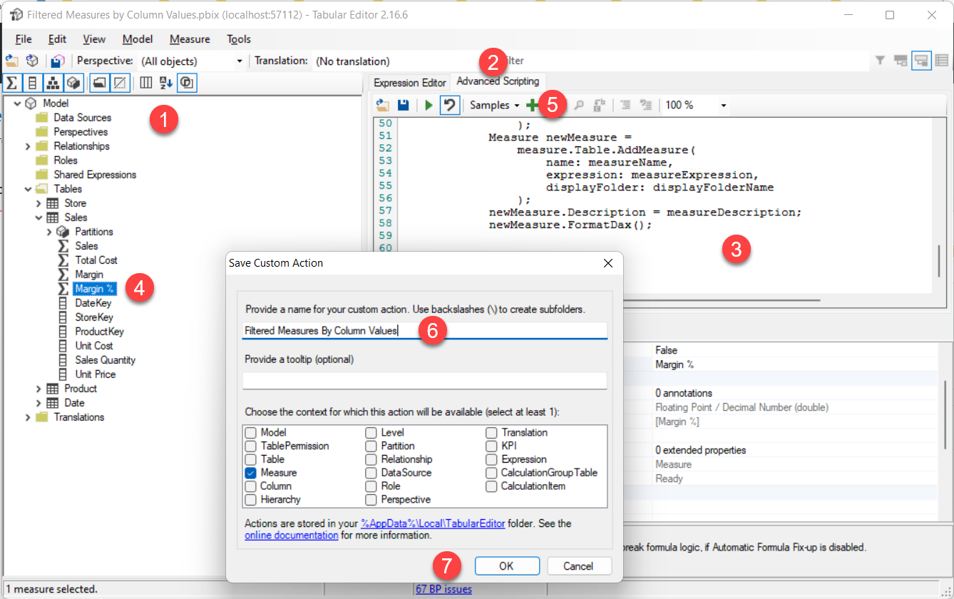
First of all, let’s copy the script from github! (I’ll be publishing this to PowerBI.Tips as usual too)
- Now launch Tabular Editor 2 (or 3 if you have it!) from Power BI Desktop
- Select «Advanced Scripting» tab
- Paste the code into the advanced scripting tab
- Select a measure (any, but you might as well select the Margin %)
- Clic on the green plus sign
- Provide a name for the custom action such as «Filtered Measures by Column Values»
- Click OK to save that.
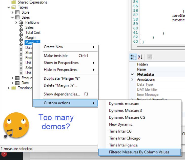
Now this code is part of your toolbelt forever!
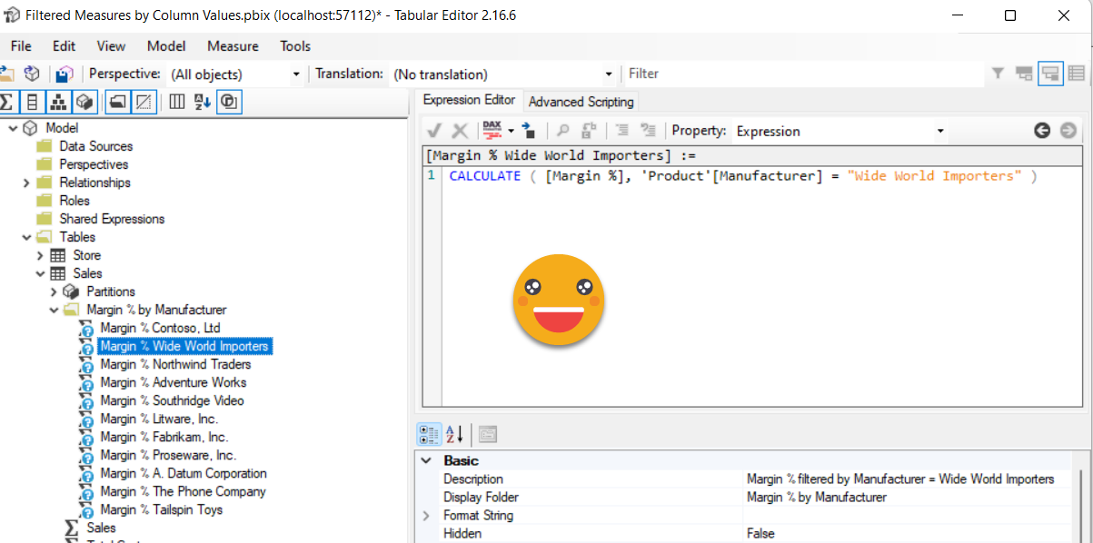
we can now rightclick our target measure, go to custom actions and select the name you gave it:
Now we need to select the table (Product) and the column of the table that we want to use to slice our measure (Maufacturer).
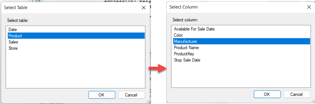
And that’s it! in like a second, we’ll see we have a new display folder in the same table as the measure, and inside there’s our desired measures!
Now we just need to save the changes back to the model (clicking on the floppy disk on a cube icon) and build our chart!
Of course if you just put all the measures in a chart it will be a complete mess — so we might want to use some storytelling techniques. To end up with something a little decent, what I did is to put all lines in light gray except for the overall Margin % one which I aptly renamed that to «Overall Margin %». I turned on series names and then turned them off for each series except for the Overall Margin % one. But then of course would be nice to visualize a single manufacturer in color, to see how compares to the overall one, and also in the context of the rest of manufacturers. I tried to add all the measures in a Field Parameter (yes I know) but adding the field in the values pane and witching didn’t really add any new series — I’m not sure if the reason is some issue with the field parameter itself or the fact that it replaces it with the actual measure, so the visual things like it has twice the same measure and anyway it’s not possible to define a color for the fields pane by itself — at least I didn’t succeed doing so.
The next possibility was doing a Dynamic Measure, so that’s what I did — I generated the calculation group with the new script and added the dummy measure to the chart. Now it did show, but of course seeing «dummy» is not nice so I change the name to «selected» — it is a pitty it does not show the name of the selected calc item but it is what it is. If the field parameter worked then it should work I guess. Anyway the final result is something like this (I discovered there’s like a Z order thing in which the last field of the box is the one shown on top)

Did you like it?
Anyway, if you want to get the script, here is the link again
If you want the pbix, knock yourself out
Keep playing, keep learning, and take care!
Would you like to comment? Follow the conversation on Twitter and LinkedIn