
This post is based in a true use case. The customer followed the market share trends, to see how it compared to the rest, as a manufacturer, and at a brand level.
So far so good. But coming from excel they were used to build charts any way they saw fit, so they liked to see on the same chart their own year-on-year growth in general as a manufacturer, then in different distribution channels, then specifically the growth of their two main brands, and then the growth on different regions. That alone was my first challenge. But then they said that that they would like to know how others were doing on the tooltip. But of course, when looking at a manufacturer-level value, they would like to see their value together with that for other manufacturers, and when looking at a brand level then wanted to see it with all the other brands. I added to the mix that it would be nice to see highlighted their own value in the tooltip of course.
There have been many learnings, but today I’ll just detail the technique to show a different tooltip depending on the item. Something like this.
Once it’s done it’s actually quite straight forward. Here’s the thing: What if I could make a chart disappear depending on a measure value or calculation?
Actually is possible: if you think of it, if the measure you are trying to plot only returns BLANK() even the axis do not display. I experienced that many times unintendedly during DAX-fights. So why not turn it into our favor? whenever the condition is true show me my measure, otherwise just BLANK(). Ok, but of course we need to take care of other aspects, like the title, or the background. Both accept measure driven content so we can apply pretty much the same approach. The only difference is that with background our BLANK outcome will be a transparent color, like #FFFFFF00.
So now, what is this condition and how can we set it up?
Well, first of all, to build any chart we need a column containing all the axis values we want to show, right? In case we want an ad-hoc chart like this we’ll have to build ourselves a table, say «KPI Chart», with a column, say «Category», with all these values. And while we are at it also an «Order» for our «Category». You can go the PowerQuery or the DAX way, it doesn’t really matter. Then of course you’ll have to make a nice measure that depending on the value of this new column it shows the appropriate calculation. . For instance, if we had just two categories, Total and Red products, our measure could be like:
KPI Chart Measure :=
SWITCH (
    SELECTEDVALUE ( 'KPI Chart'[Category] ),
    "Total",
        CALCULATE (
            [Sales Amount],
            'Product'[Product Brand] = "Contoso"
        ),
    "Red Products",
        CALCULATE (
            [Sales Amount],
            'Product'[Product Color] = "Red"
                && 'Product'[Product Brand] = "Contoso"
        )
)
If that was the case, we could build the measures of the tooltip in a similar fashion, as we would have two different tooltips, one for each category. For the tooltip chart showing when on top of «Total», the measure would be:
Total Tooltip Measure :=
IF (
    SELECTEDVALUE ( 'KPI Chart'[Category] ) = "Total",
    [Sales Amount]
)
This measure does not filter by brand, because in the tooltip I’m imagining, the chart axis will contain the Brand.
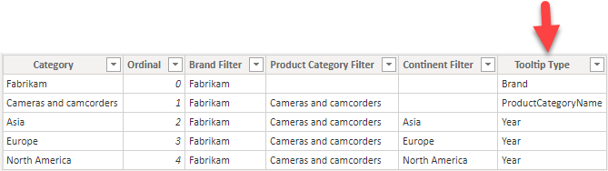
And so on. However, on a general case, we might have a few columns that share the same tooltip, just displaying different data, just as we saw on the example above for «Asia», «Europe» and «North America». It does not really make sense to check all the individual categories, for something that we can put on the same «KPI Chart» Table. Adding a «Tooltip Type» column makes things much clearer.
You certainly saw there other columns than the ones I mentioned, these ease my DAX but I don’t want to go deeper there or we’ll lose our focus.
To complete the tooltips I created 3 groups of measures, one for each Tooltip Type (Brand, ProductCategoryName, and Year). And, as we said before, in each group there are 4 measures: one for Values, one for Background color, one for Title and one for Data Colors.
If you do not want title on your tooltip you can skip that, and if you don’t want conditional formatting you can also skip the Data Colors one. But…. since it’s basically always the same, CAN WE DO ANY BETTER???
Of course we can, we always can. I just made a tabular editor script to ease the process. To use it follow this steps:
- Download and install Tabular Editor if you haven’t already.
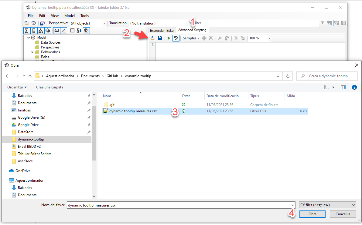
- Go to my GitHub repository and download the latest release of the code for dynamic-tooltip
- Unzip the file wherever you’d like to have it
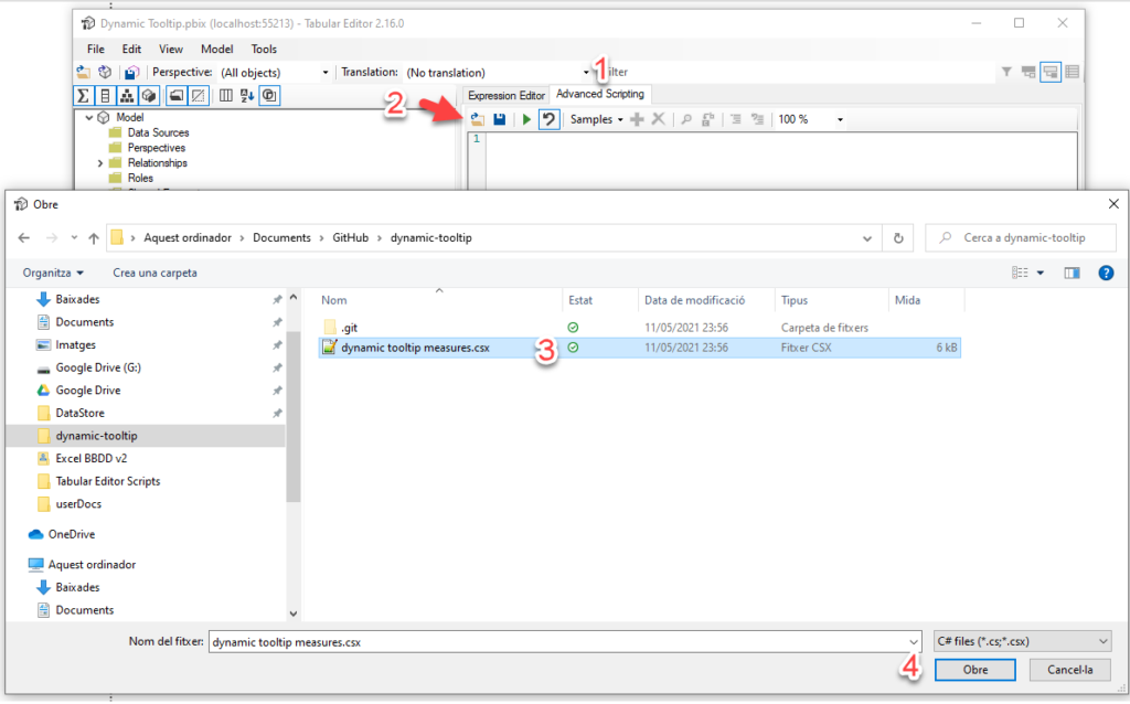
- Open tabular editor from power bi or connect it to your local pbix.
- From advanced editor tab, click open and select the csx file on the location selected on step 3
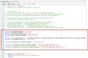
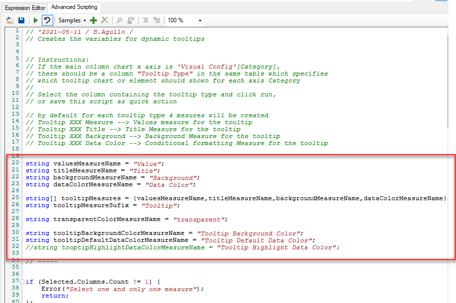
- Review the naming conventions of the script described at the beginning of the script
- Now, on the model tree in tabular editor, select the Tooltip Type column and run the script
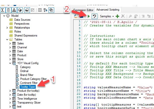
- will create a display folder for each tooltip type and will put inside the 4 measures we just said with the common code already baked in.
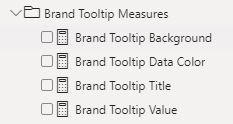
You’ll still have to work a little, but you’ll have more fun as the boring part is already taken care of. For instance, the Background measures are fine as they come
Brand Tooltip Background :=
VAR Result =
    IF (
        SELECTEDVALUE ( 'YOY Visual Config'[Tooltip Type] ) = "Brand",
        [Tooltip Background Color],
        [transparent]
    )
RETURN
    FORMAT ( Result, "@" )
The final FORMAT thing is important, as otherwise Power BI does not recognize it as a valid color measure because it’s not sure if it’s a text one or not. I guess.
The script will even create some color measures that you can later modify such as «Tooltip Background Data Color» and «Tooltip Default Data Color» and even a Transparent color. You can modify those if you want to change all tooltips at once, or go to the individual measures if you want to change them individually.
Oh, I forgot. It might be a bit tricky to set up the charts because by default they don’t show up. I normally set them up next to the main chart, and they should appear when one category is selected and disappear otherwise. If you are having difficulties setting up the data color settings, because if no value is shown the menu item disappears as well, then you can modify the measure to show a 1 or something no matter what and then modify it back. Once you have your charts that show and hide when they have to, just copy them and paste them on the tooltip page, one on top of each other. Since all but one will be visible simultaneously, it all will play nice.
You can get the script from my repository
https://github.com/bernatagulloesbrina/dynamic-tooltip
A sample file is a bit rough (not done with the script) but you get the idea
Hope it helps! let me know your thoughts on this